

Color holds incredible power. It transforms mood, shapes perception, and sometimes even sparks a memory you didn’t know existed. In living rooms, on websites, across brand identities, the right palette can turn ordinary into unforgettable. This year has designers reaching for hues that feel both comforting and bold, blending earthy warmth with unexpected vibrancy.
So what’s driving these choices? Let’s be real, the world feels chaotic. Designers are responding with colors that ground us yet dare us to feel something new. From the luxurious browns that Pantone crowned as their color of the year to nature-inspired greens and dramatic jewel tones, the palettes emerging this year tell a story of connection, confidence, and creative freedom.
Mocha Mousse: The Rich Brown Taking Center Stage
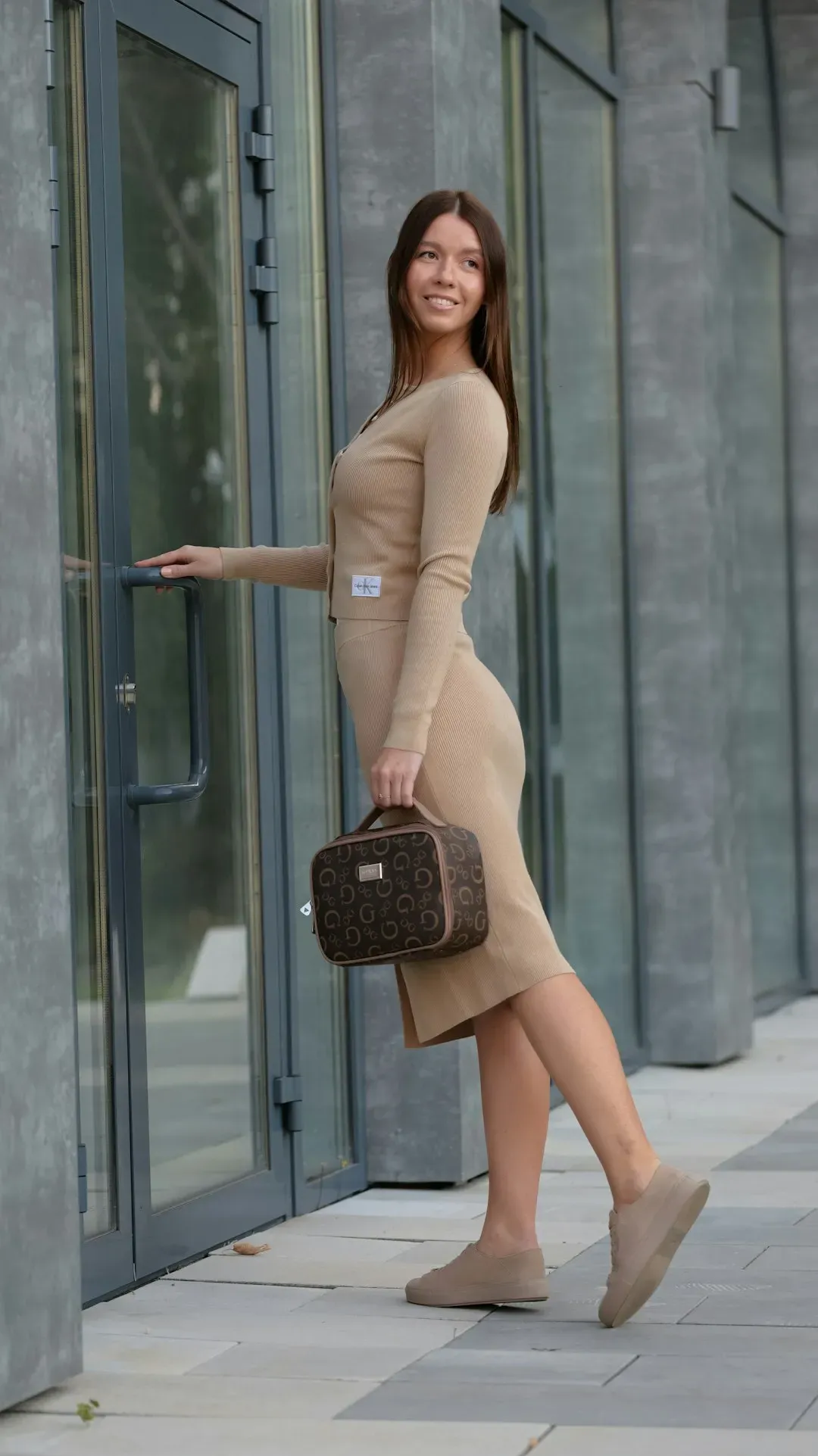
Pantone has named Mocha Mousse as its Color of the Year for 2025. This isn’t just any brown. Pantone’s PANTONE 17-1230 Mocha Mousse has been named the 2025 color of the year, celebrated for its rich, warming qualities. This deep brown hue combines the indulgence of chocolate and coffee with a sense of comfort and stability, perfectly aligning with our collective desire for reassurance and grounding. Think of it as the antidote to years of cool gray domination.
Mocha Mousse represents something bigger than aesthetics. It’s about finding pleasure in simplicity, about those small moments that make life feel manageable again. Looka’s 2025 logo data told the same story – 22% of logo designers chose a shade of brown as one of their logo colors. Interior designers are painting entire rooms in this hue, while graphic designers use it as a sophisticated backdrop. Whether paired with creamy neutrals or contrasted against metallics, this shade delivers warmth without overwhelming a space.
Earthy Browns and Terracotta: The Grounded Neutrals Making a Comeback

Browns are having a serious moment beyond just Mocha Mousse. Mottershead predicts dessert-inspired hues, from chocolate and coffee to caramel and toffee, to reign in 2025. This embracing of brown is a continuation of the trend shifting away from cooler grey interiors to a warmer palette of natural hues that deliver comforting, soothing schemes.
A rise in earthy tones will add a grounding and opulent look to designs. We’re seeing reddish clay tones, deep terracotta, and warm taupe showing up everywhere from fashion runways to boutique cafe branding. These colors don’t scream for attention. They invite you in with a quiet confidence, creating spaces that feel lived-in yet aspirational. Paired with natural materials like rattan, warm wood, and stone, these browns create a tactile experience that goes beyond visual appeal.
Vibrant Yellows: Optimism in Every Shade
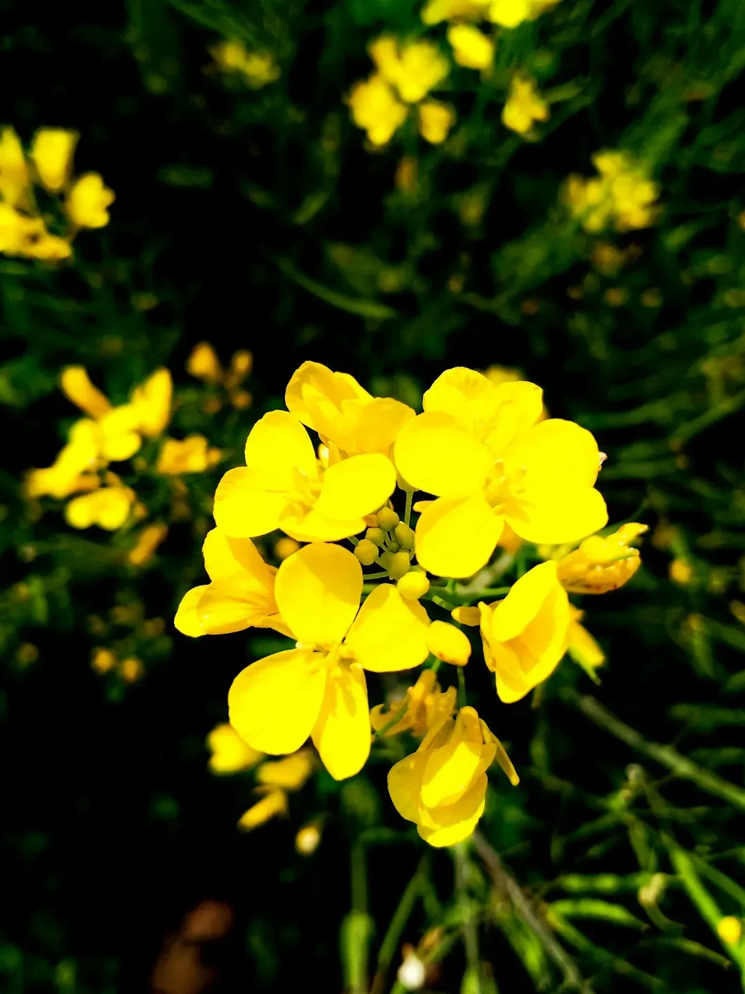
Here’s the thing about yellow: it demands to be noticed. From a bright sunny yellow to a deep mustard, folks are looking for happiness and a way to stand out. Yellow hits both targets. This color trend is all about optimism and energy. Whether it’s a buttercream soft enough to whisper or a marigold bold enough to shout, yellow is showing up as the ultimate mood lifter.
We’re seeing yellow, orange, buttercream, and mustard used as ways to add warmth and joy to designs. Designers are using it strategically, sometimes as a primary color but more often as an unexpected pop against darker backgrounds. It works beautifully in monochromatic schemes where different intensities of yellow create depth without introducing additional colors. The shade you choose matters tremendously. A golden yellow feels vintage and grounded, while a neon lemon screams modern energy.
Burgundy and Deep Reds: Drama with Sophistication
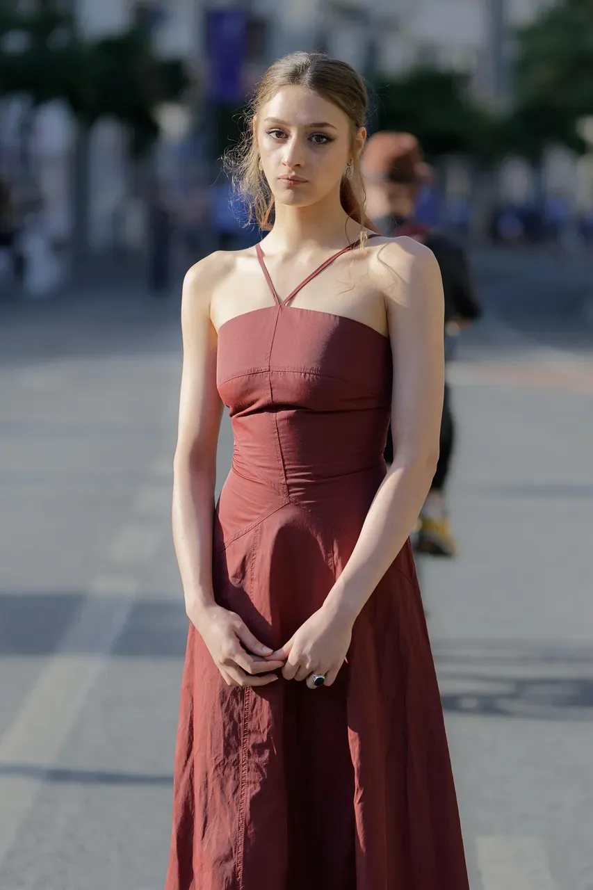
Nothing says confidence quite like a deep, saturated red. Decorating with red gained plenty of traction in 2024 thanks to the unexpected red theory, but this interior color trend is shifting away from saturated tomato reds toward rich and warming wine reds, such as burgundy and oxblood. These aren’t the reds of Valentine’s Day or fire engines. They’re moodier, more complex.
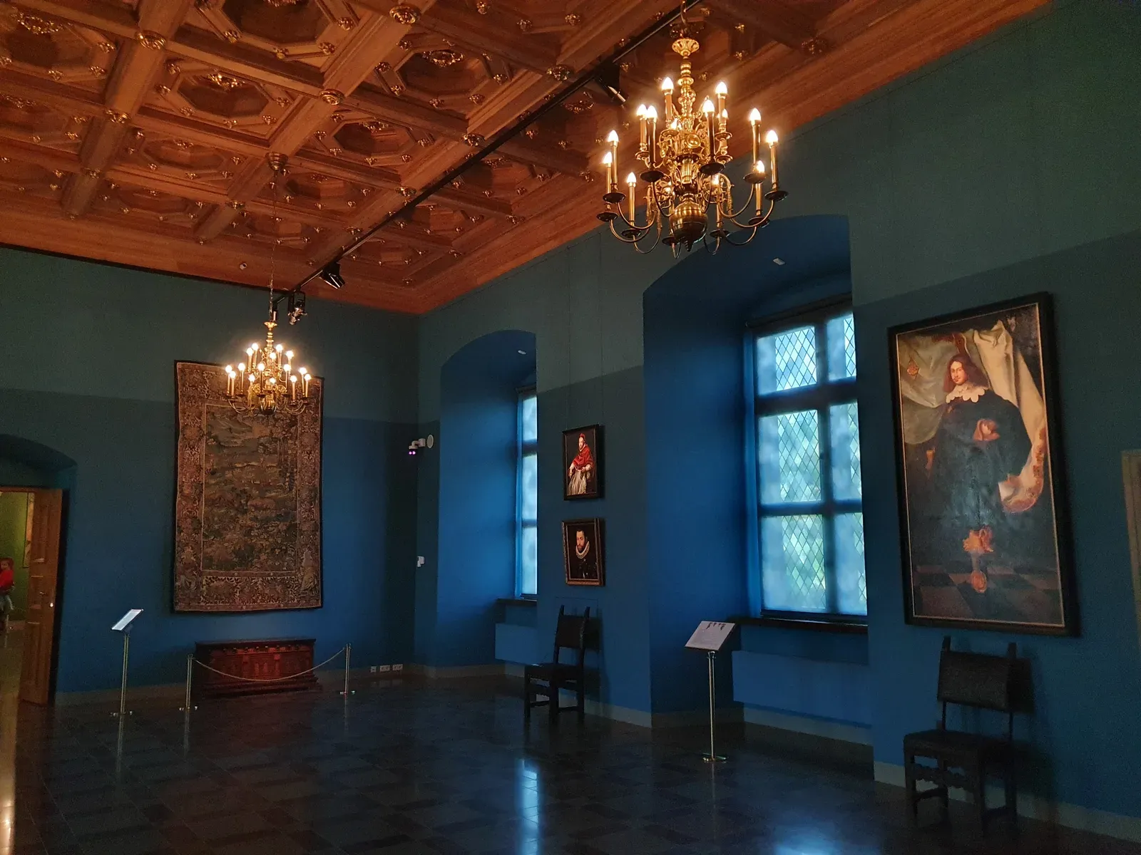
These shades exude luxury and sophistication, perfect for adding warmth to interiors or fashion ensembles. Think rich merlot, crimson, and wine-inspired shades that pair beautifully with metallics like gold or brass. Burgundy works as both a statement color and a surprisingly versatile neutral. In branding, it conveys heritage and quality without feeling stuffy. In interior spaces, it creates intimacy and drama, especially when used on accent walls or in velvet furnishings. Sophisticated deep-red and purple shades like burgundy and eggplant counter the trending brighter colors and add elegance to everything they encounter. These opulent hues evoke nostalgia for vintage glamor and historical richness but are also applied in modern, fresh ways.
Ocean Blues and Ethereal Aquas: Calm in a Saturated World
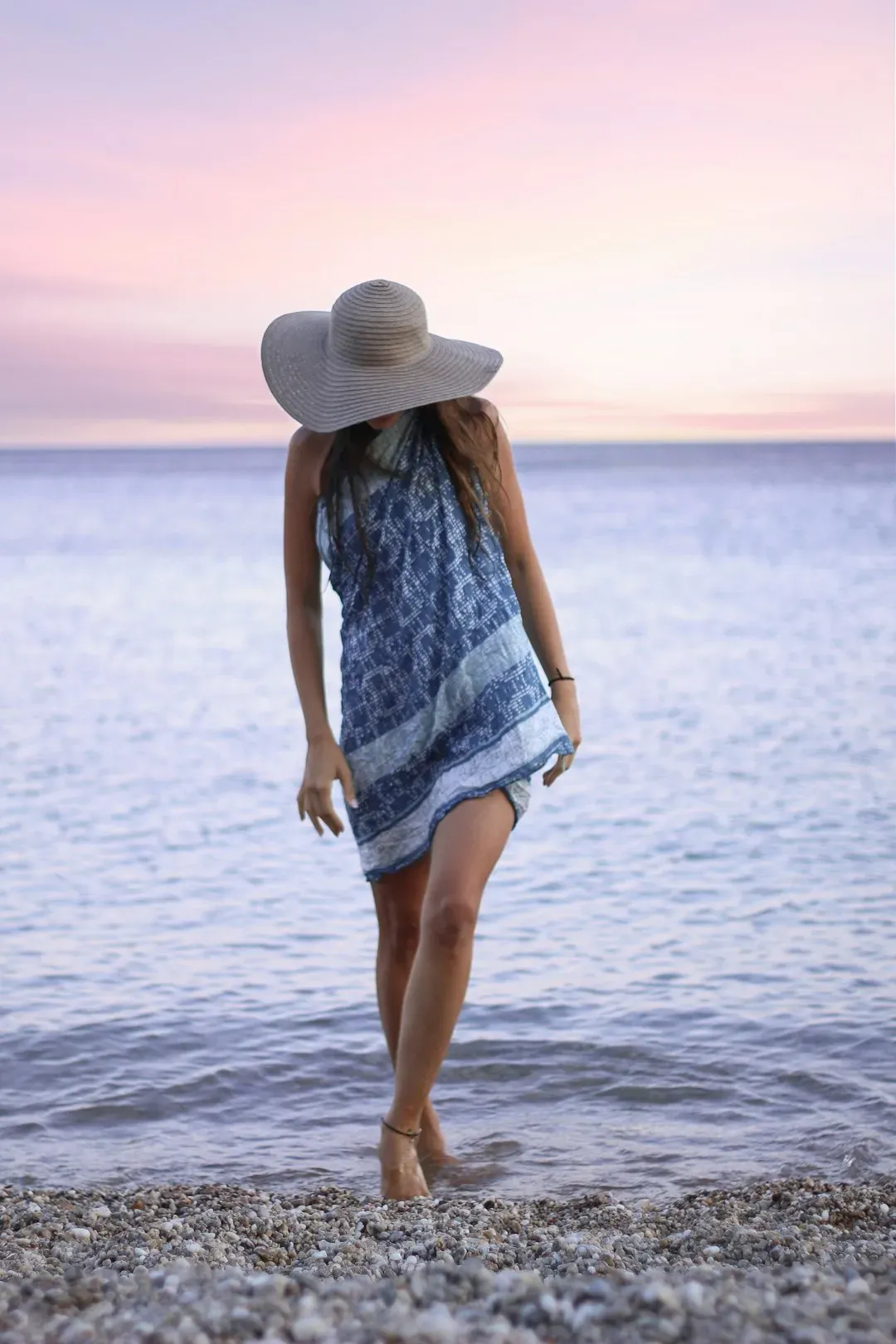
Blue never truly goes out of style, yet the blues trending now feel different. Ethereal blues are soft, calming, and a bit otherworldly, bringing a serene energy to any project. Ethereal blues are excellent for industries like wellness, health, and technology, where calmness and trust are key emotional drivers.
These aren’t the stark navy blues of corporate offices. We’re talking seafoam greens with blue undertones, misty grays tinged with aqua, and airy sky blues that feel like a deep breath. Nature serves as a major source for color trends, with ocean blues, forest greens, and earthy browns in focus. These colors captivate viewers and bring calmness. Paired with sandy beiges or warm neutrals, aqua creates palettes that feel fresh without being cold. It’s particularly effective in digital design where screen fatigue is real and softer colors offer visual relief. This palette speaks to ease and clarity, inviting viewers to linger rather than scroll past.
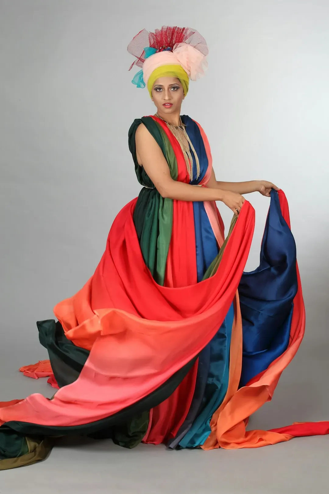
Bold Jewel Tones and Saturated Brights: Energy That Refuses to Be Ignored
Vibrant tones will also vie for attention in 2025. We’re talking intense, saturated colors like marigold orange, fuchsia and hot pink, emerald green, and sapphire blue, which grab attention and energize the space in which they appear. While much of this year leans toward grounding neutrals, there’s an equally strong pull toward colors that celebrate joy and individuality.
Think of brands like MasterCard or vibrant fashion campaigns that use color to spark emotion instantly. Frog Green and Hot Pink: it’s sharp, loud, just a little bit rebellious, and it’s everywhere. You’ve probably already seen it out in the wild. Squid Game used a striking pink-green contrast in its visual branding. These combos aren’t for the faint of heart. They work best when balanced with breathing room, generous white space, or muted backgrounds that let the brightness shine. Designers are using them to create memorable moments, whether in packaging, social media graphics, or statement interiors. It’s color that celebrates boldness without apology.
Monochromatic Magic: Depth Through Single-Color Variation
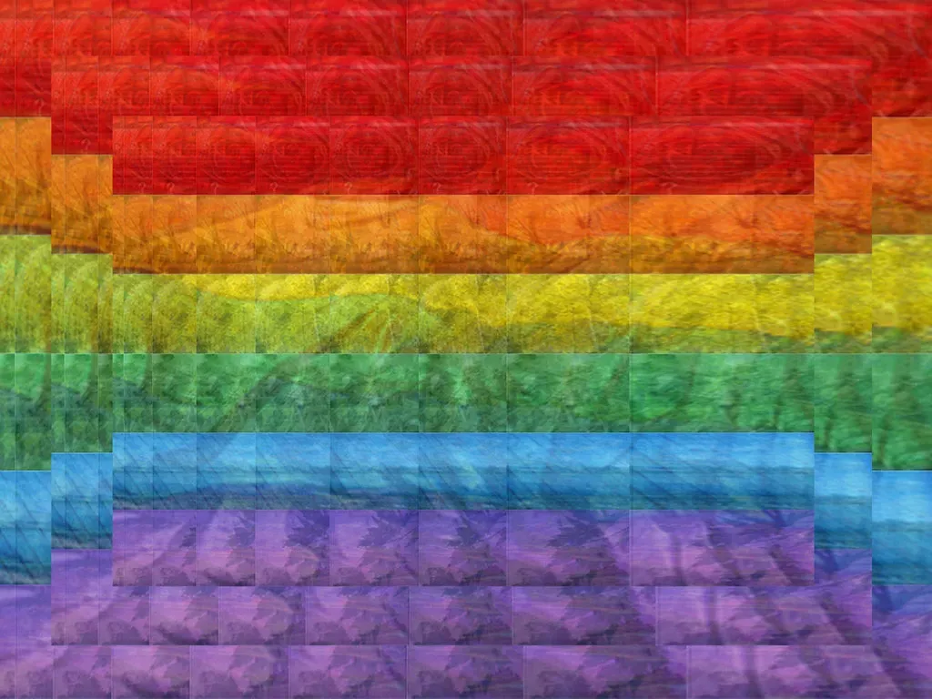
One surprising trend gaining serious traction is monochromatic palettes. The emerging theme is that designers are leaning toward the look of monochromatic contrast in colors. Monochromatic palettes are intriguing – they create harmony, simplicity, and a sense of sophistication.
In logo data of 2025, the colors with the most monochromatic pairings were brown, blue, and yellow. Folks toggled with pairing dark tones with light ones to create that unified monochromatic look. This approach feels simultaneously restrained and dynamic. By playing with saturation and brightness within a single color family, designers achieve visual interest without the complexity of multiple hues. A chocolate brown paired with a creamy tan, or a navy blue alongside powder blue creates cohesion while maintaining contrast. It’s a sophisticated choice that reads as intentional and polished.
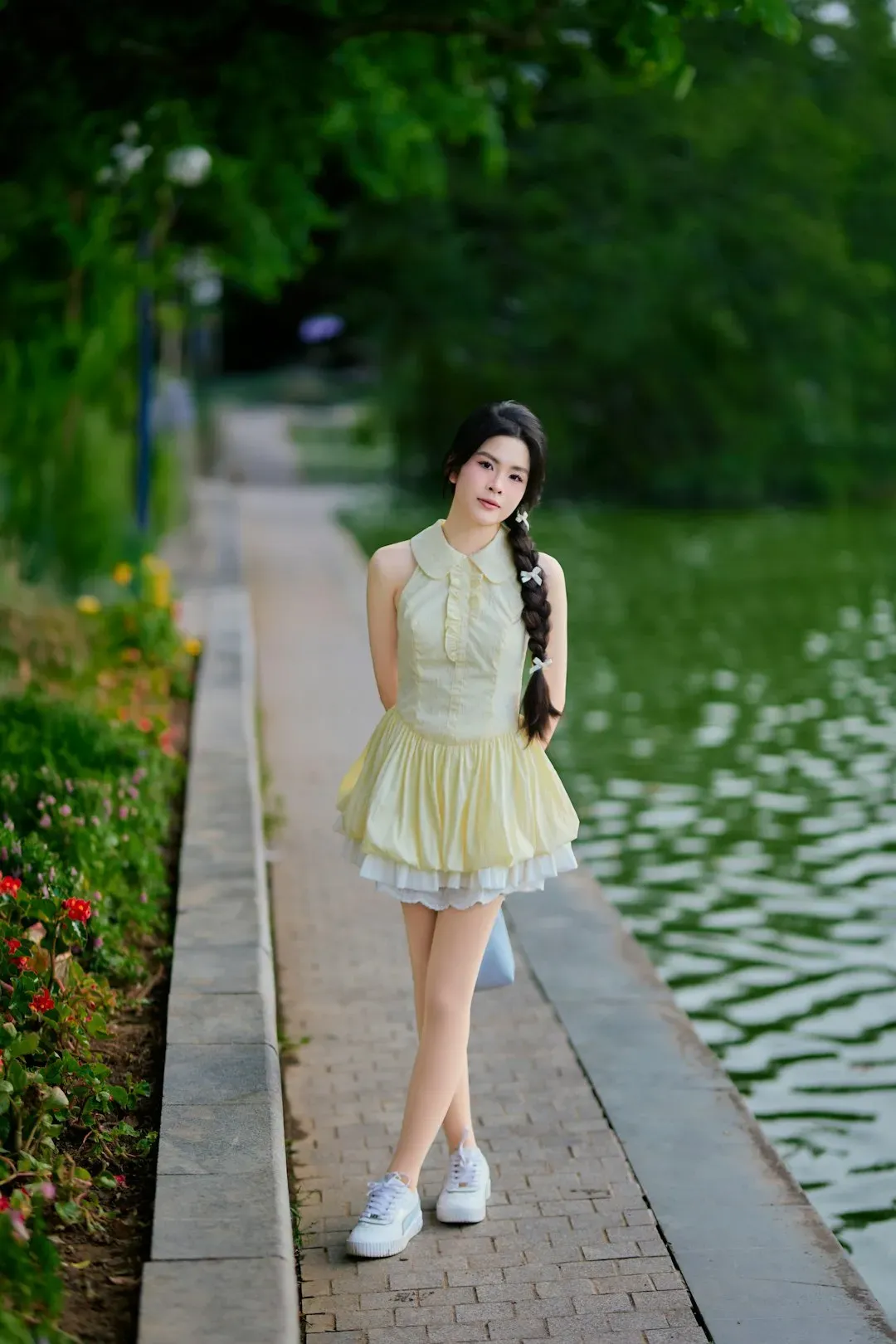
Creamy Pastels: Soft but Never Weak
Pastels are back, but not the Easter egg variety. Creamy pastels continue to be a strong trend in 2025. These colors exude softness and subtlety, making them perfect for UI designers, social media managers, and marketers. Unlike brighter pastels, creamy pastels bring warmth to your palette, giving a nod to nostalgia without feeling outdated.
These are muted, creamy versions that feel grounded rather than sugary. Think blush pinks with beige undertones, sage greens that lean toward gray, and dusty blues that whisper rather than shout. These soft, muted tones are ideal for creating clean, calming visuals that don’t demand attention but gently hold it. They work well as background colors or even product packaging. In a world oversaturated with visual noise, these colors offer a respite. They’re especially popular in wellness branding, beauty products, and lifestyle content where the goal is to create feelings of tranquility and ease.
The Unexpected Combinations: When Rules Get Rewritten
Perhaps the most exciting trend is how designers are mixing what shouldn’t work on paper. The combos we’re seeing in 2025 don’t hold back. They’re confident, expressive, and sometimes a little unexpected – in the best way. Some feel soft and comforting. Others bring heat and contrast. A few mix both and still manage to look good. Designers are having fun again, trusting their instincts, and getting more comfortable with color that says something, without having to explain it.
Gold paired with navy creates timeless luxury. Crimson against light blue feels fresh and high-impact. Even that audacious frog green and hot pink combo finds its audience. Strategic color choices increase CTA clicks by up to 34%. These palettes succeed because they balance boldness with intention. They’re not random; they’re carefully composed to create specific emotional responses. Whether it’s surprise, joy, or curiosity, these unexpected pairings prove that color rules are more like guidelines, meant to be broken by those who understand them well enough.
The palettes dominating this year aren’t just about following trends. They reflect a cultural moment where we crave both comfort and courage, stability and surprise. Studies show that 93% of buyers focus on visual appearance, and color influences 85% of purchasing decisions. Whether you’re redesigning a space or building a brand from scratch, these color stories offer a starting point for creating something that feels both current and enduring. What will you create with these hues? The canvas is yours.


