
Logos are everywhere. They’re printed on your shirt, stamped on your morning coffee cup, and glued to your phone. We interact with them constantly, often without thinking twice. These tiny symbols speak louder than words, telling entire brand stories in just a flash of recognition. Here’s the thing though: many of these emblems were born from surprising origins, absurdly low budgets, or sheer happenstance. Honestly, if you knew how some of the world’s most iconic logos came to be, you’d probably be shocked.
Behind those polished images lie messy beginnings and quirky tales. From university students designing billion-dollar symbols for pocket change to accidental design choices becoming legendary, the stories behind your favorite logos are often more fascinating than the brands themselves. Let’s dive in.
Nike’s Swoosh: A Student’s $35 Masterpiece
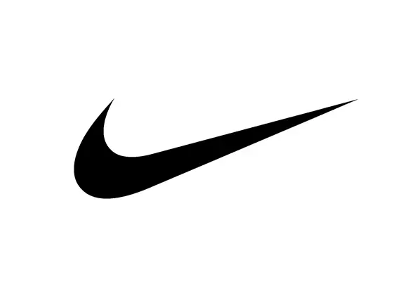
The iconic Nike Swoosh was created in 1971 by Carolyn Davidson, a graphic design student at Portland State University. Overall, the Swoosh took Davidson around 17.5 hours to design, and she was paid $35 for her work. That’s right. One of the most recognizable logos on the planet cost less than a dinner for two. Phil Knight wasn’t entirely satisfied with the design at the time, but he thought it had potential and kept it. Imagine being lukewarm about a design that would eventually become synonymous with athletic excellence worldwide.
Davidson’s inspiration for the logo came from the Greek goddess Nike, known for her speed and strength, and she drew inspiration from the wings of the goddess, which gave her the idea for the Swoosh design. In September 1983, Knight invited Davidson to a company reception and presented her with chocolate swooshes, a diamond ring made of gold and engraved with the Swoosh, and an envelope filled with 500 shares of Nike stock, then worth about seventeen cents per share or $85, worth in 2023 after stock splits bringing the total to 32,000 shares, about $3 million. Not too shabby for what started as a side gig.
Apple’s Bitten Fruit: No, It’s Not About Alan Turing
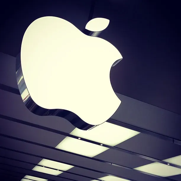
The Apple logo has a bite taken out of it to make sure it looks like an apple from far away, and not a cherry, according to designer Rob Janoff. Despite numerous romantic theories linking the bite to Alan Turing’s tragic death or the biblical Garden of Eden, the truth is far simpler. Janoff added the bite mark to ensure the logo was recognizable as an apple, not a cherry or another similarly shaped fruit, and that small detail is what makes the logo unmistakably an apple.
The original Apple logo from 1976 was vastly different. Apple’s first logo design illustrated Isaac Newton reading under an apple tree and was designed by the third co-founder, Ronald Wayne, in 1976. Steve Jobs quickly realized that intricate drawing wouldn’t work for modern branding. Jobs hired Rob Janoff, an experienced logo designer, to rebrand the company, and the result underscored the company’s Apple II computer, the world’s first colored-display computer. The rest, as they say, is history.
Amazon’s Smile: More Than Meets the Eye
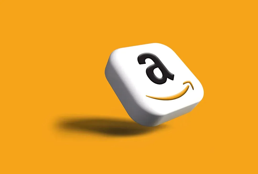
Today, the iconic ‘Smile’ logo features an arrow starting at the letter A and ending at Z, from ‘A to Z,’ a motif that cleverly reflects Amazon’s endless range of products and end-to-end delivery. It’s deceptively simple yet brilliantly layered. The smile is also an arrow that goes from A to Z in the word “Amazon,” which means the e-commerce website offers an exhaustive range of products.
The original Amazon logo was designed by the agency Turner Duckworth in 1995, and the same agency would go on to design today’s logo, too. Amazon founder Jeff Bezos did not want to spend money on additional branding elements, such as package design, so designer Turner Duckworth suggested using only a smile in the design, turning ordinary boxes into smiley ones. This decision transformed packaging into a marketing tool and made every delivery feel like happiness arriving at your door.
McDonald’s Golden Arches: From Architecture to Icon
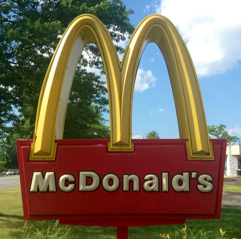
When the first franchised McDonald’s restaurant was put up in 1952, the arches were a part of the exterior design of the establishment. Nine years later, those same arches were incorporated into their logo design, and since then, the arches have remained throughout the many logo redesigns the company has had in over 60 years. The arches weren’t initially meant to be a logo at all. They were architectural features that happened to look good enough to become a global symbol.
The brand colors of yellow and red were a purposeful direction on the company’s part, as red represented energy and stimulation, while yellow is associated with happiness. Psychology meets design in the fast-food world. Studies show that people form an impression of a brand within 10 seconds of seeing its logo, and 90% of consumers expect brand consistency across platforms. McDonald’s nailed both.
Starbucks Siren: From 15th-Century Woodcut to Modern Minimalism
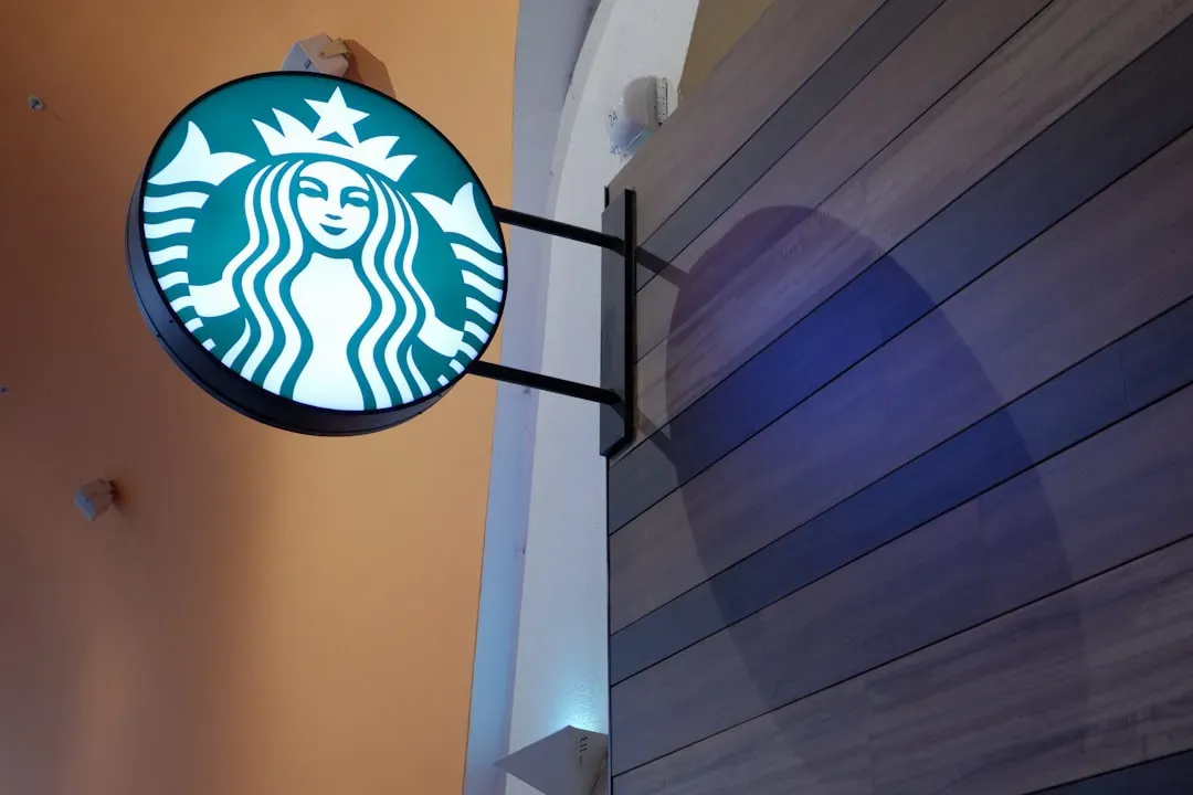
In 1971, Starbucks chose a twin-tailed siren as its visual identity, and originally, the look was very 15th century and had the circular badge with the description of the Starbucks name along with its offerings of coffee, tea, and spices. The original color scheme was brown and white, and from 1987 to 1992, the logo took on new colors of green, black, and white, but it kept the twin-tailed siren and the circular badge.
From 2011 to today, Starbucks dropped the circular badge with descriptive words and went with the siren. Over time, even Starbucks has adopted the icon-only approach. The evolution from detailed illustration to minimalist icon mirrors a broader shift in branding. Less is more, especially when your logo is plastered on millions of cups worldwide.
Disney’s Signature That Isn’t Really His Signature
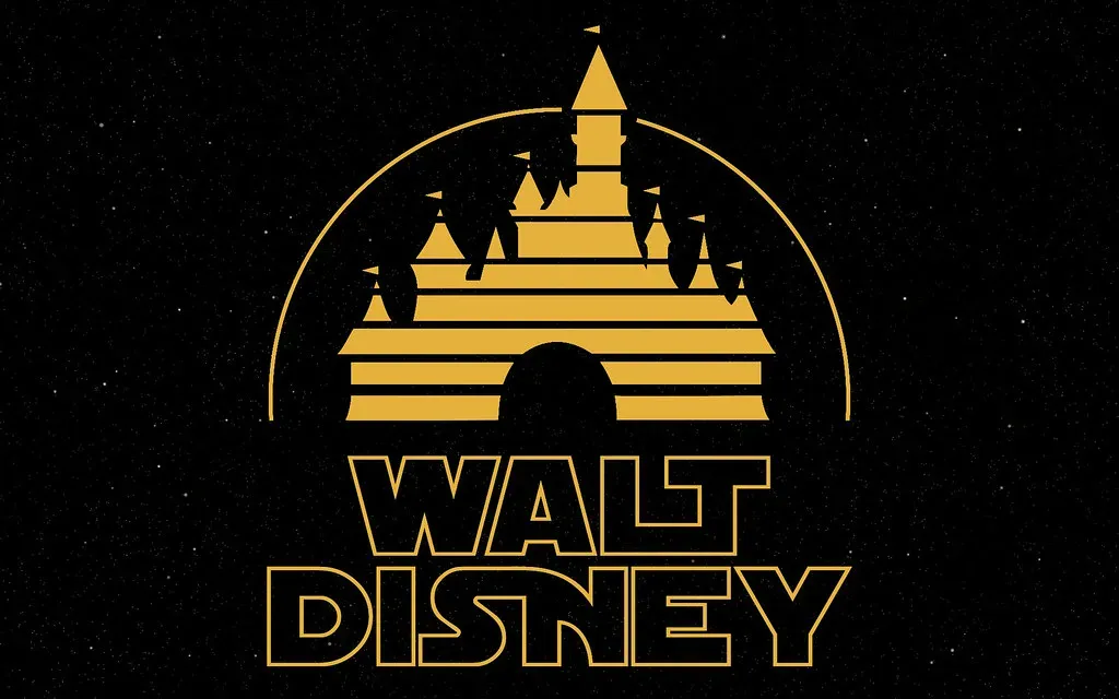
Although this “handwriting” is a stylized version of the founder’s, Disney changed his signature so often that it was impossible to pin down by designers, and in the words of Walt Disney collectibles expert Phil Sears, “Walt consciously re-designed his signature over the years, in much the same way he changed the appearance of Mickey Mouse over time.” Walt’s signature will look different for every decade, and then there are differences within each decade.
The iconic Disney castle was first introduced to the logo in 1995, and in 2006 the emblem was, with the help of Pixar, given a stunning dose of technological advancement by turning it 3D. The logo constantly evolves while maintaining that core whimsical feeling. It’s branding that grows with technology but never forgets its roots.
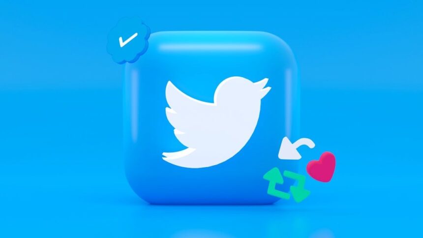
Twitter’s Larry Bird Logo: A Boston Tribute
The company’s co-founder, Biz Stone, comes from Boston and he named the icon after legendary basketball player, Larry Bird, and the athlete played for the Boston Celtics. They bought the logo of iStock from a logo designer called Simon Oxley, who only received $6 after iStock took its cut. That’s even less than what Nike paid. The Twitter bird has undergone several redesigns, but the name and essence remain.
Coca-Cola’s Script: Unchanged Since 1905
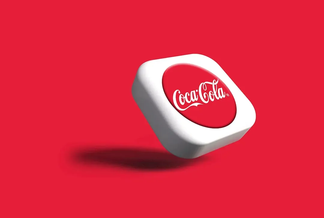
Coca-Cola is an interesting case study for logo evolution because, for the most part, the script of the logo hasn’t changed since 1905. Coca-Cola’s logo is one of the best examples of brand consistency, and since the early 1900s, Coca-Cola has kept its red and white script nearly unchanged, aside from a few small adjustments, and this enduring design has made Coca-Cola a beloved symbol of nostalgia and comfort across the world.
When you find something that works, don’t mess with it. Coca-Cola understood this decades before most companies. The Coca-Cola logo was created by Frank Mason Robinson, who was the company’s bookkeeper and also suggested the name “Coca-Cola.” Sometimes your accountant has the best creative ideas.
Logos aren’t just corporate doodles. They’re visual shorthand for identity, values, and emotions. Studies show that people form an impression of a brand within 10 seconds of seeing its logo. That’s barely enough time to blink twice. The best logos transcend their origins and become cultural artifacts. They start conversations, spark memories, and sometimes even inspire myths.
These stories remind us that brilliance doesn’t always require massive budgets or corporate committees. Sometimes it just takes a college student with 17 and a half hours to spare or a simple idea about connecting two letters with a smile. Did you expect that? What’s your favorite logo origin story, and does it change how you see the brand now?


