You know that moment when you’re browsing a bookstore and a cover just stops you cold? There’s something magnetic about a truly stunning book cover. It’s not just marketing. It’s art, psychology, and sometimes a little bit of rebellion all wrapped into one package. The best ones whisper secrets before you’ve read a single word.
What most people don’t realize is that behind these gorgeous designs lie fascinating tales of creative battles, last-minute changes, and hidden messages that authors and designers tucked away for eagle-eyed readers to discover. Some covers were accidents that became iconic. Others were carefully orchestrated masterpieces that took months to perfect. Let’s dive into the world where art meets literature and uncover what really happened behind those spines.
The Accidental Masterpiece of The Great Gatsby

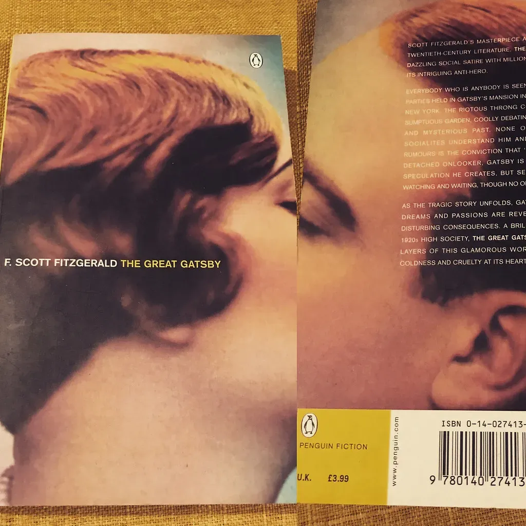
Francis Cugat created what many consider the most haunting book cover in American literature, and he did it before Fitzgerald had even finished writing the novel. Those disembodied eyes floating over a twilight carnival scene weren’t just decorative. Fitzgerald loved the artwork so much that he actually wrote it into the story itself, describing the eyes of Doctor T.J. Eckleburg watching over the Valley of Ashes.
The cover almost didn’t happen. Cugat was a relatively unknown artist at the time, and the publisher took a huge gamble on his surrealist vision. The ethereal female face with eyes like celestial orbs and a single tear became synonymous with the Jazz Age’s dark underbelly. Honestly, it’s wild how one piece of art can define an entire era of literature.
What makes it even more interesting is that the original painting has never been found. Collectors have searched for decades. Some believe it was destroyed. Others think it’s gathering dust in someone’s attic, waiting to be rediscovered.
Penguin Orange and the Revolution of Paperback Design


Before nineteen thirty-five, book covers were stuffy affairs with elaborate illustrations and cramped text. Then Allen Lane founded Penguin Books and changed everything with a simple color-coded system. Orange for fiction. Green for crime. Blue for biography. The minimalist design was so radical that established publishers thought it looked cheap.
Edward Young, a twenty-one-year-old office junior, sketched the original Penguin logo on scrap paper during his lunch break. Lane liked it so much he paid the kid just five pounds for it. That doodle became one of the most recognized publishing symbols in history. The simple horizontal bands and clean typography were actually inspired by Bauhaus principles and modernist architecture.
The genius wasn’t just in the design. It was in the democratization of reading. These books cost the same as a packet of cigarettes and fit in your pocket. The covers said literature doesn’t need to be pretentious. It can be accessible, affordable, and still beautiful.
To Kill a Mockingbird’s Quiet Power

The first edition cover of Harper Lee’s masterpiece is deceptively simple. A spare tree against a white background. No characters. No courthouse. Just that lonely tree that somehow captures the entire soul of the book. The designer deliberately chose understatement in a market drowning in busy, loud covers screaming for attention.
What most readers miss is the subtle detail in the tree’s branches. If you look closely, they form shapes reminiscent of reaching hands. Some say it represents the children’s innocence. Others see it as the community’s collective guilt. The designer never confirmed the intention, preferring to let readers draw their own conclusions.
The cover became so iconic that when publishers tried to update it for anniversary editions, there was genuine public outcry. Readers didn’t want a mockingbird perched anywhere on that cover. They wanted their tree, stripped and honest, just like the story inside.
The Controversial Brilliance of A Clockwork Orange

David Pelham’s cover for the nineteen seventy-two British edition is a masterclass in unsettling minimalism. That single staring eye with the false eyelash formed from ones and zeros became instantly controversial. Conservative bookstores refused to display it face-out. Parents complained. Sales skyrocketed.
Pelham borrowed heavily from the Kubrick film’s aesthetic, which had just scandalized audiences worldwide. The mechanical eye perfectly captured the book’s themes of free will versus conditioning, violence versus beauty. What’s fascinating is that Burgess himself initially hated it, thinking it was too provocative and would overshadow the linguistic brilliance of his nadsat language.
The cover sparked a trend of dystopian literature embracing stark, confrontational designs. Publishers realized that sometimes making readers slightly uncomfortable is exactly the point. The eye still shows up in college dorm rooms and hipster coffee shops, a testament to design that refuses to look away.
Chip Kidd and the Art of the Thriller

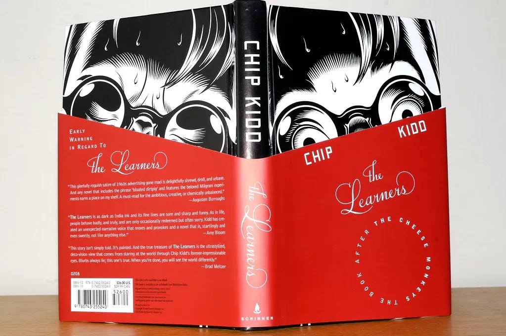
Jurassic Park’s original cover is so clever it makes you want to slap yourself for not thinking of it first. Those skeletal ribs forming a menacing silhouette against black. Kidd designed it fresh out of college, and it launched his career into the stratosphere. What people don’t know is that he almost used a full dinosaur skeleton, but his mentor convinced him that suggestion is more terrifying than revelation.
Kidd revolutionized thriller and mystery covers in the nineties by stripping away the cheesy illustrations and blood-red letters that dominated the genre. He understood that smart readers want to feel smart. His covers worked like visual puzzles, rewarding closer inspection with hidden details and double meanings.
The Jurassic Park design became so successful that Spielberg incorporated elements of it into the film’s marketing. That’s rare, when a book cover influences a blockbuster movie’s aesthetic rather than the other way around. Kidd’s minimalist approach proved that less isn’t just more. Sometimes it’s everything.
The Catcher in the Rye’s Mysterious Evolution

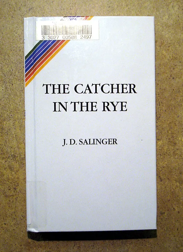
Salinger famously hated having his photograph on book covers, but his relationship with cover art was even more complicated than that. The first edition featured a simple maroon cloth binding with gold lettering and nothing else. No illustration. No imagery. Just text, because Salinger believed the reader’s imagination was the only illustration that mattered.
Later editions tried various approaches, from carousel horses to prep school crests, but Salinger fought most of them. He won some battles and lost others. The paperback editions from the sixties and seventies, which he had less control over, featured psychedelic designs and teenage rebellion imagery that completely missed the point of Holden’s authentic alienation.
The ongoing legal restrictions on cover designs mean that publishers still can’t use certain imagery or photographs. This creates a fascinating situation where one of the most influential American novels has no definitive visual identity beyond its title in whatever font the publisher chooses.
Beloved’s Haunting Simplicity


Toni Morrison’s masterpiece has had several cover designs, but the most powerful feature a simple house or a fragmented family photograph. The best ones use empty space and shadow to suggest the presence of ghosts, the weight of history that can’t be fully captured or contained.
One edition featured just a single photograph of a young girl, slightly out of focus and overexposed, as if she were fading from memory or struggling to be remembered. That ephemeral quality captured the novel’s exploration of trauma and remembrance better than any literal depiction could have.
The challenge with covering Beloved is honoring the brutality of the history it depicts without exploiting it or making it decorative. The strongest designs lean into abstraction and suggestion, trusting readers to bring their own emotional understanding to the visual cues.
Book covers remain one of the last truly tactile parts of our reading experience. Even as we scroll through digital catalogs and read on screens, that first impression still matters. The most beautiful covers don’t just sell books. They become part of how we remember and understand the stories themselves. Next time you pick up a book, take a moment to really look at what the designer tucked into that front panel. You might be surprised by what you’ve been missing. What’s the most memorable book cover you’ve ever seen? Tell us in the comments.