

Color is everywhere, and yet most of us never stop to think about how deeply it shapes our lives. From the moment we open our eyes in the morning to the products we buy, the spaces we inhabit, and the sports teams we cheer for, color is quietly running in the background, tugging at our emotions and steering our decisions. The study of these effects, known as color psychology, has fascinated researchers across disciplines, including psychology, marketing, design, and neuroscience. The science behind it is both richer and more nuanced than most people expect.
Color is a ubiquitous perceptual stimulus that is often considered in terms of aesthetics, but research that looks beyond aesthetics reveals a clear link between color and psychological functioning in humans. Studies clearly show that color can carry important meaning and have a significant impact on people’s affect, cognition, and behavior. Whether you realize it or not, the hues surrounding you are already at work.
Color and Emotion: What the Latest Research Tells Us
Color is an integral part of natural and constructed environments. For many, it also has aesthetic appeal, with some colors being more pleasant than others. Moreover, humans seem to systematically and reliably associate colors with emotions, such as yellow with joy, black with sadness, and light colors with positive while dark colors are linked to negative emotions. A landmark 2025 systematic review published in Psychonomic Bulletin & Review, covering 128 years of psychological research, confirmed just how consistent these associations are across the human experience.
Research summarized by Elliot indicates that red hues are associated with higher arousal, increased chroma and saturation correlates with heightened arousal, and blue and green hues are linked to lower arousal at the psychological level. High lightness is associated with emotions of high valence and low dominance, such as calm, awe, and gratitude, a phenomenon labeled the serenity effect, where these emotions involve low control over a situation but retain a positive valence. The more we learn, the clearer it becomes that color does not simply decorate our world – it structures how we feel within it.
Color in Marketing: The Numbers Behind the Choices
The significance of color in marketing stems from its ability to elicit specific psychological and physiological responses in viewers. Research indicates that consumers typically make initial judgments about products within 90 seconds of interaction, with 62 to 90 percent of that assessment based solely on color. That is a striking window of influence for something most shoppers are barely conscious of. Research further indicates that color can increase brand recognition by up to 80 percent, with this heightened recognition stemming from the emotional and psychological associations that colors invoke.
According to research, 85 percent of buyers say that color is the main factor in their decision to select one product over another, and 93 percent of consumers base their decision to buy new products on appearance. Just as the color red lends itself to sweet and green to sour, researchers have found that the use of red encouraged impulse buying while navy blue triggered a more thoughtful and budget-conscious purchase response. These findings carry enormous weight for anyone designing packaging, advertisements, or storefronts.
Warm vs. Cool Colors: Two Worlds, Two Different Minds

Warm colors such as red and orange are associated with energy, stimulation, and excitement, and they tend to enhance motivation and can be used in areas requiring activity or social interaction. Cool colors such as blue and green, by contrast, evoke calmness, relaxation, and emotional stability, making them ideal for settings that call for concentration or recovery. This distinction is not merely aesthetic preference; it reflects measurable physiological and emotional outcomes documented across multiple research traditions.
Key findings from 2024 research include enhanced understanding of how warm and cool colors elicit distinct emotional responses, insights from neuroimaging studies that demonstrate the brain’s processing of color stimuli, and applications in therapeutic settings that leverage color to regulate mood. A qualitative synthesis of 72 peer-reviewed studies published between 1990 and 2025 reveals that lighter colors, particularly blue, green, yellow, and white, tend to enhance mood, reduce stress, and promote physiological calmness. The takeaway is that getting the temperature of color right in any environment is far more than a stylistic call.
Color in the Workplace: Designing for Performance

Although the environmental color of a workspace is recognized as a critical factor influencing the psychological well-being of its occupants, empirical findings have remained inconsistent, prompting researchers to utilize immersive virtual reality to simulate controlled yet realistic workspace environments. Blue is one of the most popular colors used in offices today, regarded as an ideal color for boosting productivity and helping calm and soothe the mind. It is no coincidence that the world’s most trusted corporate brands, from technology giants to financial institutions, lean so heavily on shades of blue.
Studies from Human Spaces research show that workers in environments with more green elements are 6 percent more productive, 15 percent more creative, and report a 15 percent higher level of wellbeing. According to color psychology, oxblood – a dramatic, rich red-brown tone – evokes confidence, strength, and creativity, and a recent survey by Pantone indicates that 67 percent of designers are experimenting with richer, more dramatic colors in 2025, with oxblood being a key player in this shift. The modern office is increasingly a carefully calibrated emotional environment, not just a functional space.
Color, Culture, and the Limits of Universality

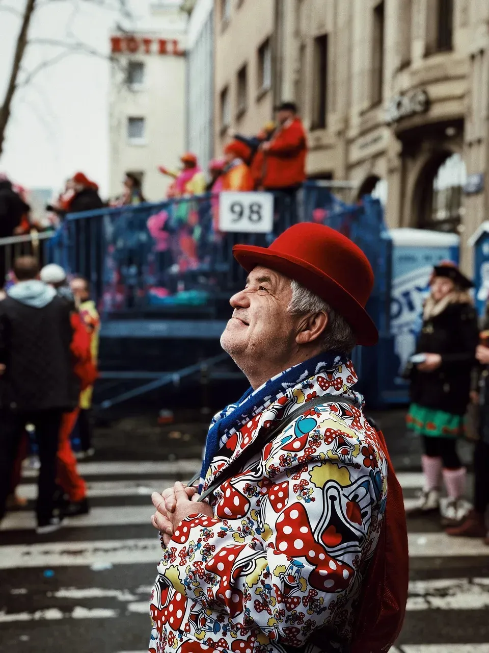
The way we perceive color is not universal – it is deeply influenced by cultural background, personal experiences, and societal traditions. What evokes happiness in one country might symbolize grief in another, which is why color psychology must be considered within the right context, especially in global marketing, branding, and design. White represents purity and weddings in Western cultures, yet in many East Asian countries it is the color of mourning and funerals. Red is often associated with love and passion in the West, while in China it symbolizes luck, prosperity, and celebration.
Analysis across demographic groups reveals significant variations in color preferences. Gender emerged as a particularly influential factor, with female respondents showing stronger preferences for purple and red compared to male respondents. Age cohorts also display distinct patterns, with younger consumers showing greater acceptance of vibrant, unconventional colors for traditionally conservative product categories. The truth is that color is too dependent on personal experiences to be universally translated to specific feelings, as research shows personal preferences, upbringings, cultural differences, and context all influence the effect individual colors have on us.
Color in Sports: Performance, Perception, and the Red Advantage

One of the most well-known examples in sports color research comes from Hill and Barton (2005), who investigated the number of competitions won in combat sports and found a significant advantage for red uniforms in comparison to blue. A notable study found that athletes wearing red in combat sports were more likely to win. The color red is often linked to dominance, aggression, and heightened arousal, which can give wearers a mental edge and even intimidate the competition. This research has since sparked a wave of investigation into how the colors athletes wear affect both themselves and those evaluating them.
Some studies comparing the effects of green and non-green exercise environments have found that green exercise improved psychological measures, such as mood, self-esteem, and vitality, as well as physiological markers such as blood pressure and heart rate variability. Blue, known for its calming and focus-enhancing properties, is ideal for precision-based sports such as swimming, archery, and golf, and also has cooling effects that make it a popular choice for outdoor sports, helping reduce stress, regulate breathing, and improve concentration. Color in competitive athletics, it turns out, is a dimension of strategy that extends well beyond the visual identity of a team.


