

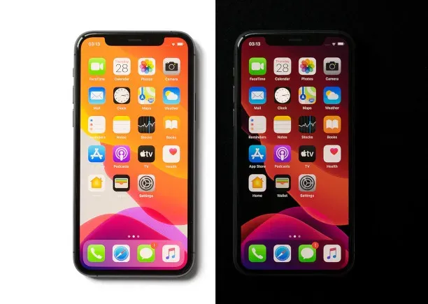
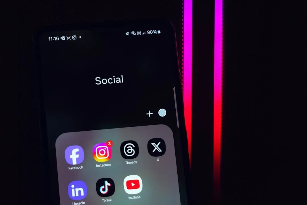
Ever notice how scrolling through your phone feels oddly… familiar? The blues, the whites, the occasional splash of orange or green. It’s not a coincidence. Open Instagram, then Twitter, then LinkedIn. Different apps, different purposes, but somehow they all feel like distant cousins at a family reunion. The color schemes repeat themselves in ways that seem almost too calculated to be accidental.
Here’s the thing: app designers aren’t lacking creativity. They’re following a playbook that’s been refined through millions of user interactions, psychological studies, and cold, hard data. The colors you see aren’t random aesthetic choices. They’re strategic decisions designed to keep you tapping, swiping, and coming back for more. Let’s dive into why your app drawer looks like it was designed by the same handful of people.
Blue Dominates Because Trust Sells
Walk through any casino floor in Las Vegas and you’ll notice something interesting about the branding outside versus the apps inside people’s phones. While the casinos themselves go wild with neon and chaos, the apps people use to book rooms, check reviews, or manage loyalty programs almost always lean heavily on blue.
Blue isn’t just popular by accident. Psychologically, it signals trustworthiness, security, and reliability. Facebook, Twitter, LinkedIn, Venmo, PayPal – they all bank on blue because they’re asking you to trust them with your personal information, your social connections, or your actual money. It’s the digital equivalent of a firm handshake and direct eye contact.
There’s also a practical reason. Blue is one of the easiest colors for the human eye to process for extended periods. It doesn’t create the visual fatigue that bright reds or intense yellows can trigger. When you want someone staring at your app for hours, blue becomes the obvious choice.
White Space Isn’t Empty, It’s Expensive
Minimalism took over app design like a slow-moving flood. Remember when websites and apps used to be packed with information, sidebars, and competing elements? Those days are long gone. Now everything floats in seas of white or light gray.
This isn’t just aesthetic trend-chasing. White space creates what designers call “breathing room” – it makes interfaces feel less overwhelming and helps users focus on what actually matters. In a city like Las Vegas, where sensory overload is literally the business model, apps do the opposite. They offer simplicity as a relief.
The tech giants set this standard, and smaller companies followed because users became conditioned to expect it. An app that doesn’t embrace generous white space now feels cluttered and outdated, even if it’s functionally identical to a “cleaner” competitor. It’s visual conformity driven by user expectations.
Red and Orange Are the Alarm Bells
Notice how notification badges are almost universally red? Or how “limited time offer” buttons tend toward orange or scarlet? There’s nothing subtle about this choice.
Red triggers urgency and demands attention in ways other colors simply can’t match. It’s the color of stop signs, fire trucks, and warning labels for a reason. App designers weaponize this psychological trigger to create fear of missing out. That little red bubble tells you something needs your immediate attention, whether it actually does or not.
Orange occupies similar territory but feels slightly less aggressive. It’s energetic without being alarming, which makes it perfect for call-to-action buttons. “Buy now,” “Subscribe,” “Get started” – these prompts often come in shades of orange because they need to stand out without triggering the same stress response as pure red.
Green Means Go, Growth, and Money
Cash apps love green for obvious reasons. Venmo, Cash App, Robinhood – they all incorporate green because the association with money is immediate and universal. But the psychology goes deeper than simple color association.
Green also signals growth, progress, and positive outcomes. When you see a green checkmark or a green screen confirming a transaction, your brain interprets it as success. This isn’t accidental. Designers are tapping into decades of conditioning where green means “proceed” and “correct.”
Health and wellness apps exploit the same principle. Green suggests natural, organic, and healthy. Fitness trackers, meditation apps, and nutrition guides frequently use various shades of green to subconsciously reinforce their health-focused mission.
Black Equals Premium and Exclusive
Luxury brands discovered long ago that black communicates sophistication and exclusivity. The same principle applies in app design, though it’s used more sparingly.
Apps targeting premium users or offering high-end services often incorporate black into their color schemes. Think of apps for luxury hotels, high-end fashion retailers, or exclusive membership services. The color choice immediately signals “this isn’t for everyone,” which paradoxically makes more people want access.
Dark mode took this concept mainstream. What started as an accessibility feature became a status symbol of sorts. Apps that offer dark mode are perceived as more sophisticated and user-friendly, even though the actual functional benefits are relatively modest for most users.
Yellow Grabs Attention but Wears Out Welcome

Yellow is the attention-seeker of the color spectrum. It’s bright, impossible to ignore, and psychologically associated with optimism and energy. Snapchat built its entire brand identity around it.
But here’s the catch: yellow is exhausting. Use it too liberally and users start feeling visually fatigued. It works brilliantly as an accent color or for brands targeting younger demographics who want that energetic vibe. For apps requiring sustained engagement or serious transactions, yellow becomes a liability.
Food delivery apps sometimes incorporate yellow because it supposedly stimulates appetite and creates a sense of speed and efficiency. Whether that’s actual psychology or clever marketing folklore is hard to say for sure, but the pattern persists across multiple platforms.
Conclusion: Familiarity Breeds Engagement, Not Boredom
The sameness of app color schemes isn’t a failure of imagination. It’s the predictable outcome of psychology, accessibility requirements, cultural considerations, data optimization, and platform standards all pushing in the same direction. Apps look similar because similar works.
What seems boring from a design perspective actually serves users well in most cases. Familiar color patterns mean less cognitive load, faster learning curves, and more intuitive navigation. When you open a new app and immediately understand what the blue buttons versus red badges mean, that’s not accident – it’s the system working as intended.
The next time you’re tapping through apps on the Vegas strip – booking a show, checking restaurant reviews, or just killing time between hands at the poker table – pay attention to those colors. They’re not random, and they’re not coincidental. They’re a carefully orchestrated symphony of psychology and pragmatism, all designed to keep you engaged and scrolling. What do you think – does the similarity bother you, or does it actually make your digital life easier?


