


Album art is supposed to set a mood, tease a sound, maybe raise an eyebrow. It is not supposed to become a historical document. Yet every so often a cover slips past its own moment and lines up with something that happens later, sometimes days later, sometimes years later, in ways that feel too specific to be coincidence and too strange to be anything else. What follows are seven covers where the image on the sleeve ended up saying more than the artist ever intended. Some are eerie because of timing. Others are eerie because they guessed at a future that hadn’t arrived yet. Either way, they’re worth a second look.
1. The Coup – Party Music (2001)
Oakland hip hop duo The Coup shot the original cover for their album Party Music in the spring of 2001, months before anyone was thinking about airplanes and skyscrapers in the way the world would that September. The original cover of the album, created in June 2001, depicted Boots Riley and Pam the Funkstress destroying the twin towers of the World Trade Center using what appeared to be a detonator. The prop in Riley’s hand was not a weapon at all.
The apparent detonator was actually an electronic tuner. The intended message was about capitalism, not catastrophe, but that distinction did not survive contact with reality. The album was originally scheduled for release in September of that year, but after the September 11 attacks, during which the Twin Towers were destroyed in real life, the band decided to postpone the album’s release until November, so they could create a new cover art. A promo run had already gone out with the original image, which is why a handful of copies with the twin towers artwork still circulate among collectors today.
2. The Notorious B.I.G. – Life After Death (1997)
Few covers in music history read as unsettling in hindsight as this one. The photograph shows Biggie Smalls in a long coat and bowler hat, leaning against a hearse with a license plate that spells out his initials. It was staged as theater, a bit of gallows humor from an artist known for leaning into danger rather than away from it.
Then the joke stopped being a joke. The second album released by The Notorious B.I.G. came out only around two weeks after he was murdered. A double album, it was released sixteen days after his murder. The title, the hearse, the funeral imagery, none of it was meant literally when the photo was taken, but the album arrived in record stores as something closer to a eulogy than a release.
3. David Bowie – Blackstar (2016)
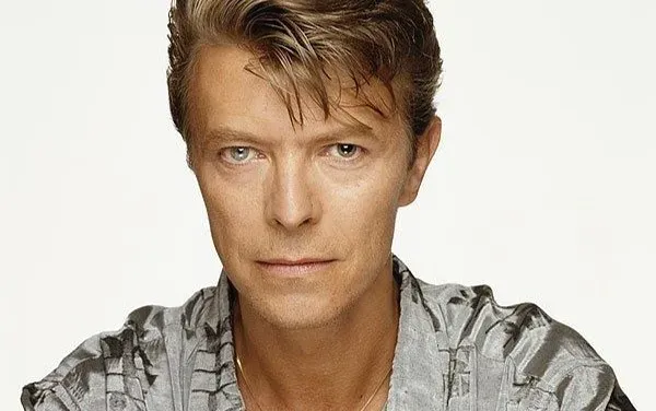
David Bowie spent his final eighteen months working in near total secrecy, and the cover of Blackstar was part of that secrecy. Designer Jonathan Barnbrook chose a single black star symbol instead of the album’s title, a decision that read as minimalist and cryptic at the time. Barnbrook explained that the Blackstar symbol has a sort of finality and darkness, and that ideas like a black hole sucking in everything relate to mortality.
What almost nobody outside Bowie’s inner circle knew was that he was dying of liver cancer as the artwork came together. Blackstar, Bowie’s twenty fifth studio album, was released on the star’s 69th birthday on January 8, and two days before his death on January 10. The Guardian has pointed out that black star is also a term used for cancer lesions, a detail that turned the cover from an abstract design choice into something closer to a private confession, decoded only after the fact.
4. 2Pac – The Don Killuminati: The 7 Day Theory (1996)
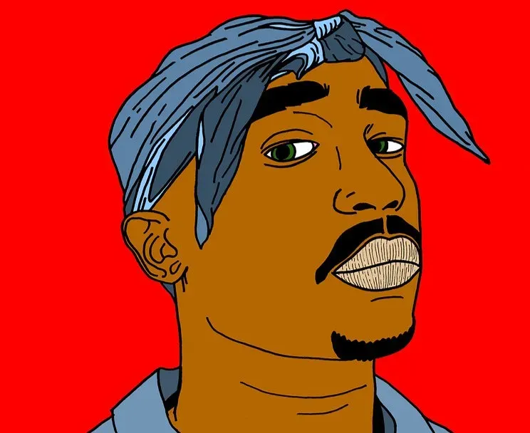
Released under the alias Makaveli, this album’s cover shows Tupac Shakur nailed to a wooden cross, wearing only a loincloth, with a map of gang territories sketched behind him. It was recorded in a handful of days and released about two months after Shakur was shot and killed in Las Vegas in September 1996. The crucifixion imagery, meant as a statement about martyrdom and persecution, took on a very different weight once the artist behind it was already gone.
The record’s fascination with betrayal, death, and resurrection fed years of conspiracy theories claiming Shakur had faked his own death, theories that the cover art did nothing to discourage. Whatever the intent behind the imagery, the timing turned a provocative artistic statement into something that felt, to many fans, like a message from beyond the grave.
Partner offer
5. Kraftwerk – Computer World (1981)
Long before anyone carried a computer in their pocket, the German electronic pioneers put four calculator style portraits of themselves on the cover of Computer World, rendered in the flat, glowing style of an early computer display. The album’s lyrics touched on data flowing between countries, interest rates calculated by machine, and the quiet creep of computing into daily life. It sounded like science fiction to most listeners in 1981.
Four decades on, the album reads less like speculation and more like a rough sketch of the data driven world that eventually arrived, right down to its interest in personal information moving invisibly across borders. Kraftwerk were not trying to forecast anything specific, but their instinct that computers would reshape ordinary life, not just laboratories and offices, turned out to be exactly right.
6. Radiohead – OK Computer (1997)
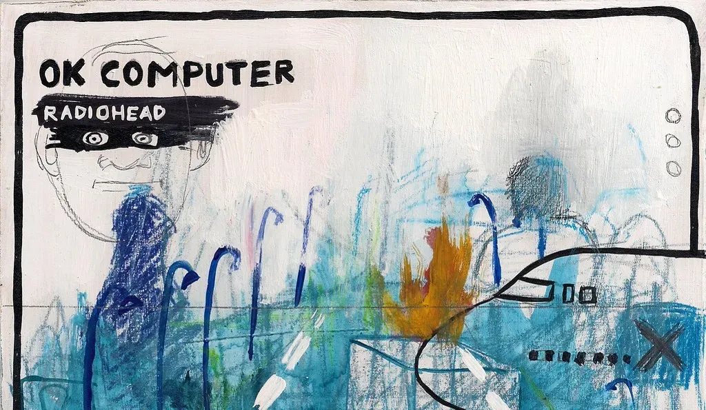
Stanley Donwood’s artwork for OK Computer looks like a road map that has been left out in the rain, all faded lines, half legible text, and a sense of systems quietly failing. It paired with an album that worried openly about technology flattening human connection, long before smartphones or social media existed to make that worry concrete. At the time, critics mostly read it as a comment on late nineties consumer anxiety.
Listened to today, the album’s themes of information overload, surveillance, and a kind of low grade digital dread feel closer to a description of daily life than a piece of nineties pop culture. The cover’s tangled, glitchy aesthetic anticipated the visual language that would later define internet era design, screens full of broken grids and corrupted text. It is one of the rare covers that aged into relevance rather than out of it.
7. Gorillaz – Demon Days (2005)
Jamie Hewlett’s artwork for Demon Days put four cartoon characters front and center, a virtual band standing in for the real musicians and producers working behind the scenes. At the time, this was treated mostly as a clever gimmick, a way for Damon Albarn to experiment outside the shadow of Blur. Few people framed it as anything more than an art project with a good soundtrack.
Twenty years later, digital avatars, virtual influencers, and animated personas built around real musicians and producers are a normal part of the entertainment landscape. Gorillaz did not invent the idea of a virtual persona, but Demon Days helped prove that audiences would fully invest in one, emotionally and commercially, rather than treating it as a novelty. The cover’s cast of cartoon characters ended up looking less like a gimmick and more like an early draft of how a lot of pop culture would eventually work.
Taken together, these seven covers are a reminder that album art is rarely just decoration. Sometimes it is a mood board for a future nobody involved could have actually foreseen, and sometimes it is simply a strange trick of timing that only looks meaningful in hindsight. Either way, each one has earned its place as more than just a sleeve wrapped around a record.Partner offer
Planning a trip to Vegas?
Compare hotel rates and show tickets on VEGAS.com.