Pick up the same novel in London, New York, and Berlin, and you might not recognize it as the same book at all. The title might even change, along with the color palette, the typography, and sometimes the entire mood of the artwork. This isn’t an accident or an oversight. It’s the result of a deliberate, often lengthy process that publishers go through every time a book crosses a border.
The rights sale is where it all begins


Before a foreign cover ever gets sketched, a publishing house in another country has to acquire the rights to release the book in its market. Once that deal is signed, the book effectively starts a new life inside that publisher’s own editorial and design departments. The book goes through the editing, marketing, and design departments of that house, where it is reshaped to suit that house’s specific audience.
This means the original cover, no matter how successful it was at home, doesn’t automatically travel with the text. A German publisher, a Brazilian publisher, and a South Korean publisher will each treat the manuscript as a fresh project. They are not obligated to reuse anything from the source edition unless they choose to.
Market taste really is different from country to country


One of the most consistent explanations that designers and editors give is simply that readers in different places respond to different visual cues. There are different covers for different countries because market tastes differ, and this seems to be the biggest reason. A cover that reads as sophisticated in one country might read as flat or uninteresting in another.
This isn’t guesswork on the publisher’s part. Sales and design teams track which kinds of imagery, fonts, and color schemes have historically performed well in their market, then apply those lessons to new titles. A cover for a thriller in Scandinavia might lean into muted, moody tones, while the same book in the United States could get a bolder, more graphic treatment.
The US and UK divide is the clearest example


Even between two English speaking countries that share a language, covers diverge constantly. Tastes in book covers differ notably in the U.S. and the U.K., with British covers often deferring to darker colors or more negative space, while American covers tend to be flashier. That single observation explains a huge number of side by side comparisons readers have posted online over the years.
Part of this comes down to how each market is structured. A New York based book designer named Megan Wilson has noted that UK covers often feel more sophisticated and willing to take risks, possibly because the market is smaller compared to the broader audience US publishers are trying to reach. A narrower, more literary minded UK market can support a subtler cover in a way a mass market US release sometimes cannot.
Genre conventions still have to be respected everywhere


Regardless of country, a cover has a basic job: signal the genre instantly. Many conventions have emerged to highlight certain genres, such as an old photograph that promises a memoir, or an image of a shirtless, muscular man that promises a romance novel. Those visual shorthand cues exist in almost every publishing market, even if the specific execution changes.
A thriller in France still needs to look like a thriller to French readers browsing a shelf, just as a thriller in Poland needs to look like a thriller to Polish readers. Publishers create jackets that fit within a genre specific space, and even a single thriller can end up with multiple covers across the world that all read as thriller while being changed to fit the country they’re sold in. The genre signal stays constant even as the specific imagery shifts.
Harry Potter shows the extremes of localization


No book series illustrates this pattern more visibly than Harry Potter, which has been reissued with wildly different artwork depending on where it’s sold. Bloomsbury, the British publisher, created both adult and children’s covers, with the adult edition depicting an object or place central to the plot while the children’s version features a major event from the book. Meanwhile the original American covers took a different visual approach entirely.
The original covers by American publisher Scholastic usually depict an amalgam of objects and people from the book against a common backdrop, a noticeably different strategy than the UK’s scene based approach. Beyond the English language editions, illustrators around the world have taken their own approach entirely. The Swedish language covers, designed by Alvaro Tapia, are considered among the most gorgeous cover artwork of any international translation of the series.
Sometimes even the title itself gets changed
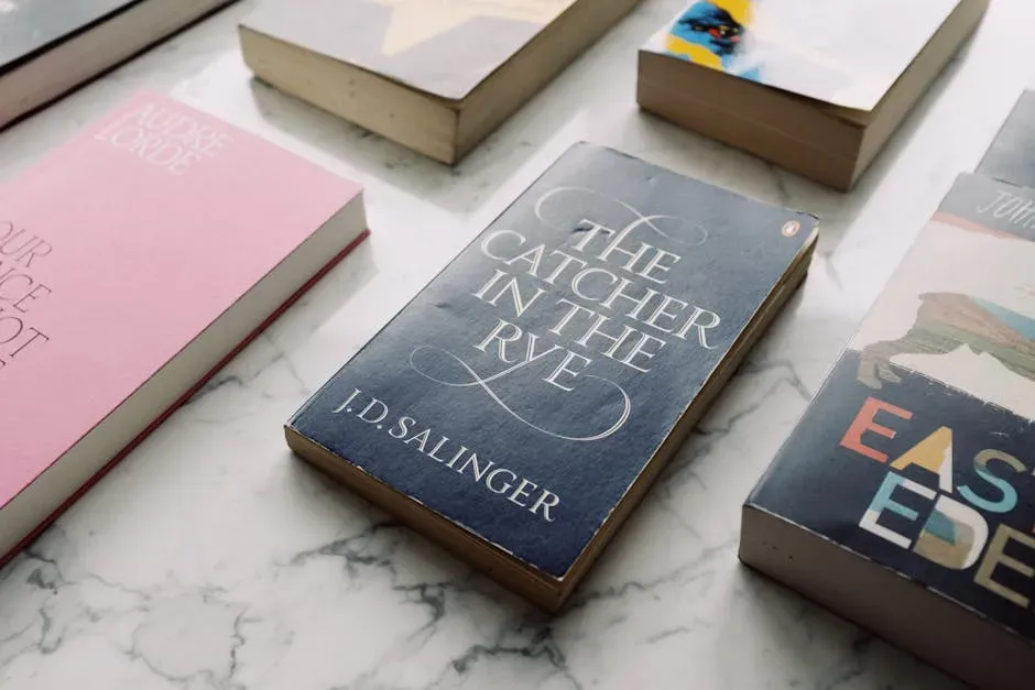
Cover art isn’t the only thing that shifts across borders. Occasionally the title changes too, which then reshapes what the cover even needs to communicate. Unlike music and movies, which generally have the same appearance globally, book jackets and sometimes titles change from country to country.
Partner offer

The most famous case remains the first Harry Potter novel, released in the UK as Harry Potter and the Philosopher’s Stone but retitled for the American market. In the United States the book was released as Harry Potter and the Sorcerer’s Stone, with British covers depicting a major event in the book while American covers depicted a series of objects and a person. A title change like that essentially forces a fresh cover concept, since the two titles emphasize different ideas entirely.
Budgets and internal structures shape the outcome too


It’s tempting to assume every publishing decision is purely artistic, but money and internal company structure play a real role. Despite most of the major publishers having international arms, their marketing and design budgets for covers may differ drastically from one division to another. A bigger budget can mean more design rounds, more testing, and ultimately a more polished final product.
Cover design also isn’t a solo task handled by one illustrator locked in a room. Creating cover art can be an immense effort, taking collaboration between designers, editors, marketing, sales, and production teams. Multiply that collaborative process across a dozen countries, each with its own internal teams and timelines, and it becomes clear why covers end up looking so different by the time they reach shelves.
Licensing an existing cover is sometimes the simpler choice

Not every foreign edition starts from a blank page. In some cases, a foreign publisher decides the original cover already works well enough that it’s worth paying to use it rather than commissioning something new. When a cover becomes iconic, many international publishers will acquire the same cover for their edition, since UK publishers hold the cover rights and license them for a fee, meaning a foreign publisher must buy the rights to use it.
This tends to happen with covers that have already proven themselves commercially or become recognizable symbols of the book itself. It’s a practical shortcut. Rather than spending money and time developing an entirely new concept, a publisher can license a design that already has visual equity attached to it, provided it seems likely to resonate with local readers too.
Social media has added a new layer of pressure


Cover design used to be judged almost entirely by in store browsing and critical reviews. That’s no longer the full picture. Noticing differences between editions isn’t exactly a new phenomenon, but one that could likely be credited to the rise of social media, when posting bookshelves on platforms became a way to attract fellow book lovers.
This visibility cuts both ways for publishers. A striking regional cover can go viral and drive sales well beyond its original market, but a poorly received redesign can attract just as much attention for the wrong reasons. Readers now compare international editions side by side constantly, which puts extra scrutiny on every cover decision a publisher makes, whether they intended that scrutiny or not.
Illustrators are chosen deliberately for each region

Rather than assigning a single global illustrator, publishers frequently hand different regional editions to artists who understand that specific market’s visual language. The Harry Potter series again offers a clear window into this. All seven French covers were done by artist Jean-Claude Götting, who was initially asked to paint only the front covers for the first three books before the publisher asked him to create full images starting with Goblet of Fire.
Within the UK itself, different artists handled different books in sequence rather than one illustrator working across the whole series. There wasn’t a single artist responsible for doing all seven books, with Philosopher’s Stone done by Thomas Taylor, who also created the well known pipe smoking wizard found on early editions. This rotation of artists, both within a single country and across different countries, is part of why the visual identity of the same book can vary so dramatically depending on where and when it was printed.
The final takeaway


A book cover is never just decoration. It’s a market specific translation of everything the story is trying to promise a reader, built by teams who understand that promise sounds different depending on where you’re standing. The next time you notice a friend’s foreign edition of a book you love looks nothing like your own copy, it isn’t a coincidence or a mistake. It’s a publisher doing exactly what publishers have quietly done for decades: reading the room, one country at a time.
Partner offer
Planning a trip to Vegas?
Compare hotel rates and show tickets on VEGAS.com.