

There’s something almost primal about staring at an album cover and feeling like you’re being let in on a secret. Musicians have always known this. The artwork isn’t just packaging – it’s a second language. Some bands whisper through it, some shout backward in it, and some hide things so deep inside it that fans are still digging years later. Honestly, a few of these discoveries are so wild they almost feel like urban legends. Almost.
From cryptic funeral symbols to messages you can only see under a blacklight, the world of hidden album artwork is stranger, richer, and more intentional than most listeners ever realize. So let’s get into it.
1. The Beatles – Abbey Road (1969): The Funeral That Never Was
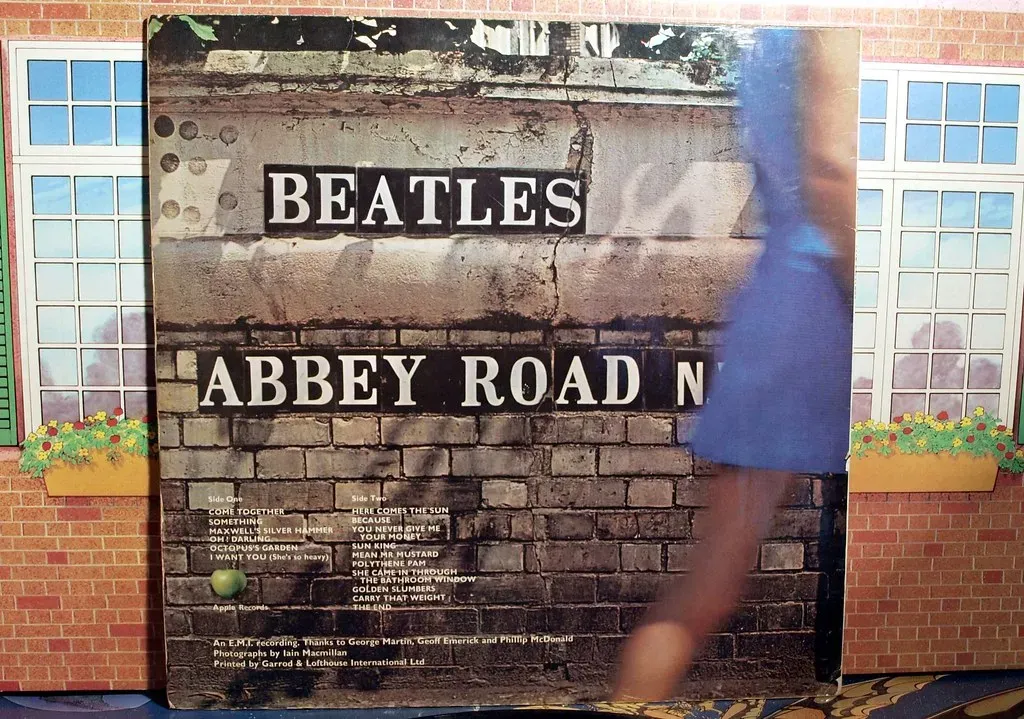
Released in 1969, the Abbey Road cover features John Lennon, Paul McCartney, George Harrison, and Ringo Starr strolling across a zebra crossing outside Abbey Road Studios. Simple, right? Far from it. Shortly after the album’s release, the cover became part of the “Paul is dead” conspiracy theory that was spreading across college campuses in the US. According to followers of the rumour, the cover depicted the Beatles walking out of a cemetery in a funeral procession, led by Lennon dressed in white as a religious figure; Starr was dressed in black as the undertaker; McCartney, out of step with the others, was a barefoot corpse; and Harrison dressed in denim was the gravedigger.
Behind the band, a Volkswagen Beetle displays the license plate “28IF.” This became one of the most famous clues in the conspiracy theory, as fans claimed it meant Paul would have been 28 years old “if” he were alive. Although inaccurate in reality, it remains one of the most iconic hidden messages in album covers. For the only time in their career, The Beatles presented the world with an album cover that didn’t feature their name, or the title of the LP at all. Designer John Kosh argued: “The biggest band in the world, you don’t have to say who they are – everyone knows who they are.”
2. The Beatles – Sgt. Pepper’s Lonely Hearts Club Band (1967): A Wink at the Rivals

The cover of “Sgt. Pepper’s Lonely Hearts Club Band” is more than a vibrant collage – it’s a cryptic puzzle that has fueled speculation for decades. On the famous cover, photographer Michael Cooper gave a namecheck to the band’s biggest “pop rivals,” with a doll wearing a fan-made sweatshirt that said “Welcome The Rolling Stones.” It was a quiet, playful gesture buried in plain sight among over seventy other figures.
This iconic cover from 1967 is filled with a crowd of famous figures, but many fans miss the deeper symbolism behind the placement of certain individuals. The presence of Indian spiritual leaders nods to the band’s growing interest in Eastern philosophy. Some have also speculated that Paul McCartney’s black flower signals the infamous “Paul is dead” conspiracy. The Fab Four were layering meaning into their sleeve art long before anyone else had even thought to try.
3. The Rolling Stones – Their Satanic Majesties Request (1967): The Beatles Hidden in the Crowd

The Rolling Stones dove headfirst into psychedelia with the 3D lenticular cover of “Their Satanic Majesties Request.” At first glance, it’s a swirl of colors and costumes, but look closer and you’ll spot the faces of The Beatles cleverly hidden among the crowd. This was more than an Easter egg – it was a cheeky nod to the so-called rivalry between the two biggest bands of the era. Honestly, it’s one of the most bold and deliberate gestures in all of rock history.
The Stones’ effort was a deliberate move and featured a subliminal message that showed their admiration for the pioneering Merseysiders. Closer inspection of the Their Satanic Majesties Request artwork shows a significant amount of psychedelic imagery which, as some rock historians have suggested, is the reason that The Beatles reference often goes unnoticed. Photographer Michael Cooper was the mastermind behind the artwork, and in 2018, his son Adam spoke about the design in an interview – finally addressing why The Beatles were featured.
4. David Bowie – Blackstar (2016): A Final Goodbye Coded in Light

When David Bowie released his swan song, Blackstar, two days before his death, it became clear to fans that he used his music as a vessel to usher him from one plane to another – and he used the packaging of his final album to convey a poignant message about mortality. Bowie’s forward-thinking final album uses fragmented stars to spell out his name at the bottom. Even more impressively, the star glows blue when you hold it under ultraviolet light and the inner gatefold sleeve shows up stars when you expose it to sunlight.
Fans found that the font used on the record’s back cover comes from a design suite called Lazarus – like the Blackstar track and musical Bowie wrote before he died – and is itself called Terminal. The assumption here is that the musician was making an oblique reference to the terminal liver cancer that would eventually claim his life. Designer Jonathan Barnbrook, who helmed the art for every Bowie album since 2002’s Heathen, confirmed in an interview with BBC Radio 6 that the artwork held mysteries waiting to be discovered. Even years later, fans are still uncovering new layers. Few artists have ever said goodbye quite like this.
5. Iron Maiden – Somewhere in Time (1986): A Whole City of Secrets

Certified platinum, Somewhere in Time is Iron Maiden’s sixth studio album released September 9th, 1986. Painted by longtime Maiden artist Derek Riggs, the futuristic cyberpunk-inspired cover is as much a celebration of the band’s legacy as it is a playground of hidden references. Fans have spent decades decoding the Easter eggs Riggs slipped into the neon-lit cityscape, many of which are nods to Iron Maiden’s own history and to pop culture at large.
Artist Derek Riggs spent weeks on the 32-inch by 15-inch painting. “It wore me out quite severely,” Riggs revealed. “I was living in London at the time, and working on that for two months, and it took three months in all – I just had to stop, because I had had enough. It got into my head and I just couldn’t see anything else. I couldn’t think about anything else.” Behind Eddie’s right leg, in the window of a hotel, there’s a sign that reads in mirror “This is a very boring painting.” The soccer score shown is “West Ham 7…Arsenal 3” – bassist Steve Harris is a big fan of West Ham United Football Club. There are at least 32 confirmed hidden references in the artwork.
6. The Velvet Underground – White Light/White Heat (1968): The Invisible Skull
The original artwork to the 1968 album White Light/White Heat appears to be pure black, but if you look closely you can see a very faint image of a skull tattoo on a disembodied shoulder. That’s it. That’s the whole cover. Most people who owned the original vinyl had absolutely no idea it was even there, which is somehow more unsettling than if they had.
The tattoo belonged to the actor Joe Spencer, who was one of Andy Warhol’s “discoveries” – and it’s thought the black-on-black design was a Warhol idea. The image is much clearer on the 2013 “deluxe edition.” The hidden message in LP art has a long and dignified history in rock, and David Bowie was known to be a huge Velvet Underground fan – the shenanigans surrounding the artwork to his final album Blackstar have been seen as a subtle homage to this classic VU album. It’s a rare case where the invisible is the message.
7. Tool – 10,000 Days (2006): You Need Special Glasses to See It

The compact disc packaging for 10,000 Days consists of a thick cardboard-bound booklet partly covered by a flap holding a pair of stereoscopic eyeglasses, which can be used to view a series of images inside. Viewed with the glasses, the artwork produces an illusion of depth and three-dimensionality. This isn’t a gimmick – it’s a fully intentional invitation to look deeper, literally and figuratively.
Alex Grey, who created a majority of the album art for Lateralus and its accompanying video “Parabola,” reprised his role for 10,000 Days. The CD face itself is decorated with stylized eyes, arranged in a seemingly logarithmic spiral toward the center, adapted from a previous Alex Grey painting called “Collective Vision.” The artwork’s intricate, fractal-like designs echo the complex rhythms and layered sounds Tool is known for. By requiring physical engagement, the band challenges fans to look beyond the obvious, both visually and musically. I think it’s one of the most genuinely inventive album packaging ideas in modern music history.
8. New Order – Power, Corruption & Lies (1983): A Decoder Ring Hidden in Plain Sight

On the back cover of New Order’s Power, Corruption and Lies, there is a wheel design made up of various coloured sections. The outer two rings of this design form a “decoder ring” to decipher messages hidden elsewhere on the cover. This code is also used on the 12-inch singles for “Blue Monday” and “Confusion,” and on New Order’s official website.
The hidden content wasn’t anything earth-shattering – the album title and band members’ names – but that was okay, because fans had the satisfaction of knowing that they cracked the code. There was a secret interaction between themselves and the band, and they knew something that someone glancing at the album cover in a record store didn’t know. It’s a small thing, perhaps. Still, there’s something deeply satisfying about a band that treats its own sleeve like a puzzle waiting to be solved.
9. Radiohead – In Rainbows (2007): The Number That Connects Everything
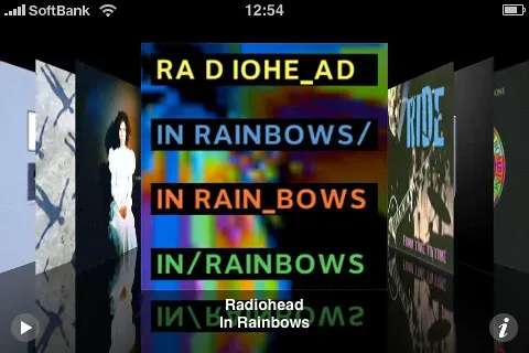
Radiohead fans are a dedicated bunch, so it’s no surprise the band opted to stuff this album with Easter eggs for them to feast on. The “I” and “O” in Radiohead are here designed to look like a 10, the number of letters in the words “In Rainbows.” It sounds minor until you follow the rabbit hole deeper.
Radiohead’s In Rainbows came out on 10/10/2007, 10 years after OK Computer, and there are 10 letters in the names of both albums. Additionally, OK Computer’s original working title was Zeroes and Ones, or “01” – the mirror image of “10.” Radiohead themselves announced In Rainbows only 10 days before it came out, which is rather unusual, and the announcement was followed by a series of 10 cryptic messages posted by the band on their website. Coincidence? The band has never confirmed nor denied a word of it, which is very on-brand.
10. Paul McCartney – Ram (1971): A Love Letter in the Liner Notes

Not long after the “Paul Is Dead” rumour that gripped hippies in the US in 1969, McCartney left a real hidden message on the cover of his 1971 album, Ram. L.I.L.Y. stands for “Linda I Love You.” After years of wild conspiracy theories and fake funeral symbols being read into his every move, McCartney decided to bury something genuinely personal inside his artwork instead.
Not long after the stupidly daft “Paul Is Dead” rumour that gripped hippies in the US in 1969, McCartney left a real hidden message on the cover of his 1971 album, Ram. It’s touching, really – a man who had been dissected and analyzed by conspiracy theorists for years quietly using the same space to say something honest and human. This tradition of hiding messages in liner notes has persisted across generations, with artists like Taylor Swift hiding messages in her liner notes since her 2010 sophomore release Speak Now. Even as physical media drifts away, music artists of all genres like to hide messages and images in their releases.
Conclusion: The Art of the Hidden Message

There’s something genuinely thrilling about the idea that a band could leave you a secret inside something you already own. It rewards curiosity, patience, and the kind of obsessive fan devotion that makes music culture so rich in the first place.
From Warhol’s nearly invisible skull to Bowie’s light-reactive farewell, these hidden details remind us that great albums are never just about the music. There’s a long tradition of artists using their album art to convey hidden messages, Easter eggs for diehard fans to pick up on. The sleeve is part of the story too, and sometimes the most important part.
What’s your favorite hidden message in album artwork – one you discovered yourself, or one that still blows your mind? Drop it in the comments.


