Most of us watch a film once, catch the plot, and move on. But some directors treat the edges of the frame as their own private canvas, stitching in clues, jokes, and thematic echoes that only reveal themselves on a second or third pass. These details rarely change what happens on screen, yet they deepen why it happens, turning a single viewing into an ongoing archaeological dig. What follows is a gallery of ten films where the production design, set dressing, or visual composition quietly carries its own narrative alongside the main one. Some of these choices were confirmed by the filmmakers themselves, others have been pieced together by obsessive fans over years of frame by frame viewing.
1. Fight Club (1999)

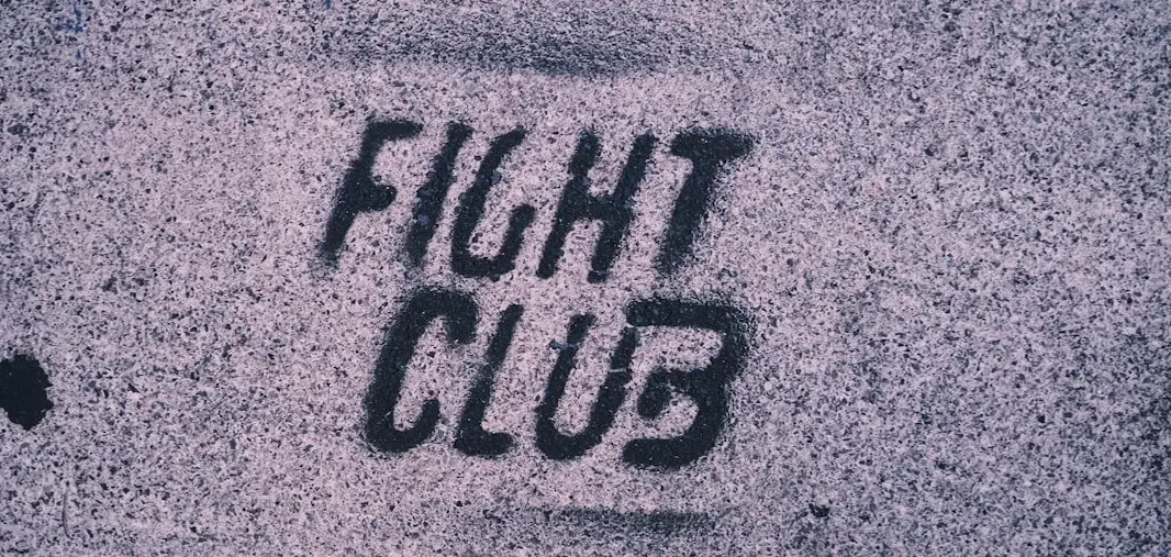
David Fincher’s adaptation of Chuck Palahniuk’s novel hides its biggest twist in plain sight before it ever gets explained. One of the most well-known Fight Club easter eggs is the single-frame Tyler Durden appearances that foreshadow the infamous fake-person twist, with four Tyler Durden blips in total, all of which happen before Tyler and the Narrator have their first conversation. These flickers last a fraction of a second, easy to miss unless you already know the ending.
Just as deliberate is the film’s obsession with a certain coffee chain. While no official count exists, Starbucks cups appear in nearly every scene of the film, making them one of cinema’s most pervasive Easter eggs. The cups symbolize the inescapable nature of corporate consumer culture, the very thing Tyler Durden fights against always present in the background, often unnoticed. The one place Fincher couldn’t touch the brand: Starbucks drew the line at having their storefront destroyed in the film’s finale, when buildings explode across the city skyline, so a generic coffee shop facade was used instead.
2. Parasite (2019)

Bong Joon-ho has openly described his own film as a staircase movie, and the description is not an exaggeration. The Parks live highest, in a colony on top of a slope, the Kims in a typical semi-basement apartment reached through staircases, and Moon-gwang the lowest of them all, in a secret underground space, again marked by staircases. Every level a character occupies in the frame maps directly onto their place in the social order.
The production design team built this vertical logic from scratch rather than relying on found locations. While filming Parasite, Bong called the project a staircase movie, using verticality as the overall motif that runs through the entire film, creating both the Parks’ and Kims’ homes from scratch built on outdoor lots. Even the furniture reinforces the theme, since the intentional design of the rich family’s coffee table is like an infinity strip, reflecting how the staircases in the film circulate.
3. Se7en (1995)


Fincher’s serial killer thriller loads its sets with visual rot long before the plot catches up to it. Detective Somerset’s apartment is spare and orderly, a visual shorthand for a man trying to control a world he finds increasingly unmanageable, while Mills and Tracy’s home is cluttered with unpacked boxes, hinting at a marriage and a move that never quite settled. The killer’s own lair, glimpsed only briefly, is lined with journals and religious ephemera that suggest a mind organizing chaos into a private, twisted liturgy.
Weather and lighting do their own storytelling here too. The film was shot to rain almost constantly outside, then goes dry and sun bleached for the desert finale, a shift audiences feel before they can articulate why the final act feels so exposed and inescapable compared to the murky city scenes before it. Nothing about this is spelled out in dialogue, yet it shapes how dread accumulates scene by scene.
4. Blade Runner 2049 (2017)

Denis Villeneuve’s sequel fills its Los Angeles with advertising holograms, corporate logos, and decayed infrastructure that tell you everything about who runs this world and who has been left behind. Wallace Corporation’s monolithic architecture dwarfs the human figures who move through it, while the ruins of Las Vegas and the orphanage sequence show what happens to spaces and people once profit moves elsewhere. The production design leans on scale itself as commentary, contrasting tiny human silhouettes against enormous structures to make a point about power that no line of dialogue needs to state.
Even small props carry weight. K’s apartment contains sparse, functional furniture that mirrors his uncertain status as a replicant trying to build an identity from very little, while Joi’s holographic advertisements plastered across the city reduce companionship itself to a purchasable product. The film trusts its audience to read economic and emotional stratification directly off the walls.
5. WALL-E (2008)

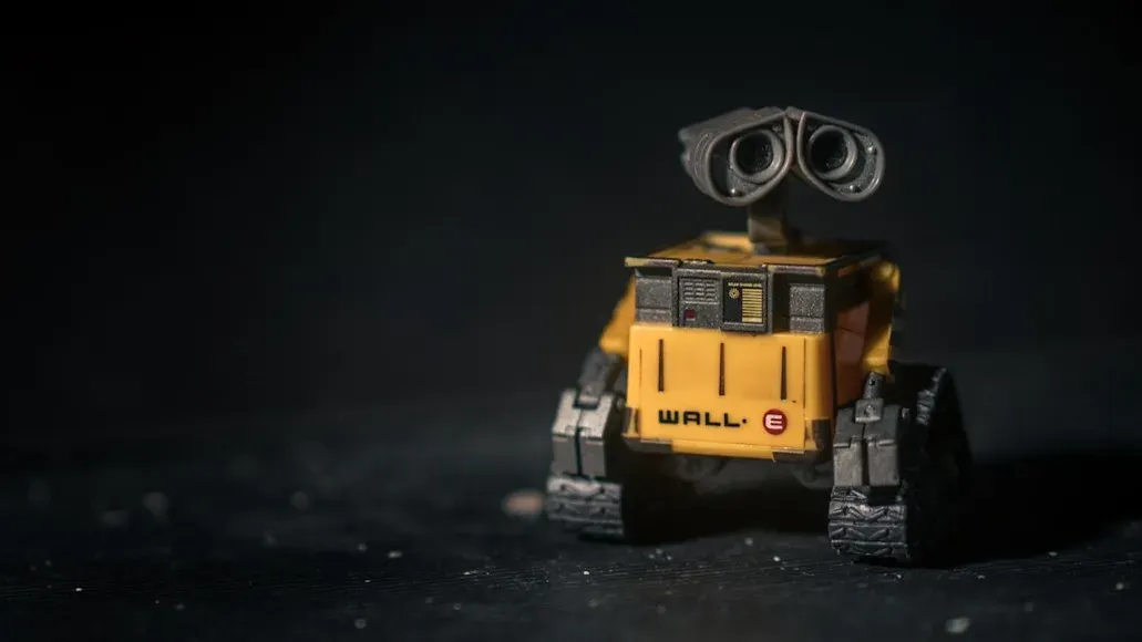
Pixar’s environmental fable does an enormous amount of storytelling before a single word of dialogue is spoken. The abandoned Earth is littered with recognizable corporate detritus, mountains of compacted trash arranged into skyscraper-like towers, a visual joke and a warning rolled into one. Every billboard and storefront still standing advertises the same mega corporation, suggesting a monoculture that consumed the planet’s resources long before it consumed its imagination. Aboard the Axiom, the humans’ physical degeneration into immobile, screen dependent blobs is reinforced by the ship’s background details, endless automated conveniences, floating chairs, and personalized advertisements that anticipate every desire before it forms. The contrast between WALL-E’s cluttered, personal collection of human artifacts and the sterile uniformity of the Axiom’s interiors makes the film’s argument about consumption versus genuine connection almost entirely through set dressing.
6. Inside Out (2015)


Pixar’s trip through an eleven year old’s mind uses background architecture to chart her emotional development in ways a young audience absorbs without necessarily naming. Headquarters, the control room for Riley’s emotions, subtly shifts in color palette and clutter as the story progresses, mirroring her growing internal turmoil. The Memory Dump, where forgotten memories fade into gray abstraction, visually distinguishes cherished long term memories from disposable ones through lighting and color saturation alone.
The islands of personality that anchor Riley’s core sense of self are each built with distinct architectural styles reflecting Family, Friendship, Hockey, Honesty, and Goofball, and their gradual crumbling during the family’s move gives the abstract concept of an identity crisis a literal, visible collapse. When Riley’s imagination land and the abstract thought chamber begin to fail, the increasingly bizarre visual logic of those places tracks her rising instability just as clearly as the script does.
7. Get Out (2017)

Jordan Peele’s horror debut plants racial commentary in nearly every prop and wall hanging inside the Armitage family home. The house is decorated with taxidermied animals and antique furnishings that suggest a family preserving and displaying things, a visual rhyme with the film’s eventual revelation about what the family actually does to the Black characters who pass through their orbit. Family photographs and portraits scattered through the house hint at a pattern that Chris, and the audience, only fully register on a rewatch. The bingo game hosted during the garden party sequence, glimpsed briefly in the background, becomes chilling once the film’s twist recontextualizes what the guests are actually competing for. Even the deer mounted on the wall, introduced early as a seemingly minor detail about Chris’s mother’s death, resurfaces as a plot mechanism and a symbol of trophies, hunted things, and who gets treated as prey.
8. No Country for Old Men (2007)

The Coen brothers fill their West Texas landscape with signs of a moral order that has already broken down before the story even begins. Empty gas stations, abandoned motels, and desolate highways stretch across nearly every wide shot, reinforcing Sheriff Bell’s sense that he is chasing something he can no longer understand or contain. Background details like the coin toss motif echoed in small visual repetitions, and the recurring presence of static, unblinking landscapes, work against the kinetic violence of Anton Chigurh’s pursuit. Cormac McCarthy’s source novel is famously sparse, and the Coens translate that sparseness into empty frames and negative space rather than dialogue. The film’s final images, of Bell recounting a dream to his wife in a kitchen that feels distinctly ordinary and unremarkable, land harder because everything visually mundane around him has been quietly building toward that sense of a world moving on without him.
9. The Truman Show (1998)

Peter Weir’s satire is essentially built around background details as the entire plot, since Truman Burbank’s world is a television set disguised as an ordinary town. Product placement within the film is deliberately, comically overt, characters address the camera directly to sell cocoa mix or lawnmowers mid conversation, a joke about advertising that only lands once you notice how unnatural those moments feel compared to the rest of the dialogue. The hidden cameras themselves are disguised throughout Seahaven as everyday objects, car dashboards, bathroom mirrors, buttonholes, rewarding repeat viewers who go back looking for them. Weather patterns in Seahaven are controlled and synthetic, and the film seeds subtle continuity errors, repeated extras, oddly staged crowd movements, that Truman himself begins noticing well before the audience is told outright that something is wrong. Once you know the premise, every background pedestrian and parked car becomes a potential clue about the artificiality Truman is slowly waking up to.
10. The Shining (1980)

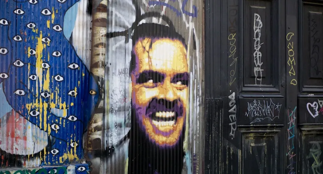
Stanley Kubrick’s adaptation of Stephen King’s novel is famous partly because of its production design puzzles, many of which remain debated by fans and scholars decades later. The Overlook Hotel’s geography is deliberately impossible, windows appear in rooms that shouldn’t have them, hallway layouts contradict themselves between shots, a disorientation that mirrors the characters’ unraveling sense of reality without ever being explained in dialogue. The hotel’s carpet patterns, repeated and hypnotic, echo the maze motif that later becomes literal in the film’s climax. Background details like the newspaper clippings, hotel photographs, and the recurring appearance of certain guests in period costume all hint at the Overlook’s history repeating itself across decades, suggesting Jack Torrance’s fate was never really his own to choose. Kubrick reportedly demanded dozens of takes partly to get these environmental details exactly right, and the sheer density of unexplained visual information is a large part of why the film continues to generate new theories nearly half a century after its release.
Taken together, these ten films make a simple case: the frame is never just a container for the plot. Set dressing, architecture, lighting, and repeated motifs can carry as much narrative weight as anything spoken aloud, rewarding the kind of patient, repeat viewing that streaming and home video make easy today. The next rewatch might reveal more than the first viewing ever did.