

A book cover is a strange kind of contract. In a second or two, it has to communicate tone, genre, and something harder to name – a feeling that the book is worth your time. Most covers fulfill that contract quietly and are forgotten the moment the dust jacket is torn. A small number, though, don’t just sell a book. They change the visual language of publishing itself, setting off ripples that designers are still navigating decades later.
The covers below aren’t simply “pretty” or “famous.” Each one introduced something genuinely new – a technique, an attitude, a visual logic – that reshaped what publishers believed a book cover could do. Together, they trace a surprisingly coherent history of how we learned to judge books by their covers.
1. The Great Gatsby by F. Scott Fitzgerald (Francis Cugat, 1925)
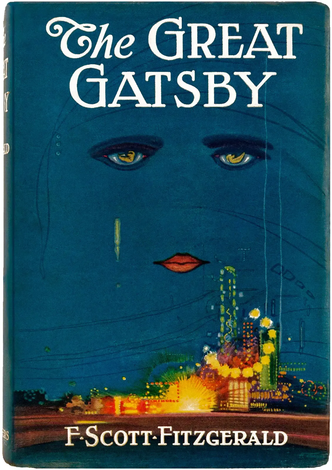
This may be the most recognizable book cover in American literature, and it comes with an unusual history: the haunting celestial face floating above the jazz-lit skyline was the only cover Spanish artist Francis Cugat ever designed. He completed the artwork before the manuscript was even finished, and it appears the image actually influenced Fitzgerald’s prose as he was writing the final chapters.
The original cover features surreal imagery – the haunting visage of a woman’s eyes hovering over a vibrant cityscape – a blend of symbolism and mood that encapsulated the themes of love and disillusionment. Fitzgerald is believed to have liked the cover so much that he wrote elements of it into the story itself. That feedback loop between image and text was something almost unheard of at the time, and it set a precedent for covers that don’t merely illustrate a book but become inseparable from it.
2. Penguin Books Original Cover System (Edward Young, 1935)

When Penguin was founded in 1935 with the radical concept of producing inexpensive paperback editions of high quality books, it adopted an equally progressive approach to typography and cover design. At the time, paperbacks were largely associated with lurid pulp fiction, and their covers showed it. Following the vision of Penguin founder Allen Lane, a young graphic designer named Edward Young helped develop a novel format.
Considering illustrated covers to be trashy, Lane insisted on a simple horizontal grid for Penguin’s jackets in colours that signified the genre of each book: orange for fiction, green for crime, and blue for biography. The rigorous application of colour, grid, and typography in those early paperbacks instilled Penguin with a commitment to design from the start. The influence of Penguin’s design philosophy extends beyond the book world and into branding and visual design more broadly – in graphic design and typography courses, Penguin covers are often cited as case studies of effective, unique design.
3. Penguin Books Refined Under Jan Tschichold (1947–1949)

The enduring principles of Penguin’s design were defined by Allen Lane when he founded the company in the mid-1930s, but it was not until the late 1940s that it adopted a truly disciplined and coherent approach to design under Jan Tschichold. Before his arrival the design of individual books had appeared cohesive, at least compared to rival publishers, but had varied with the views of the editor and printer. A firm believer in typographic systems, Tschichold designed a template for all Penguin books with designated positions for the title and author’s name.
His design philosophy stressed the importance of white space as well as clear typographical hierarchy, building on and refining Penguin’s existing visual strategies. Tschichold created new standards of text arrangement and style that inspired all British postwar graphic design. The covers conformed to the golden ratio, measuring 110 mm × 180 mm – a precise mathematical elegance that made design feel like an exact science rather than a commercial afterthought.
4. Catch-22 by Joseph Heller (Paul Bacon, 1961)
According to his obituary in the New York Times, Bacon was responsible for what became known as the “big book look,” a widely imitated style that stressed big typography and blocky colors with understated drawings. The Catch-22 cover, with its torn red figure against a stark field, crystallized everything that style stood for – raw, expressive, and immediately legible from across a bookshop floor.
Bacon designed covers for about fifty years, from his start in the early 1950s to the early 2000s, and throughout his career he used hand-drawn letters and illustrations. Graphic artist Paul Bacon has been credited with creating the “Big Book” look, featuring prominent titles and author names with small, conceptual images. Each element of Bacon’s famous covers was pieced together by hand, including the iconic red figure from Catch-22’s cover that Bacon ripped out of a piece of paper to become part of book-cover history. It was a technique that looked almost accidental – and that was precisely the point.
5. A Clockwork Orange by Anthony Burgess (David Pelham, 1972)
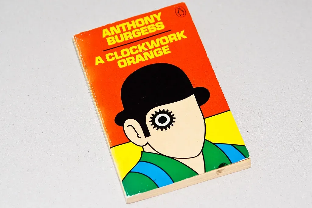
Designed ten years after the book’s first publication, to coincide with the release of Stanley Kubrick’s 1971 film adaptation, this iconic cover was designed and realized by Pelham in a single night after an illustrator’s first attempt was deemed inadequate. The cog-eyed Droog design was thus adopted and instantly became a design classic.
What makes Pelham’s cover remarkable is how it bypassed illustration entirely. Rather than depicting a scene, it constructed a visual metaphor – the mechanical eye communicating violence, surveillance, and dehumanization at a glance. The bold and robust design used in the cover became the visual symbol of the novel itself and later Kubrick’s film adaptation. That relationship between cover art and cinematic identity was something publishers paid close attention to in the years that followed.
6. Jaws by Peter Benchley (Roger Kastel, 1974)

Published in 1974, the original cover for Jaws was designed by Paul Bacon with an all-black background and the white forms of a swimmer and the massive jaws of a great white shark looming beneath her. However, the author wasn’t a fan, and thought the silhouette looked wrong. So illustrator Roger Kastel was commissioned to design the more colorful version that has become as iconic as the book and its classic film adaptation.
The design was also used for the official film poster. That crossover from book jacket to cinema billboard marked a significant moment – it demonstrated that cover art could function as a complete brand identity, capable of carrying a property across multiple media. The legendary book designer Paul Bacon had designed covers for authors like Norman Mailer, Kurt Vonnegut, and Joseph Heller, and his haunting visual ideas carried into the film world as well. Kastel’s shark image proved that a single, primal image could lodge itself permanently in public memory.
7. The Bell Jar by Sylvia Plath (Shirley Tucker, 1966 UK Edition)

Sylvia Plath is the author of this novel and Shirley Tucker is the designer of the book cover. The protagonist of the novel finds herself in the tunnel of despair – and this is reflected by the concentric circle design of the book cover. That simple formal choice, spiraling inward, turned the cover into a diagram of the book’s psychological reality rather than a representation of it.
This is among the coolest and most arresting of all canonical book covers. The mesmerizing concentric circle design is perhaps a metaphor for the tunnel of despair that the protagonist often finds herself in. The cover proved that abstract geometry could carry emotional weight equal to any figurative illustration, influencing a generation of literary fiction designers who began to favor conceptual forms over literal imagery.
8. Jurassic Park by Michael Crichton (Chip Kidd, 1990)

This era saw the emergence of famed book designer Chip Kidd, widely regarded as one of the most innovative cover artists of the late 20th century. Kidd’s minimalist yet striking design for Michael Crichton’s Jurassic Park shows how a single image – a skeletal dinosaur silhouette – could become an enduring icon far beyond the book’s pages.
The first edition book cover is so simple, yet is one of the most beautiful and widely recognized book covers in existence. It became so iconic that it became the symbol and logo of the whole Jurassic Park universe. The cover captures the book’s atmosphere and metaphorically brings life back to dinosaurs using nothing but bones. Chip Kidd is widely regarded as one of the greatest book cover designers of all time, and this cover made history. It showed that a cover could survive translation across posters, merchandise, and film with zero loss of force – because it had been stripped to its irreducible essence.
9. Everything Is Illuminated by Jonathan Safran Foer (John Gray, 2002)

One of the most distinctive book covers of the early 2000s belongs to Jonathan Safran Foer’s Everything Is Illuminated. With this cover, designer John Gray started the revival of hand-lettering and book cover typography, setting up a new book cover design trend. Published in 2002, the cover stands in sharp contrast to the clean graphics that were fashionable at that time.
The 21st century ushered in the digital age, revolutionizing how books are published and consumed. With e-books and audiobooks rising in popularity, designers faced new challenges: covers now needed to stand out as tiny thumbnails on screens rather than physical objects on shelves. This shift encouraged more minimalist and bold approaches, focusing on striking visuals and readable typography within limited digital dimensions. Gray’s hand-lettered cover pushed back against that pressure, and its influence helped launch a broader return to artisanal, human-made aesthetics that continues to define literary fiction design today.
Taken together, these nine covers reveal something worth sitting with: the most consequential designs were rarely the most technically sophisticated. The art of creating a successful cover lies in appealing to a target audience – for designers, it’s a delicate balance between being familiar with cultural and commercial trends and having the artistic vision to craft something distinctive enough to stand out. What separated these covers from the rest was that their designers broke the existing rules clearly enough that a new set of rules formed around what they had done. That is a rarer achievement than it sounds.


