
You stare at logos every single day. They’re on your coffee cup, your delivery box, your phone screen, the truck that cut you off in traffic. Most of them vanish from your mind in seconds. Some marketing experts estimate that we see as many as 5,000 advertisements, including logos, each day. That’s a staggering number. Yet somehow, the biggest brands in the world have been quietly hiding messages right in front of your face, and most people never even notice.
Subliminal logos operate by playing with the subconscious mind of the viewer, embedding hidden messages or images that trigger certain emotions or associations. A logo that appears innocuous may actually contain subtle elements that evoke trust, confidence, or aspiration. Once you start seeing these hidden tricks, it becomes genuinely hard to stop. So let’s dive in.
1. FedEx – The Arrow You Never Saw Coming
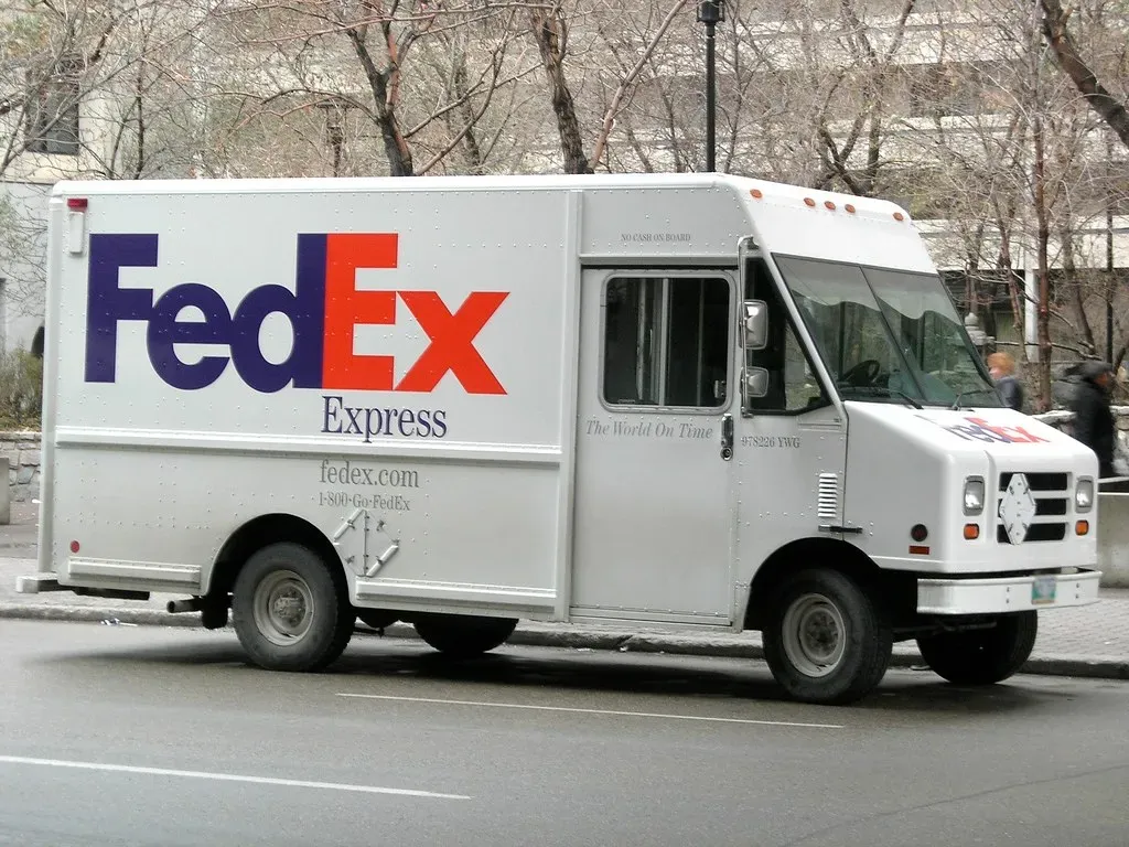
Let’s start with the most famous one, the one that design students talk about in hushed, reverent tones. At first glance, the FedEx logo looks like clean, modern typography in purple and orange. Nothing special. Then someone points out the arrow. Look between the capital E and the lowercase x, and there is a perfectly formed white arrow pointing forward. Designer Lindon Leader intentionally embedded it in 1994 to symbolize speed, precision, and forward motion.
Once you see the arrow in the FedEx logo, it is virtually impossible to unsee it from that point on, making it essentially impossible to forget. That’s genius-level branding, honestly. The arrow isn’t just a cute trick either. It does real psychological work, reinforcing the core promise of the company every single time you see a delivery truck on the street. Companies use hidden messages to connect with their target audience on a subconscious level, making them feel more emotionally invested in the brand, and the use of hidden messages in logo design is a clever marketing strategy that can set a company apart from its competitors.
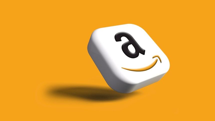
2. Amazon – A Smile That Goes from A to Z
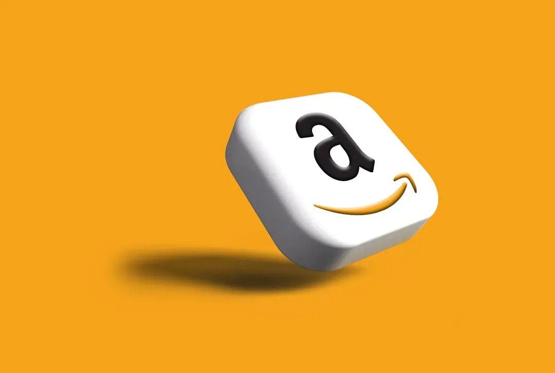
Here’s something most people chalk up to a simple, friendly curve. The yellow arrow under “Amazon” looks like a cheerful little smile, right? Well, it absolutely is. The smile is also an arrow that goes from A to Z in the word “Amazon,” meaning the e-commerce website offers an exhaustive range of products. The arrow also stands for continuous growth and perseverance in achieving goals.
Amazon’s logo is a masterclass in simplicity and meaning. The design features a smile-like arrow that points from “A” to “Z,” encapsulating several layers of meaning, including a comprehensive product range and customer satisfaction, aligning with Amazon’s focus on excellent service. It does three jobs at once: it’s a smile, it’s a directional arrow, and it’s a brand promise. That’s the kind of multi-layered thinking most companies only dream about achieving in a logo design.
3. Toblerone – A Bear Hiding in the Alps
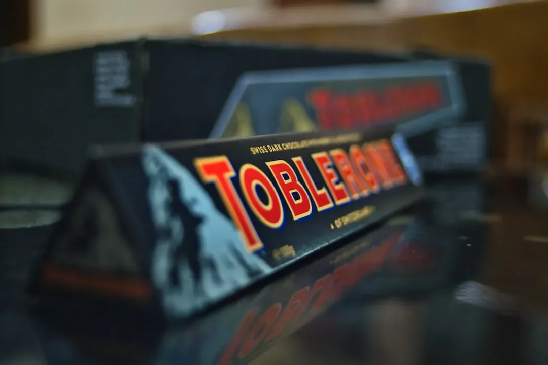
You’ve probably eaten a Toblerone on a long-haul flight and admired that iconic Matterhorn mountain on the packaging. Scenic. Classic. Very Swiss. But look closer. The Toblerone logo features the iconic Matterhorn mountain, and inside that mountain, hidden in the white negative space, is a bear standing upright. The bear references Bern, Switzerland, Toblerone’s birthplace, often called “The City of Bears.”
The famous triangular chocolate’s logo contains a bear silhouette hidden within the Matterhorn mountain design. This playful element pays tribute to Bern, Switzerland, the city where Toblerone was created in 1908 and whose name means “City of Bears.” Rather than stamping “Made in Bern” on the wrapper, they wove the city’s identity right into the mountain silhouette. I think that’s a level of elegance most brands simply never reach. And honestly, the fact that it went unnoticed by millions of people for years makes it even better.
4. Baskin-Robbins – The Number You Almost Missed
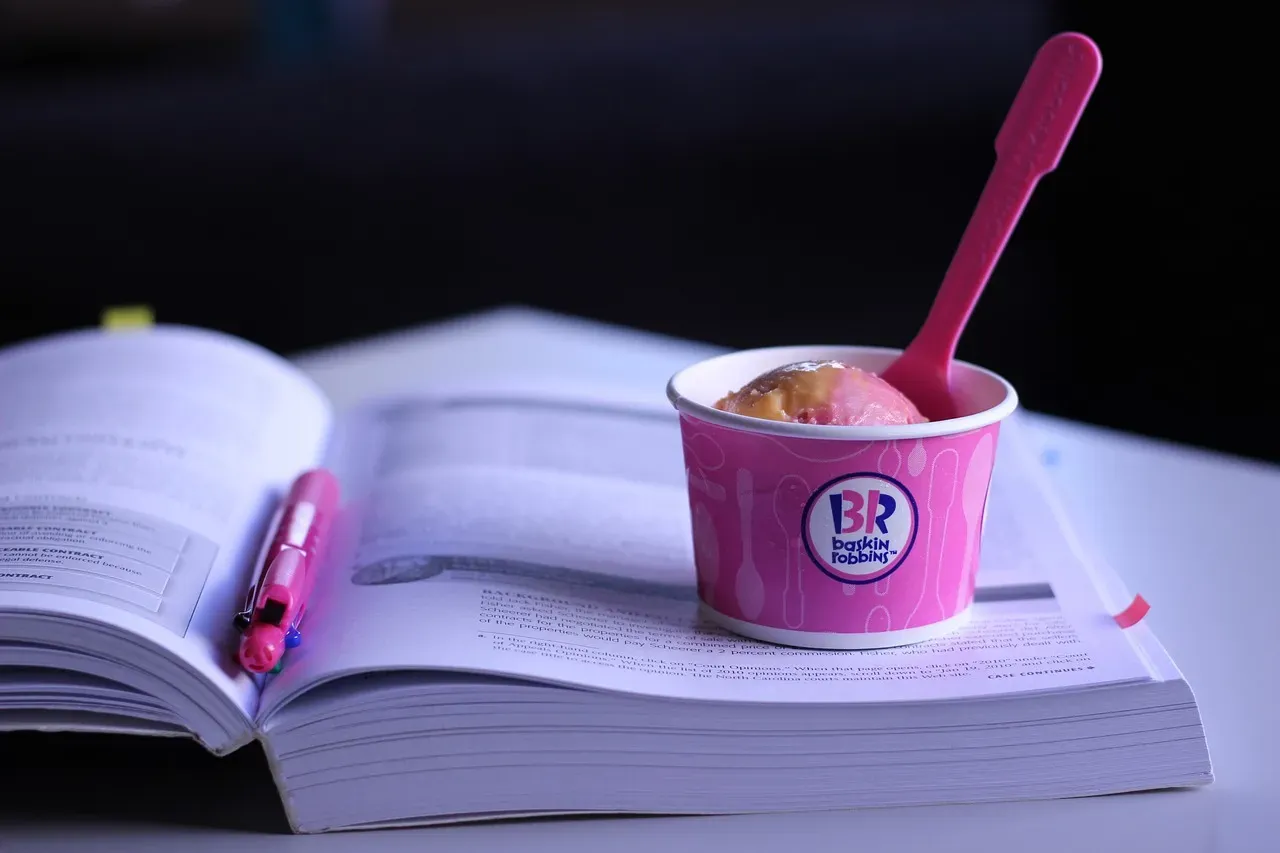
Ice cream and hidden numbers are a surprisingly great combination. The Baskin-Robbins logo seems like simple pink and blue lettering, but the B and R form the number 31 in bright pink. That number dates back to 1953, when the company promoted 31 flavors, one for each day of the month. It’s the kind of thing you see and immediately feel a little embarrassed for missing it all along.
Today, the menu includes more than 1,400 flavors worldwide, yet even after the 2022 logo refresh, the hidden 31 remains, woven into the initials as a lasting nod to its roots. Over a thousand flavors and they still kept the 31 embedded in the design. There is something deeply charming about a brand that clings to its origin story that way. It’s like a secret handshake between the logo designers and the die-hard ice cream fans.
5. Cisco – The Golden Gate Bridge in Plain Sight
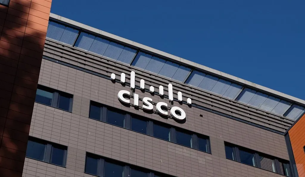
Cisco is a global giant in IT and networking. Its logo looks, at first glance, like a series of blue electromagnetic lines floating above the company name. Totally fitting for a tech firm, and totally unremarkable. Except it isn’t just that. Cisco’s logo contains a hidden message about its origins. The company was founded in San Francisco, and the lines are based on the shape of the Golden Gate Bridge.
The bands above the name represent an electromagnet, but they also have a hidden meaning. The difference in their height evokes the silhouette of the Golden Gate Bridge in San Francisco, where Cisco’s headquarters are located. Two meanings stacked into one set of minimalist lines. It’s the kind of origin story homage that feels genuinely earned rather than forced. Not flashy. Not shouty. Just quietly there, waiting for someone clever enough to notice.
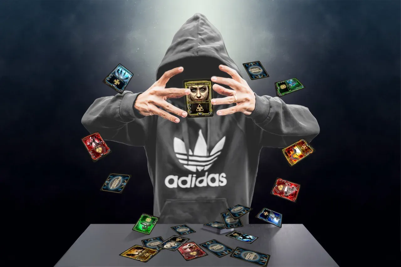
6. Adidas – The Mountain You Have to Earn

Most people see the three Adidas stripes and just think “sportswear.” Fair enough. That’s exactly what you’re supposed to think. Back then, the three Adidas stripes were just three stripes and they didn’t have much meaning behind them. In the 90s, the logo was tweaked and the three stripes were turned diagonally on their side to create the shape of a mountain peak. The new design kept the basic idea of the original logo while giving purpose to those stripes, which now represent the struggle athletes must endure to achieve greatness.
With Adidas in lowercase, bold type, most people focus their attention on the company name. Those diagonal stripes are intended to look like a mountain, the type of mountain elite athletes would push themselves to climb against all odds. It’s not just a logo. It’s a philosophy baked into a geometric shape. Every time an athlete puts on a pair of Adidas shoes, they’re literally wearing a metaphor for perseverance. That’s powerful, even if most wearers never consciously know it.
7. Beats by Dre – The Head Wearing the Headphones
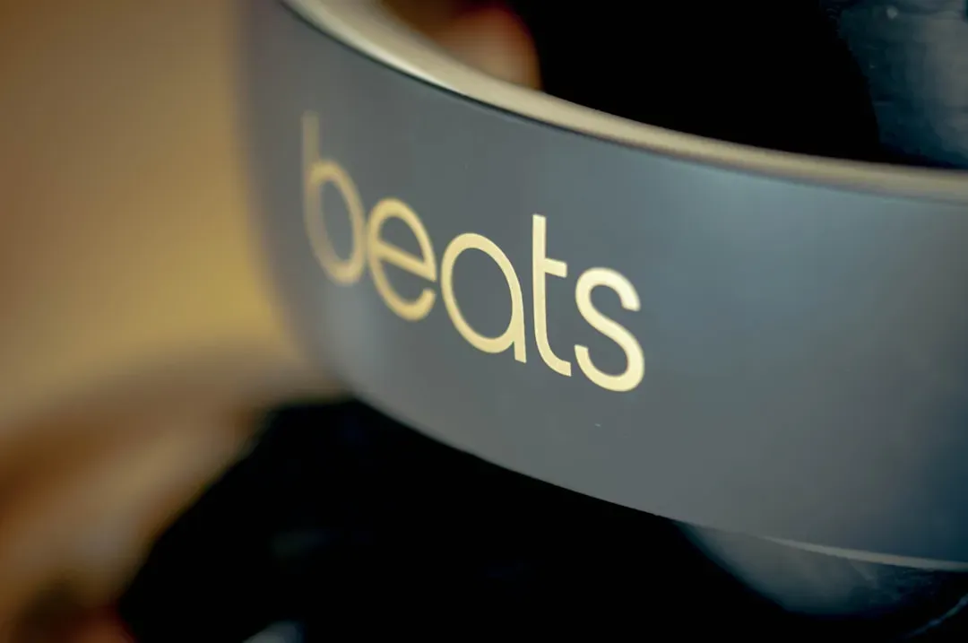
At first glance it’s so simple you almost wonder if a logo designer actually got paid for it. A red circle. A lowercase “b.” Done. Except no. The Beats by Dre logo is little more than a red circle with the letter b inside of it. However, that red circle is actually supposed to represent a human’s head, and the b is supposed to be a pair of Beats headphones over their ears.
The “b” letter is the representation of headphones of the brand. This grants the brand a personalized feature that allows a consumer to see himself on his headphones. This kind of secret message is very relatable to the brand. The genius here is how personal it feels once you notice it. It stops being a product logo and becomes a mirror. You’re not just buying headphones. You’re buying the image of a person fully immersed in music. That’s a very different emotional pitch, and it lands hard.
8. Wendy’s – The “Mom” in the Collar
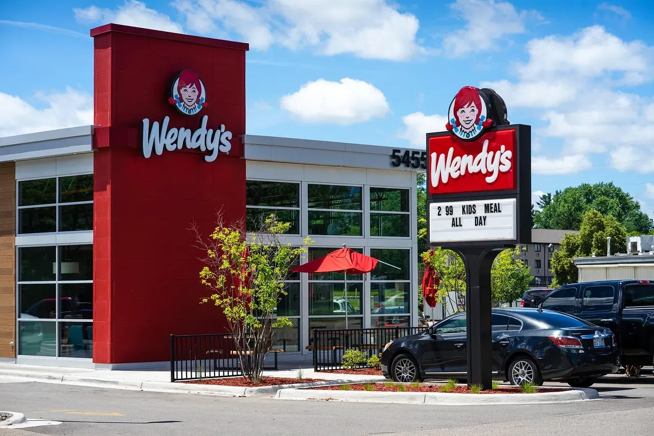
This one is a bit of a curveball because the brand itself insists it was an accident. When Wendy’s updated its logo in 2013, sharp-eyed internet users noticed something unusual. The company updated its logo in 2013, and in the redesign, pigtailed redhead Wendy appears slightly older with only the collar visible. The lines and waves on her collar spell out the word “mom.”
Wendy’s said the word “Mom” embedded in its logo is unintentional. After a website questioned whether the company was trying to relay a subliminal message to customers, Wendy’s confirmed that the word “Mom” is embedded in its logo, but insisted it was unintentional. Whether you believe them or not is, honestly, up to you. The Wendy’s brand has always revolved around home-cooking, and fans believe that Wendy’s collar spells out “Mom” in a nod to the company’s humble home-cooked roots. Intentional or not, it’s the kind of thing that lives rent-free in your brain once you see it.
9. Tostitos – Two Friends Sharing Chips
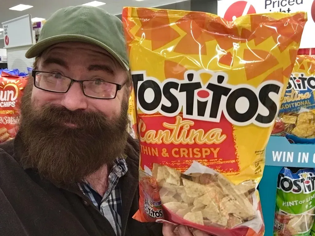
This one is genuinely delightful and I’m a little annoyed at myself for not spotting it sooner. Tostitos is the kind of brand that could have just slapped a chip on the logo and called it a day. Instead, they built a tiny social scene right into the typography. Tostitos has perhaps one of the best hidden logo messages of all time. The two lowercase t’s in the logo represent people holding a chip, and the dot on top of the letter i serves as their bowl of salsa.
This message aligns with Tostitos’ branding as a party snack and encourages consumers to associate their products with social occasions and enjoyable gatherings. Two little stick figures sharing a single chip around a salsa bowl, hidden inside the word “Tostitos.” It’s warm, it’s communal, and it perfectly encapsulates what the product is for. Logos with hidden messages can tell a story about the brand, its values, or its history. These messages serve as a way to communicate with consumers on a deeper level, fostering a connection and understanding of what the brand represents beyond just its products.
10. LG – The Face That’s Been Watching You All Along
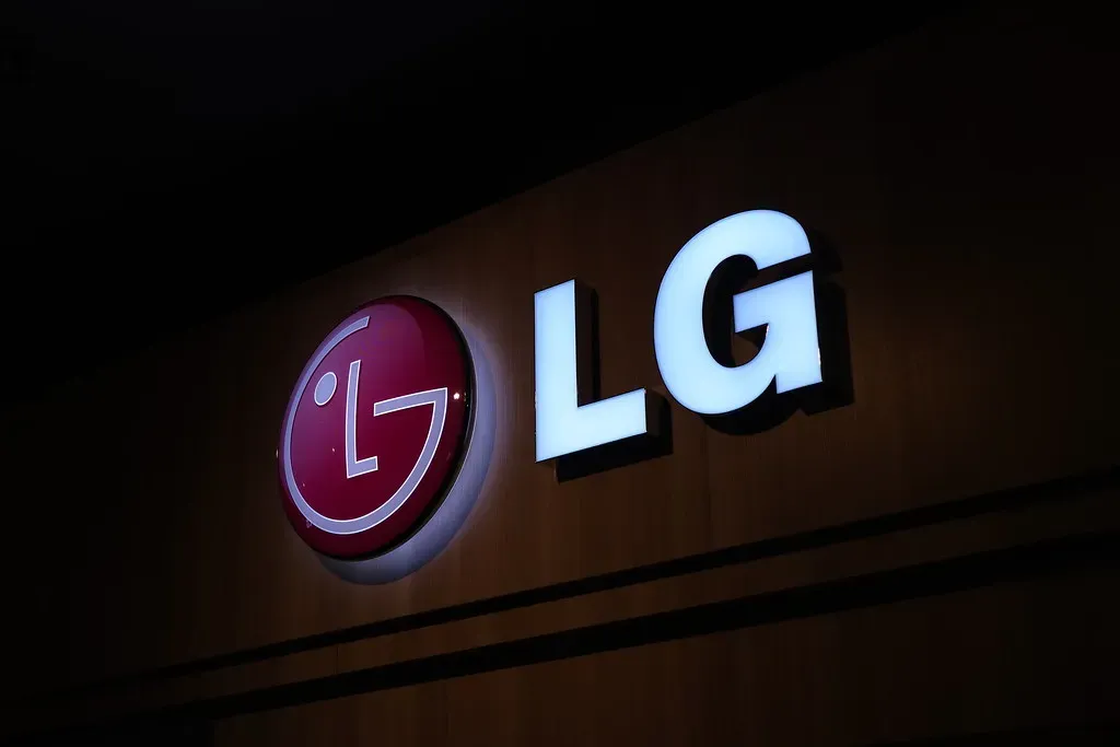
LG is one of those brands so globally familiar that most people stopped really looking at the logo years ago. That red circle and those two letters. Yep. You know it. LG has worldwide recognition and the “L” and “G” letters are most known in the famous company logo. However, most people do not know that these letters help to build a face. The nose is made with the “L,” and the face is composed of the “G.” This makes the brand more welcoming and open to people, and people can usually feel a connection with the brand.
In 1995, LG debuted what it dubbed the “Face of the Future.” According to LG, the logo stands for the world, future, youth, humanity and technology. The one-eyed smiley face made with the L and G represents goal orientation, concentration and positivity. There’s something unexpectedly intimate about a corporate logo that is, functionally, a face looking back at you. It humanizes an electronics giant in a way that a thousand ad campaigns couldn’t do alone. It’s the kind of trick that works because it taps into something ancient and primal. Humans are hardwired to notice faces. LG simply took advantage of that.
The Science Behind Why These Tricks Work
You might wonder whether any of this actually matters beyond being a fun party fact. Turns out, the research suggests it does. When logos are repeatedly exposed to consumers, they can influence their decision-making, affecting everything from brand loyalty to purchase habits. The mechanism isn’t magic. It’s just psychology applied with precision.
The overall findings of consumer research showed that subliminal messages can slightly influence people’s choices but only if they are already in a receptive state. It was also found that if the hidden message matched people’s goals they were more likely to respond to it. This suggests that embedded subliminal messages in advertising could potentially influence consumer behavior slightly with the correct conditions. So it isn’t a mind-control superpower. It’s more like a nudge. A quiet whisper in a crowded room. Discovering a hidden message within a logo can be a fun and rewarding experience for consumers. It creates a sense of interaction with the brand, fostering a positive association and potentially encouraging word-of-mouth promotion. That last part matters more than people realize. Getting someone to talk about your logo, to share it with friends, to post it online and say “wait, did you see this?” That’s free marketing of the most powerful kind.
Conclusion
The world’s most iconic brands aren’t just selling products. They’re telling stories, planting ideas, and building emotional bridges right inside the shapes and spaces of their logos. Some of it is deliberate genius, like FedEx’s arrow or Tostitos’ chip-sharing friends. Some of it, like Wendy’s “mom,” may have slipped through unplanned. Either way, once you see it, you can’t unsee any of it.
A well-designed logo can do more than identify a company or brand. Adding a hidden message or symbol to a brand’s logo can add layers that not only makes it more unique but also incredibly memorable, especially once you figure out the logo’s secret meaning. Next time you grab a Toblerone, order from Amazon, or watch a FedEx truck drive past, take a second look. The message was always there. You just had to know where to look.
What other brand logos do you think are hiding something? Tell us in the comments.


