Movie posters used to do a lot of heavy lifting. Before trailers flooded social media and streaming platforms pushed autoplay previews, a single sheet of paper outside a theater had to convince a stranger to hand over their money. The best ones paired striking imagery with just the right words, and decades later, some of those phrases still live in our heads long after the films themselves have faded from memory. That combination of image and text is what separates a forgettable poster from a cultural artifact. Below are eight posters whose taglines became just as famous as the films they promoted. See how many you already know by heart before reading the details.
1. Jaws (1975)

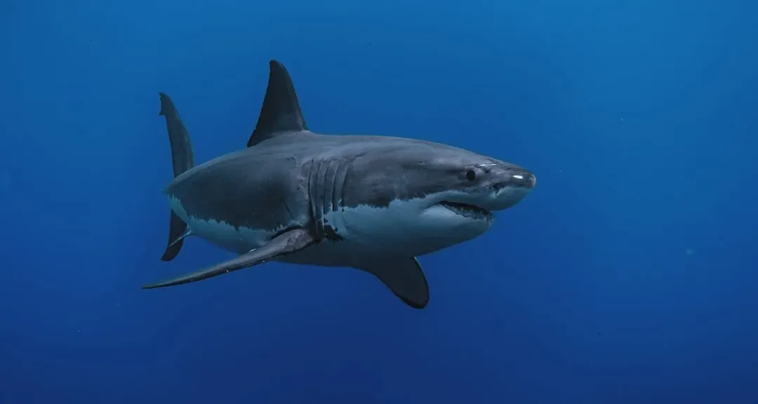
The poster shows a lone swimmer unaware that a massive great white shark is rising beneath her, and the image alone was enough to keep beachgoers nervous that summer. The tagline for the film, “Don’t go in the water,” kept a lot of shark-hysterical ocean-swimmers and 1975 summer beachgoers wary. The artwork, painted by Roger Kastel, became one of the most recognizable pieces of illustration in American film history.
Steven Spielberg’s film turned a modest thriller into the template for the modern summer blockbuster. The poster’s simplicity, just teeth, water, and a single vulnerable figure, proved that dread doesn’t need clutter to work. It’s still referenced and parodied constantly, which says a lot about how well the original did its job.
2. Alien (1979)


Ridley Scott’s sci-fi horror film used one of the most minimal posters ever released: a cracked, glowing egg against total darkness. The first Alien poster is a minimalistic masterpiece: a Xenomorph egg glowing green from a V-shaped crack, set against a pitch-black background, with the tagline immediately below. That tagline was “In space, no one can hear you scream.”
What makes the story behind it interesting is how casually it came together. The poster design and the tagline came from the same household, Philip Gips designed the former, while his wife, Barbara Gips, came up with the latter so casually it was almost on a whim, telling the New York Times in 1981 the line came to her while driving their kids home one evening. Nearly fifty years later, the phrase is still shorthand for cosmic isolation and dread.
3. The Shining (1980)

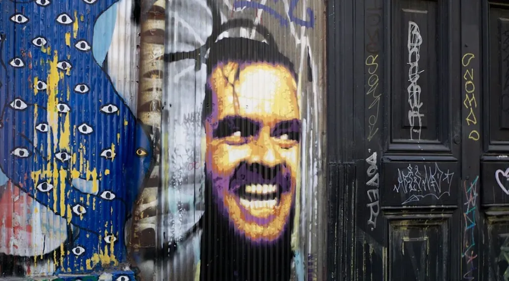
Stanley Kubrick’s adaptation of Stephen King’s novel used a poster designed by legendary graphic artist Saul Bass, featuring an unsettling, doll-like face peering through the letters of the title. Bass and Kubrick went through over 300 potential designs before settling on the final version, with the words “A MASTERPIECE OF MODERN HORROR” at the top. For the UK release, a different line was used instead.
The UK poster carried the tagline “The tide of terror that swept America IS HERE.” It’s a good example of how marketing teams often tailored language by territory, sometimes landing on entirely different phrases for the same film. Either version, the ominous face or the sweeping terror line, captures the same sense of creeping dread that defines the movie.
4. Jurassic Park (1993)

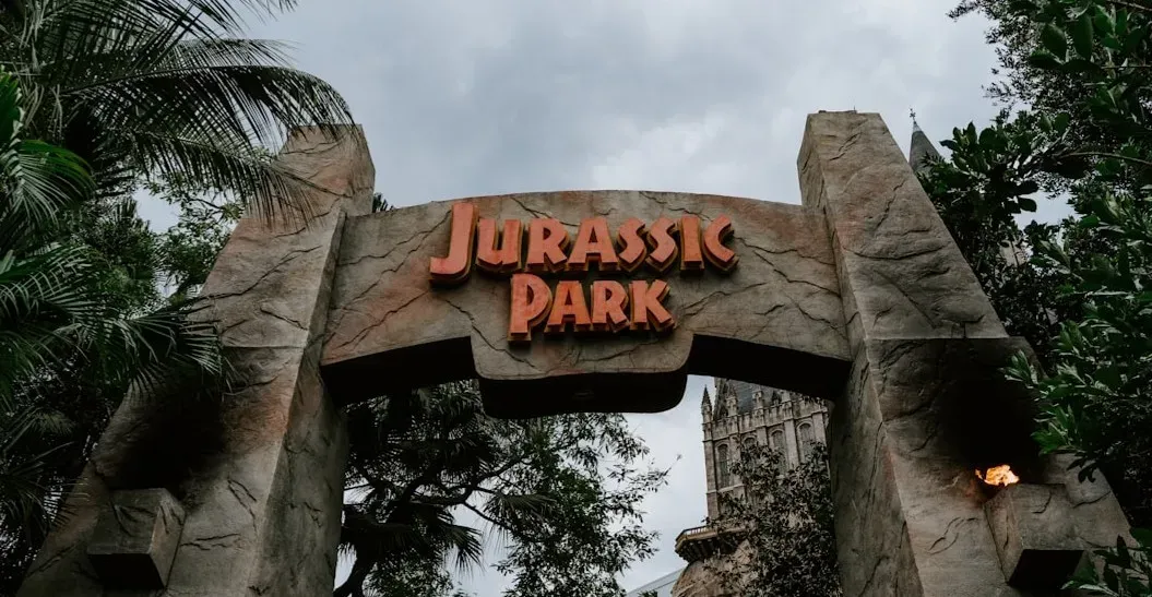
Steven Spielberg’s dinosaur epic used a poster built around a striking silhouette rather than a photograph or painting of a character. Designed by John Alvin, it features a stark black background with a red and yellow silhouette of a T. rex skeleton inside a circular emblem. The tagline underneath did the rest of the work.
The tagline reads “An adventure 65 million years in the making.” It’s a clever line because it works on two levels: it references the age of the dinosaurs while also nodding to how long moviegoers had waited for a film that could bring them to life convincingly. The design proved so effective that later films in the franchise stuck close to the same visual formula.
5. Independence Day (1996)

Roland Emmerich’s alien invasion blockbuster leaned into a sense of quiet dread with its main promotional line rather than showing spaceships blowing things up. The tagline reads, “We’ve always believed we weren’t alone. On July 4th, we’ll wish we were.” It set up the entire premise without giving away a single plot detail.
The film’s marketing also leaned on the specific date, tying the story directly to the American holiday it borrowed its title from. That connection between title, release timing, and tagline gave the campaign a cohesion that a lot of blockbusters try and fail to replicate. It remains one of the more efficient examples of a tagline building anticipation purely through implication.
6. Scarface (1983)

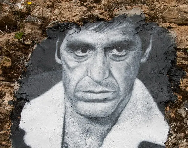
Brian De Palma’s crime drama, starring Al Pacino as Tony Montana, used a poster built around a single striking image of its lead character rather than an action sequence. The film’s chilling tagline, “He loved the American Dream. With a vengeance,” suggests the movie is more of a cautionary tale than one of inspiration. The phrase has outlived the film in some ways, showing up on merchandise decades later.
What’s notable is how the line manages to compress the entire arc of the story into six words. It hints at ambition, excess, and violence without spelling any of it out directly. That kind of economy is rare in tagline writing, and it’s part of why the phrase still gets quoted regularly.
7. Rocky (1976)

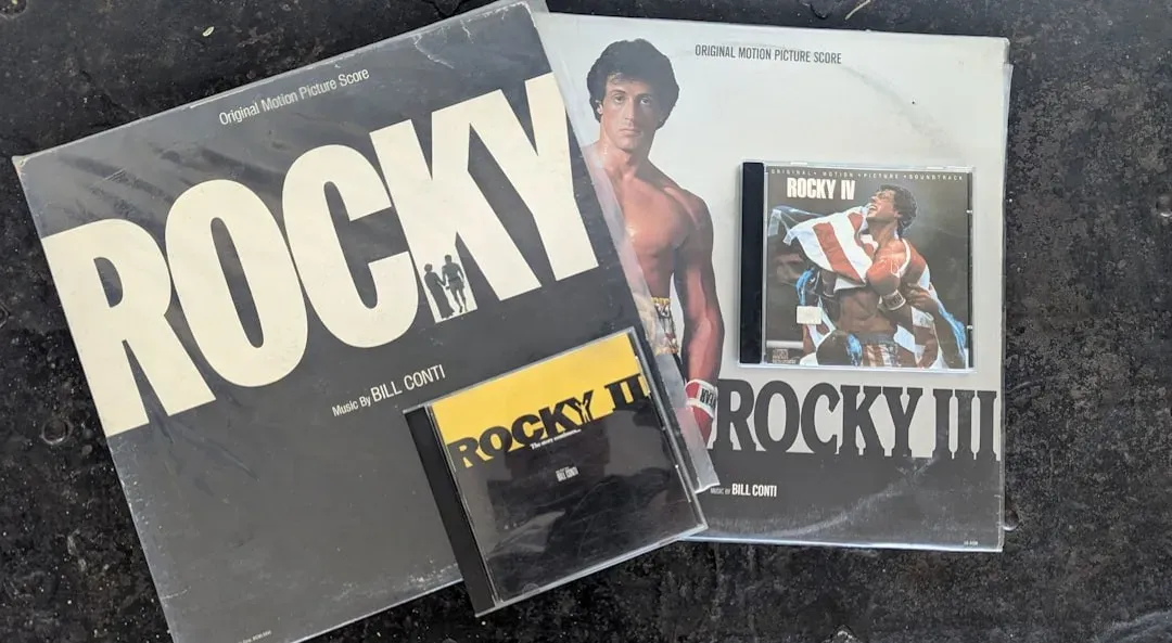
Sylvester Stallone’s underdog boxing drama used a poster that focused on quiet determination rather than spectacle, showing Rocky Balboa alone against a plain backdrop. The tagline, “His whole life was a million-to-one shot,” became one of the most quoted lines in American film marketing. It captured the entire emotional pitch of the movie in a single sentence.
That phrase worked because it wasn’t really about boxing at all. It tapped into a broader idea about long odds and persistence that resonated far beyond sports fans. The film went on to win Best Picture, and the tagline has remained tied to underdog stories in popular culture ever since.
8. Poltergeist (1982)

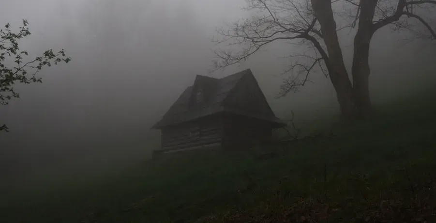
Tobe Hooper and Steven Spielberg’s haunted house film used a deceptively calm poster, showing a suburban home under a stormy sky, nothing overtly frightening at first glance. The tagline, “They’re here,” delivered the unease that the image alone didn’t quite show. Two words did what an entire paragraph of exposition couldn’t.
The brevity is really the point. Horror marketing from that era often relied on short, punchy phrases that implied danger without describing it, and this is one of the cleanest examples. It’s stuck around in pop culture partly because it’s so easy to repeat, and partly because it still works as a piece of writing on its own.
Taglines like these succeeded because they trusted the audience to fill in the blanks rather than spelling everything out. A great one doesn’t summarize a plot, it plants a feeling that lingers long after the poster comes down from the wall. If most of these felt instantly familiar, that’s less about memory and more about how well these eight lines were written in the first place.