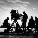


Most of us think of a film’s look as something that belongs to the cinematographer. Often, though, it starts somewhere quieter, with a book of photographs passed around in a pre-production meeting. A still image can settle a debate about color, grain or mood faster than any amount of talking.
The five photographers below each left a visible mark on a particular movie. Some influences are well documented, others are described more loosely, and where that’s the case I’ve said so.
Robert Capa and Saving Private Ryan
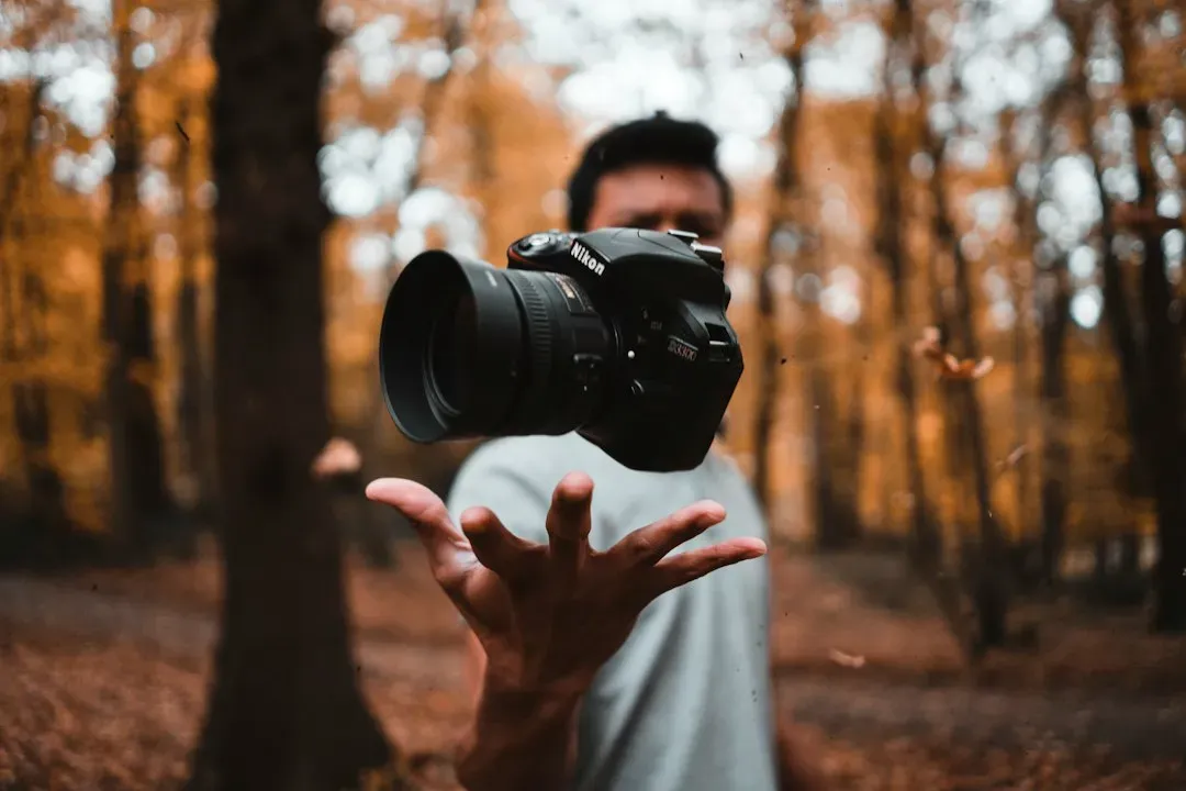
For Saving Private Ryan (1998), Steven Spielberg consulted the photographs Life magazine photojournalist Robert Capa took during the D-Day attacks in 1944. Magnum Photos makes a similar point, noting that Capa’s landing photographs were said to have served as Spielberg’s reference point for the film.
You can see the logic in the film’s opening sequence. Capa’s Omaha Beach frames are shaky, hurried and a little out of focus, and the movie borrows that unsteady, close to the ground feeling. It’s a reminder that “realistic” in cinema often means “looks like the famous photographs.”
Bill Owens and The Virgin Suicides
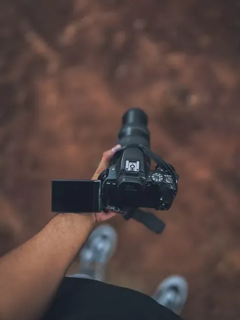
Sofia Coppola has said that photography is where her films begin. She first saw Bill Owens’s suburbia photographs at an art fair, and they became a reference when she started work on The Virgin Suicides. Owens documented American suburban life in the 1970s, with its tidy lawns, backyard barbecues and family rooms.
Coppola’s habit is to build a reference book before shooting. She describes sitting with the cinematographer and art department, looking at photographs to show what she wants a film to feel like. Owens’s ordinary, slightly faded domestic scenes helped anchor the film’s hazy suburban memory.
Saul Leiter and Carol
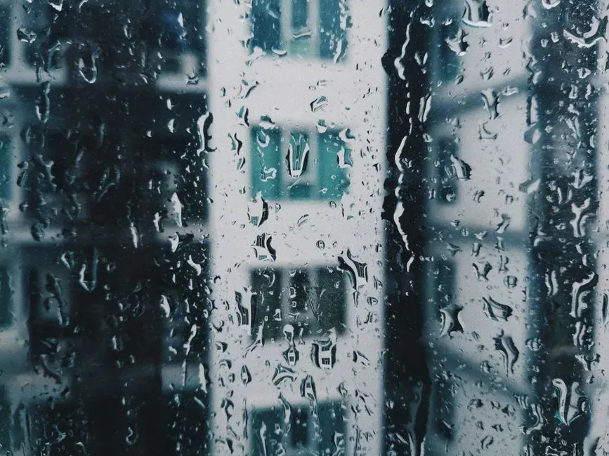
Todd Haynes’s Carol is often discussed in terms of street photography. Cinematographer Ed Lachman shot on 16mm film to evoke the look of 1950s street photography, giving the picture a grainy, old photograph feel. The photographer most often linked to its color and compositions is Saul Leiter, whose New York street scenes of the same era are known for muted tones and objects blurred in the foreground.
Leiter’s habit of shooting through rain-streaked windows and steamed glass shows up in the film’s many car and cafe shots. Characters are partly hidden, framed behind reflections or glass. That sense of looking in on a private moment suits a story about a relationship that had to stay discreet.
Robert Frank and Seven
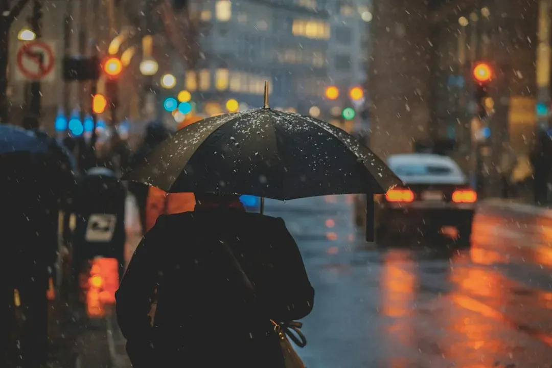
Robert Frank’s book The Americans changed how many cinematographers think about gritty realism. One account of the film’s cinematography says that like numerous cinematographers, Darius Khondji cites The Americans as having inspired the look of Seven, particularly the mix of bright exteriors with relatively dark, moody interiors.
Frank’s pictures have rough grain, odd angles and a feeling of weary, ordinary America. Seven takes that raw texture and pushes it into a rain-soaked, unnamed city where the light barely gets in. The result feels less like a polished thriller and more like a place that has been quietly worn down.
Dorothea Lange and The Grapes of Wrath
John Ford’s 1940 adaptation of John Steinbeck’s novel is widely said to have drawn on Depression era documentary photography, especially the Farm Security Administration pictures by Dorothea Lange and her colleagues. Cinematographer Gregg Toland is usually credited with giving the film its stark, dusty realism. It’s worth noting that this influence is described mainly in film histories rather than in a single definitive statement.
Lange’s portraits of displaced farm families, with their tired faces and sparse belongings, set a template for how hardship looked on camera. Ford’s film echoes that restraint, using natural looking light and weathered faces rather than glamour. Eighty years on, it still reads like a moving version of those photographs.