


Album art has always been more than packaging. Long before streaming thumbnails flattened everything into a tiny square, cover designers treated the sleeve as its own puzzle box, something fans could stare at for hours and still find something new. Some of these hidden details were planted on purpose, others grew into legend simply because people refused to stop looking. Either way, the six covers below reward a second, closer look.
Sgt. Pepper’s Lonely Hearts Club Band by The Beatles

The 1967 cover crams in dozens of faces, but the crowd almost looked very different. The design featured John, Paul, George and Ringo in full Sgt Pepper garb, backed by over 80 cardboard cutouts and wax models. Several figures never made it to the final print, including a young Beatles favorite who was pulled at the last moment for legal reasons.
Leo Gorcey was modelled and originally included, but subsequently removed when a fee of 400 dollars was requested for use of his likeness. Adolf Hitler was also part of the original plan before being quietly dropped. Hitler was requested by Lennon, modelled behind the band, and replaced by Johnny Weissmuller. Look closely at the wax figures too, since Shirley Temple’s hair pokes out from between the wax figures of John Lennon and Ringo Starr, and she also stands in front of the model of Diana Dors.
Abbey Road by The Beatles
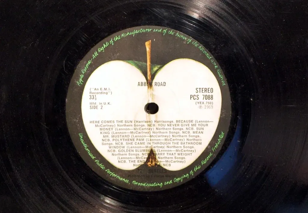
No album cover has been picked apart quite like this one. The famous zebra crossing photo became the centerpiece of the entire “Paul is dead” rumor mill, largely because of small visual details that fans decided meant something bigger. One of the most famous details is that Paul McCartney is walking barefoot, an unusual choice that became a central element in the theory suggesting the image represents a symbolic funeral.
The oddities kept stacking up. Paul appears slightly out of step compared to the other Beatles, and he is seen holding a cigarette in his right hand even though he was left handed. Behind the group sits one more supposed clue. A Volkswagen Beetle displays the license plate 28IF, which fans claimed meant Paul would have been 28 years old if he were alive. The theory was eventually laughed off by the band, but it never really stopped circulating.
Wish You Were Here by Pink Floyd
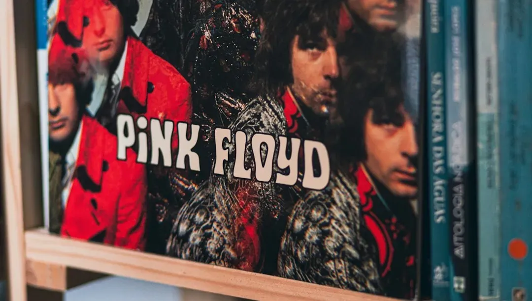
Pink Floyd’s 1975 sleeve hides its meaning in plain sight rather than in coded symbols. The image of two businessmen shaking hands while one burns was built entirely around the idea of empty gestures. The team devised a concept for the cover involving two men shaking hands to seal some unknown deal, since a handshake is often seen as an empty gesture, void of meaning or purpose.
The fire itself was genuine, not a trick of the darkroom. Thorgerson recalled paying the stuntman a thousand dollars to be lit with accelerant, and on the fifteenth take the wind shifted and blew the flames back into Rondell’s face, costing him an eyebrow and part of his moustache. The band pushed the concept even further at the point of sale. Thorgerson concealed the artwork for Wish You Were Here in black coloured shrink wrap, making the album art absent as an extension of the theme. Only a small sticker of a mechanical handshake gave any hint of what was inside.
Sticky Fingers by The Rolling Stones

Andy Warhol’s design for this 1971 release turned the sleeve itself into an interactive object. The cover showed a close cropped photograph of a man’s crotch in tight denim, complete with a real working zipper stitched into the printed jeans. Pull it down and there was a second image printed underneath, a small joke that felt right at home on a record from a band that never shied away from provocation.
The zipper caused practical headaches almost immediately, since stacking the records for shipping tended to dent the vinyl underneath. In Spain, where the ruling government at the time enforced strict censorship rules, the image was swapped out entirely for a tamer photograph of fingers inside a can. That substitute cover has since become a minor collector’s item in its own right, valued precisely because it hid the original joke rather than revealing it.
Dangerous by Michael Jackson

Michael Jackson wanted his 1991 album to feel timeless, so he turned to surrealist painter Mark Ryden rather than a simple photograph. Jackson commissioned Ryden to create a highly detailed portrait filled with symbolism and mystery, a piece that took hundreds of hours to create. The finished painting reads less like a portrait and more like a circus poster stuffed with private references only a patient viewer would ever notice.
Tucked into the chaos are small signatures and numbers that took fans years to spot. Ryden’s signature is hidden in the teeth of the giant skull held by the little girl in the painting. Elsewhere the numbers carry their own quiet weight, since a map of the world and the number 7 are engraved on the sculpture of Michael Jackson’s hand, while the number 9 appears on the elephant’s forehead. None of it explains itself outright, which was exactly the point Jackson wanted.
The Life of a Showgirl by Taylor Swift

Released in 2025, Taylor Swift’s twelfth studio album arrived with not one cover but several, each one loaded with details fans immediately began dissecting frame by frame. On the main cover Taylor floats in water, half drowned and half dazzling, while other versions show her in a severe black bob with feathers, or lounging backstage surrounded by framed pictures. The color choices were not accidental either.
Fans speculated that the album’s theme may be inspired by the painting of Ophelia, with a color palette of orange and mint green symbolizing transformation and endurance, while double exit signs hinted at hidden meanings. Swift herself has openly embraced the scrutiny rather than downplaying it. She has said that as long as fans enjoy hunting for the clues, she has no intention of stopping. Whether every spotted detail is truly intentional or simply a byproduct of intense fan attention remains an open question, but that ambiguity is part of what keeps people looking.
Taken together, these six covers show that a great piece of album art rarely gives up everything on first glance. Some hidden details were carefully engineered by design teams working under strict secrecy, while others became legend only because millions of fans decided to keep staring long after the record stopped spinning. Either way, the habit of hiding something in plain sight has clearly outlived vinyl, cassette, and CD alike, and it shows no sign of slowing down now that album covers live mostly as tiny icons on a phone screen.