

Some books get a new cover every few years just to freshen up a shelf display. Others go through redesigns so dramatic that longtime readers barely recognize the title without checking the spine. The seven examples below all fall into that second category, cases where a publisher didn’t just tweak a font or swap a color, but rethought the entire visual identity of a beloved story. Some changes came from legal necessity, others from a milestone anniversary, and a few sparked genuine debate among readers about whether the update honored the original or lost something along the way.
1. Harry Potter and the Sorcerer’s Stone (and the whole series)
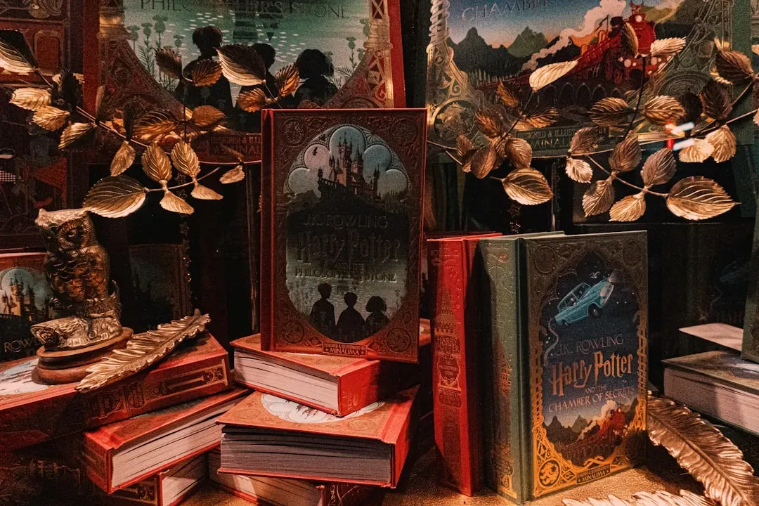
When Scholastic marked the twentieth anniversary of the American release of the first Harry Potter book, they didn’t just slap on a new sticker. Scholastic announced they had hired children’s book author and illustrator Brian Selznick to design the new jackets. Instead of the colorful, action-packed art fans grew up with, Selznick went for something quieter and more atmospheric.
He wanted the covers to be in black and white, and wanted to create a single image that told the story of all seven books. The real trick was pulling off seven covers that each worked on their own while also connecting into one continuous mural when lined up side by side. Selznick purposely created a greater image that connected each of the seven illustrations in a horizontally aligned mural. Fans who grew up with Mary GrandPré’s original illustrations tend to split down the middle on this one, nostalgia versus artistic ambition.
2. The Great Gatsby
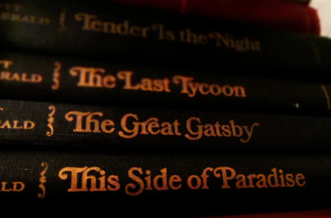
F. Scott Fitzgerald’s novel has one of the most recognizable covers in American publishing history, the haunting eyes floating over a carnival skyline. “Everybody knows the original with the spooky eyes,” says Greil Marcus, author of a book about Gatsby’s cultural legacy. That image, painted by Francis Cugat, became so tied to the novel that when the book entered the public domain in 2021, publishers faced an odd problem.
None of the publishers of the new Gatsby editions could use the original artwork, so instead they went dark and minimalist. Modern Library, Penguin Classics, and other houses each took their own approach. The new Modern Library edition features a ’20s car emerging from the darkness, its headlights peering out of the cover. Whether any of these newer takes can match the emotional weight of Cugat’s original is still very much up for debate among readers and designers alike.
3. To Kill a Mockingbird
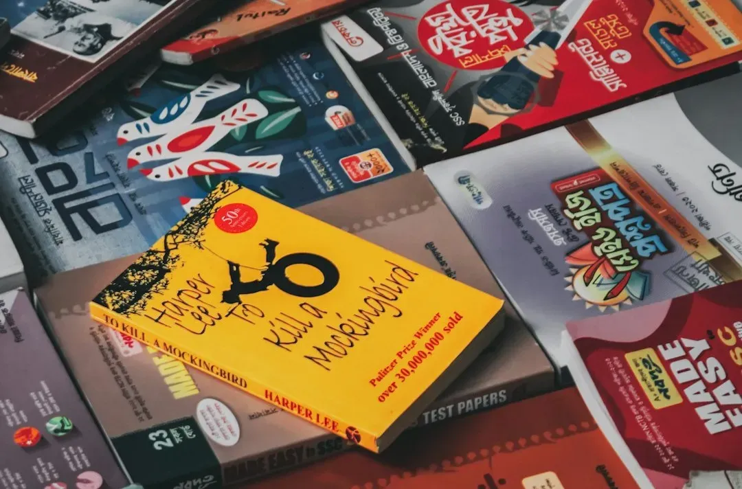
Harper Lee’s novel has worn dozens of different jackets since it first hit shelves in 1960, and the changes tell their own quiet story about how publishers have interpreted the book over time. The first edition, designed by Shirley Smith, featured none of the more iconic images now associated with the story but did include the tree where gifts were mysteriously left for the Finch children, along with a quote from Truman Capote and a photo of Lee. That simple, symbolic approach set the tone for decades of covers that leaned on the tree motif rather than depicting characters directly.
Later editions moved in different directions entirely, some emphasizing the courtroom drama, others going abstract or typographic. The book’s cover art has changed considerably since 1960, starting with a simple tree referencing where Boo and the children left gifts, then a slightly more explicit version showing the tree with an actual watch and ball of string in it. By the fiftieth anniversary in 2010, multiple publishers released their own distinct redesigns simultaneously, giving readers an unusually wide menu of visual takes on the same story.
4. Twilight (Life and Death tenth anniversary edition)

Stephenie Meyer didn’t just redesign a cover for Twilight’s tenth anniversary, she flipped the entire concept behind it. The special edition features the original Twilight cover on the front, while the back reveals a separate cover for “Life and Death: Twilight Reimagined,” a version where the gender roles of the main characters are reversed, turning Edward into Edythe and Jacob into Julie. It’s a flip book format, so both covers exist as legitimate front doors into the story.
Partner offer
The edition was packaged as an oversize, jacketed hardcover flip book featuring nearly four hundred pages of exclusive content along with reimagined cover art. The two covers use similar visual language, a red flower against a black background, but subtle shifts in composition hint at the swapped dynamic inside. It’s less a redesign in the traditional sense and more a mirror image experiment, which makes the comparison genuinely interesting rather than just cosmetic.
5. George Orwell’s 1984
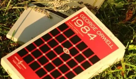
Few dystopian novels have been reinterpreted visually as often as 1984, and each generation of designers seems to find a new way to represent surveillance and control without relying on the same tired imagery. Early editions leaned on stark, industrial typography, evoking the grim bureaucratic tone of Orwell’s Oceania. Later paperback runs shifted toward more graphic, almost poster-like designs, using eyes, cameras, or fractured faces to hint at the story’s central themes of watching and being watched.
Penguin’s various Modern Classics reissues over the years have swung between minimalist type treatments and bolder illustrative concepts, reflecting how differently each era reads the book’s warnings. Some readers prefer the older, more restrained covers that let the text speak for itself, while others appreciate covers that visually underline the paranoia baked into the story. Given how often 1984 gets assigned in classrooms, it’s one of the few novels where a whole generation can recognize which decade someone read it in just from the cover they picture.
6. Neil Gaiman’s American Gods

American Gods has gone through a particularly wide range of covers since its original 2001 release, partly because the novel blends so many visual traditions, from Americana road-trip imagery to ancient mythological symbolism. Early paperback editions favored moody, road-and-storm visuals that matched the book’s cross-country structure. Anniversary editions and television tie-in covers later leaned harder into character imagery, tying the book more directly to its screen adaptation.
The shift between editions says something about how publishers balance literary identity against marketing needs when a book gets a second life through adaptation. Readers who discovered the novel before the show sometimes find the newer, show-branded covers a little jarring, since they replace the mysterious tone of the original design with more concrete faces and scenes. It’s a common tension in cover redesigns tied to adaptations, where recognizability competes with the subtler mood the original artwork was trying to set.
7. Fahrenheit 451
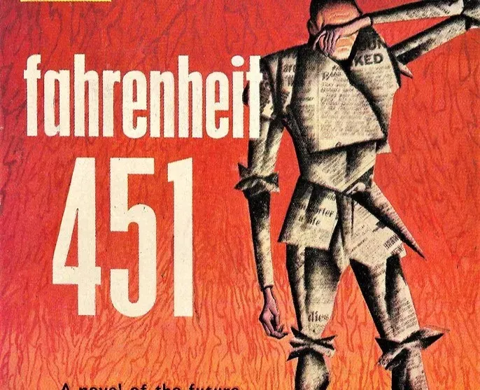
Ray Bradbury’s novel about censorship and book burning has arguably attracted more inventive cover concepts than almost any other classic, mostly because the central image, a burning book, is both obvious and endlessly reinterpretable. Some editions go literal, showing flames consuming pages or a match striking against a spine. Others take a more conceptual route, using negative space or fragmented typography to suggest destruction without showing fire at all.
Design-focused reissues over the past couple of decades have often tried to distance the book visually from its most literal interpretation, aiming for something more unsettling than a straightforward burning book graphic. That shift mirrors a broader trend in classic literature redesigns, where publishers increasingly favor mood and suggestion over direct illustration. Whether that restraint serves the story better than the blunt imagery of earlier editions is exactly the kind of question that makes cover comparisons like this worth having.
Looking across all seven, a pattern emerges. Redesigns tend to happen for one of three reasons: a legal shift like copyright expiration, a marketing milestone like an anniversary or film tie-in, or simply a publisher deciding the old look no longer speaks to new readers. None of these motivations guarantee a better cover, only a different one. What stays consistent is how strongly readers attach memory to the version they first held, which is probably why these comparisons never really settle into a single right answer.Partner offer
Planning a trip to Vegas?
Compare hotel rates and show tickets on VEGAS.com.