Music is full of secrets. Most of us press play and let the songs wash over us without ever turning the cover over, squinting at the background, or holding the sleeve up to a UV light in a dark room. Yet some of the most celebrated artists in history have quietly embedded codes, symbols, and personal messages directly into their album artwork – messages that took years, sometimes decades, to fully decode.
Some of these are playful nods between rival bands. Others are deeply personal tributes, coded farewell letters, or brazen conspiracies that gripped entire nations. Honestly, it’s the kind of rabbit hole you don’t come back from easily. So let’s dive in.
1. The Beatles – Abbey Road (1969): The Funeral That Wasn’t

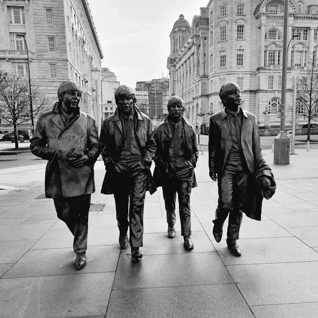
Shortly after Abbey Road was released, the cover became part of the “Paul is dead” conspiracy theory that was spreading across college campuses in the US. Followers of the rumour believed the cover depicted the Beatles walking out of a cemetery in a funeral procession. The idea sounds wild until you actually look at the details.
According to the theory, Lennon dressed in white symbolized a religious figure, Ringo Starr in black was the undertaker, McCartney barefoot and out of step was the corpse, and Harrison in denim was the gravedigger. The left-handed McCartney is holding a cigarette in his right hand, supposedly indicating an impostor, while the number plate on the Volkswagen reads 28IF – meaning McCartney would have been 28 if he had lived.
The iconic cover was photographed on August 8, 1969, when photographer Iain Macmillan stood on a stepladder in the middle of the road and captured the legendary image in just six quick shots. Abbey Road eventually sold over 30 million copies worldwide, making it one of the best-selling albums of all time. The conspiracy, absurd or not, certainly didn’t hurt.
On the back cover, there is a crack running through the band’s name written in tiles on a wall. Of all the symbols, this one turned out to be the most meaningful and sad. Although the release of Abbey Road was followed by ample evidence that McCartney was alive and well, what the public didn’t know was that the Beatles had secretly broken up.
2. David Bowie – Blackstar (2016): A Farewell Hidden in Light


On January 8, 2016, Bowie released his final work, the experimental rock album Blackstar. Just two days later, he died of liver cancer. What seemed like a minimalist black star on a white background turned out to be one of the most elaborately coded ever made.
The biggest Easter egg, as reported by The Independent, comes when you leave the vinyl gatefold out in the sun. With enough exposure to light, one fan found that the album’s iconic black star is replaced by an image of a starry galaxy. A Bowie fan also found that the Blackstar sleeve gives off a bluish glow when exposed to a blacklight.
Designer Jonathan Barnbrook revealed that even Bowie himself wasn’t aware of the full extent of the secrets embedded in the artwork. When asked if Bowie requested him to fill it with symbols, Barnbrook said he did not – Bowie simply didn’t know about some of them.
Perhaps most subtly, there could be a hidden message in the very font Bowie chose for the record’s back cover. According to fans, the font comes from a design suite called Lazarus – like the Blackstar track and musical Bowie wrote before he died – and is itself called Terminal. The assumption is that the musician was making an oblique reference to the terminal liver cancer that would eventually claim his life.
3. The Beatles – Sgt. Pepper’s Lonely Hearts Club Band (1967): A Nod to the Rival


On the famous cover of Sgt. Pepper’s Lonely Hearts Club Band, photographer Michael Cooper gave a namecheck to the band’s biggest pop rivals, with a doll wearing a fan-made sweatshirt that said “Welcome The Rolling Stones.” Tucked in among hundreds of famous faces, this one detail takes real effort to spot.
This iconic cover from 1967 is filled with a crowd of famous figures, but many fans miss the deeper symbolism behind the placement of certain individuals. The presence of Indian spiritual leaders, for example, nods to the band’s growing interest in Eastern philosophy.
Photographer Michael Cooper shot the cover on March 30, 1967, at his Chelsea Manor Studios in London when the album was nearly finished. Paul chose avant-garde artists like Karlheinz Stockhausen and William S. Burroughs, John added writers like Oscar Wilde and James Joyce, and George’s picks were all Indian gurus. Every single face in that crowd meant something to someone.
Just months later, the Rolling Stones released Their Satanic Majesties Request, with an equally vibrant cover that was clearly a reference to the Beatles. The two bands essentially kept a coded visual conversation going across album sleeves, which, let’s be honest, is one of the coolest rivalries in music history.
4. The Velvet Underground – White Light/White Heat (1968): The Invisible Skull


The original artwork to the 1968 album White Light/White Heat appears to be pure black, but if you look closely you can see a very faint image of a skull tattoo. It belonged to the actor Joe Spencer, who was one of Andy Warhol’s discoveries – and it’s thought the black-on-black design was a Warhol idea.
According to a December 1967 letter from Lou Reed to Gerard Malanga, it was Warhol’s idea to use “a black-on-black picture of a motorcyclist tattoo.” Reed had seen the tattoo on the bicep of actor Joe Spencer in Warhol’s film Bike Boy, and Factory artist Billy Name blew up a black-and-white negative frame from the film, setting it against a black background – creating a cover that was the very antithesis of the psychedelic, Sgt. Pepper–inspired imagery that was everywhere at the time.
Under closer inspection, using light, UV, or brightening the image digitally, you can clearly make out the tattoo of a skull on an arm. It’s a cover that literally hides itself from casual observers. It’s well known that David Bowie was a huge Velvet Underground fan, and the shenanigans surrounding the artwork to his final album Blackstar are considered a subtle homage to this classic design approach.
5. Nirvana – Nevermind (1991): Capitalism on a Fishing Hook


The record’s cover famously shows a naked baby swimming with a dollar bill dangling on a fishing hook ahead of him. Simple enough at face value. Except it isn’t simple at all. Inspired by Kurt Cobain’s fascination with underwater births, the record label’s art director Robert Fisher hired photographer Kirk Weddle to shoot a conceptually related image.
It was Fisher’s idea to doctor the image to include a type of bait – the famous dollar bill hooked to the fishing line. This enigmatic and playful reworking of a fishing scene is open to multiple readings. One popular interpretation is that it’s a critique of corporate capitalist society and the principles of consumerism.
The Nevermind album cover, featuring a baby swimming toward a dollar bill, is often seen as a commentary on capitalism and the loss of innocence. The dollar bill is within reach, yet out of grasp, symbolizing how people are conditioned to chase wealth from an early age. Kurt Cobain stated it’s a representation of how people get sucked into the consumerist lifestyle.
After seeing the album cover so many times you become normalised to its presence, but it is absolutely astonishing that the band’s major-label debut was allowed to feature a baby’s penis on the front cover in the social climate of the early nineties. The cover remains one of the most analyzed and debated pieces of art in rock history.
6. Led Zeppelin – IV (1971): The Devil in the Mirror


The cover of Led Zeppelin’s untitled fourth album shows an old man carrying a bundle of sticks, but this rustic image holds deeper meaning. It’s often interpreted as a rejection of modern society and technology, reflecting the band’s back-to-basics approach. The weathered appearance of the painting contrasts with the technological advances of the time, reinforcing this theme.
The band did themselves no favors with the gatefold sleeve, which depicts a rag-clad figure on a hillside. Hold the image up to a mirror, though, and you get a horned beast. Whether this was intentional or the product of overactive fan imagination has never been conclusively settled. Personally, I think the band knew exactly what they were doing.
Some artists used their album artwork as a way to address their current status. Led Zeppelin may have inspired, intentionally or otherwise, more chatter about their alleged occult dabblings. The mirror trick with the hermit on the hill is one of those details that, once you see it, you absolutely cannot unsee.
7. Paul McCartney – Ram (1971): A Love Letter in Plain Sight


Not long after the absurd “Paul Is Dead” rumour gripped audiences in 1969, McCartney left a real hidden message on the cover of his 1971 album, Ram. The letters L.I.L.Y. stand for “Linda I Love You.” Hidden in the cover artwork as a quiet personal tribute, it’s easily the most genuinely romantic Easter egg in rock history.
The “L.I.L.Y.” stands for “Linda I Love You” – a touching gesture to his wife Linda. It’s a striking contrast to all the sinister skull imagery and occult mirror tricks elsewhere in this list. Here was a man just trying to tell his wife he loved her, in the most discreet way he could find.
There’s something deeply human about that. Fans spend so long hunting for dark conspiracies in album art that a genuine, warm message hiding in plain sight almost feels more surprising than any hidden devil face. McCartney has always had a mischievous streak, and this counts as one of his best-kept secrets.
8. New Order – Power, Corruption & Lies (1983): A Fully Functional Decoder Ring


On the back cover of New Order’s Power, Corruption and Lies, there is a wheel design made up of various coloured sections. The outer two rings of this design form a decoder ring to decipher messages hidden elsewhere on the cover. This code is also used on the 12-inch singles for “Blue Monday” and “Confusion,” and on New Order’s official website.
There’s no radically new information revealed if you take the time to decode it. It’s mostly the catalog numbers and titles of the releases on which they appear. That might sound anticlimactic, but the fact that you need a literal decoder wheel just to read the liner notes is an artistic statement in itself.
This is the kind of thing that made post-punk and new wave so fascinating in the early 1980s. Bands weren’t just making music, they were building entire worlds out of their packaging. New Order essentially turned the back of a record sleeve into an interactive puzzle, years before the internet made that kind of fan engagement standard practice.
9. Michael Jackson – Dangerous (1991): A Canvas Hiding a Universe

The cover of Michael Jackson’s Dangerous is a dense tapestry of symbolism, painted by surrealist artist Mark Ryden. Every inch teems with hidden figures and cryptic references, from nods to Jackson’s childhood and career to broader commentary on fame and the entertainment industry. The eyes staring out from behind a mask hint at the tension between Jackson’s public persona and private self.
There are probably more symbols in this one album cover than in the rest of many album catalogs combined. The life of a pop star, the artwork by Mark Ryden seems to say, is not all it’s cracked up to be. Outside it’s all glamour and glitz, but the interior of the image is starker, darker, and more ominous. Meanwhile, 19th-century circus entrepreneur P.T. Barnum watches over the chaos with an icy gaze.
You could genuinely spend an afternoon with a magnifying glass on this cover and still not find everything. It’s the kind of album art that rewards obsession, which makes sense given that Jackson’s fanbase has always operated at an obsessive level. Ryden packed so much in that the cover itself became something of a myth.
10. Coldplay – X&Y (2005): The Morse Code Nobody Asked For

The colorful shapes on Coldplay’s X&Y cover are actually a graphical visualization of the Baudot code – an early telegraph communication system patented by French inventor Emile Baudot in 1874. Used alongside Morse code, the Baudot system transmitted readable messages as ones and zeroes, assigning five-character sequences for every letter, number, and punctuation mark.
On X&Y, the different colors and sizes of the blocks correspond to different bits and their letters – which spells out the album’s title. At first glance it looks like a modernist design pattern. Look closer, and it’s a vintage telegraph message hiding in full view on the front of one of the biggest-selling albums of the 2000s.
It’s hard to say for sure whether most Coldplay fans ever noticed, but the detail is genuinely clever. The Baudot code predates radio, predates recorded music entirely. Using it to spell out an album title is the kind of nerdy, lateral thinking that the best album artwork is built on. It also raises a fun question: how many other covers are hiding entire alphabets that nobody has cracked yet?
Conclusion: The Art of Hiding in Plain Sight


The best album packaging gives artists the opportunity to enhance the story told throughout their music – or tell a new one entirely. These hidden messages prove that the cover was never just decoration. It was always part of the conversation.
From Bowie’s galaxy appearing under sunlight to Paul McCartney whispering “I love you” in plain sight, from Warhol’s invisible skull to a Beatles funeral procession nobody officially planned, the art of hiding meaning in plain view is one of music’s most enduring traditions. Even as physical media drifts away, music artists of all genres like to hide messages and images in their releases.
What’s genuinely thrilling is that some of these secrets still haven’t been fully uncovered. Barnbrook himself admitted there were things in the Blackstar artwork that even he hadn’t told anyone yet. Which makes you wonder – what are you holding in your record collection right now that you haven’t looked at closely enough? What do you think is still out there, waiting to be found?