


Most people glance at an album cover for maybe two seconds before flipping it over or swiping past. That’s a shame, because some of the most famous covers in music history were built like puzzle boxes, packed with symbols, jokes, and quiet confessions that only reveal themselves once you know where to look. A few artists buried entire arguments about fame, mortality, or politics inside a single square of artwork. What follows is a closer look at nine covers that carry more weight than their first impression suggests. Some of the meanings were confirmed by the designers themselves, while others grew into legend through decades of fan analysis. Either way, they’re worth a second look.
Nirvana’s Nevermind hides a joke about selling out

The image seems simple on its face: a baby underwater, reaching for a dollar bill on a fishhook. The idea grew out of a program about water births that Kurt Cobain happened to be watching, an image that stuck with him enough to mention to Geffen art director Robert Fisher. The team then spent an afternoon brainstorming what to dangle from the hook, and Cobain came up with the idea of adding a fishhook to make the whole thing more menacing after they agreed a baby floating alone wasn’t quite enough.
The dollar bill wasn’t anyone’s grand statement about capitalism, at least not at first. Nobody remembers who actually suggested the dollar, but everyone liked it, and the whole concept came together organically rather than from a planned message. Fans read it differently anyway, with some interpreting the baby as Nirvana itself, a band that had just signed to a major label and, in the eyes of the underground scene, sold out. That double meaning, intentional or not, is part of why the image still feels sharp more than three decades later.
Abbey Road turned four men crossing a street into a funeral
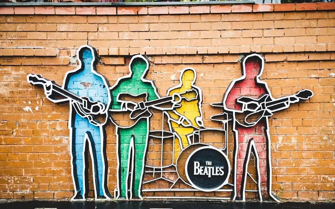
The Beatles never meant their last cover shoot to spark a death hoax, but the details lined up too neatly for fans to ignore. The theory cast John Lennon in white as a heavenly figure, Ringo Starr in black as the undertaker, George Harrison in denim as the gravedigger, and Paul McCartney, barefoot and out of step, as the corpse. A parked Volkswagen only fed the fire, since its plate reading LMW 281F was misread as 28IF, supposedly McCartney’s age had he still been alive, while LMW stood for Linda McCartney weeps or Linda McCartney, widow.
The real story is far less dramatic. According to people involved in the shoot, Paul can be seen wearing sandals in other photos from the same session and simply kicked them off because they were uncomfortable. None of that stopped the rumor from becoming one of pop culture’s longest-running games of hide and seek, and it even helped push older Beatles albums back onto the charts once the story took off in late 1969.
Sticky Fingers turned a zipper into shock art

Andy Warhol wasn’t shy about pushing buttons, and the cover he designed for the Rolling Stones’ 1971 album did exactly that. The photograph focused tightly on a man’s jeans, and the artwork emphasized the innuendo of the title through a close-up of a jeans-clad crotch, with the original vinyl LP featuring a working zipper that opened to reveal a sub-cover image of white briefs. Behind that zipper sat a small printed joke, since the underwear was seemingly stamped in gold with Warhol’s own stylized name, followed by the line “this photograph may not be, etc.”
The identity of the man in the photo became its own small mystery. Many fans assumed it was Mick Jagger, but those involved in the shoot say Warhol used several different models, none of whom were Jagger. The zipper itself caused real problems too, since retailers complained it was damaging the vinyl in stacked shipments, so the zipper was unzipped slightly toward the middle of the record to reduce the damage. It’s rare that a design flaw becomes part of an album’s legend, but this one did.
Houses of the Holy borrowed its imagery from science fiction

Led Zeppelin’s 1973 cover looks like a dreamy, almost eerie collage of children climbing rocky terrain at dawn, and that eerie quality was intentional. The whole concept was inspired by a scene from Arthur C. Clarke’s novel Childhood’s End, where naked children represent humanity’s next stage of evolution. The setting itself carries its own history, since the artwork was pieced together from photos of two children scaling Giant’s Causeway in Northern Ireland, shot over a ten-day period, with the unusual coloring coming from an accidental effect rather than a planned choice.
What looks like a crowd of children is actually a clever bit of photographic trickery. In reality, only two children modeled for the shoot, and the photos were multi-printed to create the illusion of eleven separate figures on the cover. The unsettling tone worked almost too well, since some record stores found the naked children too controversial and refused to stock the album at all.
The Dark Side of the Moon encoded the band’s whole philosophy in a beam of light

Pink Floyd’s prism has become one of the most reproduced images in music, but its origin was almost accidental. The design team at Hipgnosis built the concept around a prism refracting light into six of the seven colors of the spectrum, with indigo notably missing, an idea that reportedly came from an image Storm Thorgerson had seen in an old physics textbook. The choice wasn’t purely visual either, since the combination of light beam, prism, and spectrum was meant to represent the band’s ambitious stage lighting, the album’s lyrical themes, and keyboardist Richard Wright’s request for something bold yet simple.
The band didn’t need much convincing once they saw it. Roger Waters later recalled the decision as unanimous, noting simply that Hipgnosis presented four designs and the band pointed to the prism without any argument, all of them agreeing that was the one. Decades later, fans still debate whether the missing indigo band was a deliberate nod to imperfection or just a printing limitation, and nobody involved has ever fully settled the question.
Michael Jackson’s Dangerous cover is a circus tent full of buried references
Painted by artist Mark Ryden, the cover for Jackson’s 1991 album Dangerous is dense with imagery that rewards close inspection. Circus performers, exotic animals, and carnival props crowd the frame, evoking the showmanship of P.T. Barnum alongside odder touches like a caged elephant and mismatched eyes peering out from the border. The layered, almost overwhelming detail mirrors the album’s themes of fame, spectacle, and the strange pressure of being watched constantly.
Jackson reportedly worked closely with Ryden on the concept, wanting a cover that felt theatrical rather than a simple portrait. The result plays like a visual maze, one that fans have spent years cataloguing symbol by symbol, from hidden faces tucked into the crowd to references pulled from old sideshow posters. Whether every detail carries a deliberate meaning or some are simply Ryden’s own artistic flourishes remains an open question among collectors.
To Pimp a Butterfly put a dead judge on the White House lawn

Kendrick Lamar’s 2015 cover is one of the most politically loaded images in modern hip hop. The black and white photograph shows a group of young African American men huddled together in front of the White House, flaunting bottles of alcohol, jewelry, and large amounts of cash. Beneath them lies a detail easy to miss at first glance, since the men are crouched over the body of a white judge with his eyes crossed out, a figure holding a gavel that marks him clearly as a symbol of the justice system.
The location wasn’t chosen at random either. Given that the White House was built partly with the labor of enslaved people, the cover reads as a group of primarily Black men reclaiming a landmark historically tied to Black oppression. Lamar addressed the imagery directly in interviews, describing it as a way of taking the same things people call bad and bringing them with him to the next level, whether that’s around the world, to the Grammys, or to the White House.
My Beautiful Dark Twisted Fantasy turned a phoenix into a warning sign

Kanye West’s 2010 album originally shipped with cover art painted by George Condo, and it caused an immediate stir. The image showed West without wings, straddled by a bare-chested, winged creature resembling a phoenix, an image so explicit that several major retailers refused to display it and West ended up releasing multiple alternate covers designed by Condo for different markets. The imagery leaned into themes the album explores at length: excess, temptation, and the strange trap of chasing fame while something predatory rides along with it.
West reportedly wanted artwork that matched the record’s uneasy tone rather than a polished, safe portrait. Condo, known for grotesque and cartoonish figures, delivered something that felt closer to a fever dream than a marketing image, which fit an album built around self-critique as much as celebration. The controversy around the art arguably extended the album’s cultural footprint, turning a cover into its own talking point months before most listeners had even heard the music.
Blackstar spelled out David Bowie’s name in a code only fans could crack
Bowie’s final album arrived just two days before his death, and its cover has been studied more closely than almost any other in recent memory. Designer Jonathan Barnbrook built the artwork around a black star symbol rather than the written word Blackstar, an idea he got from a conversation with William S. Burroughs, comparing the symbol to Egyptian hieroglyphs and modern emoji. Below the main star sit smaller fragmented shapes that look decorative at first, but both sleeve versions actually arrange five star segments below the main star to spell out the word Bowie in stylised letters.
Barnbrook confirmed the effort behind hiding it so cleverly, explaining that he spent many hours trying to make Bowie’s name legible enough to eventually notice, but not so obvious that anyone would read it straight away. The vinyl edition held one more surprise, since removing the record reveals a hidden starfield when the foldout sleeve is held up to light, an effect that took fans more than four months to discover. Coming so close to Bowie’s death, the cover has since been read by many as a quiet goodbye dressed up as a design experiment. Album covers like these prove that the best artwork doesn’t always announce itself. Sometimes the real message is folded into a zipper, hidden behind a name spelled out in tiny fragments, or crouched at the feet of a crowd on a White House lawn. The next time a record catches your eye in a shop or a scroll through a streaming app, it might be worth pausing for more than two seconds.
Partner offer
Planning a trip to Vegas?
Compare hotel rates and show tickets on VEGAS.com.