


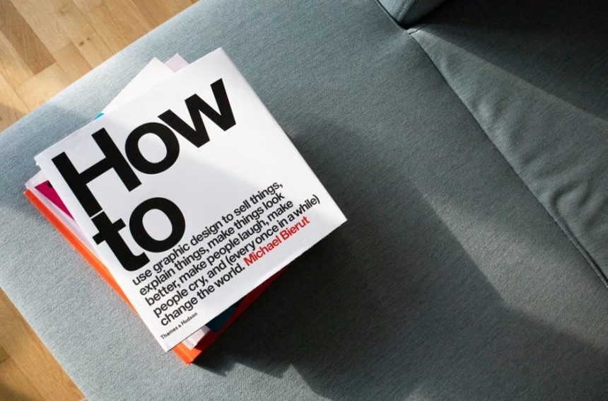
A debut novelist usually has no track record, no built-in readership, and no name that signals what to expect. The cover has to do much of that work. It’s often the first thing a bookseller, reader, or librarian sees, and it has to say something about genre, tone, and promise in a moment.
Inside a publishing house, choosing that cover is rarely one person’s call. It’s a negotiation among editors, designers, marketers, sales teams, and sometimes the author. This article walks through how that process generally works. It stays with practices that are widely described in the industry rather than claiming one fixed formula.
It Starts With the Book and Its Genre

Designers typically begin by reading the manuscript, or at least a detailed summary supplied by the editor. They also receive a brief that covers the genre, the intended audience, and a few comparable titles. That brief shapes everything that follows.
Genre matters because readers use visual shorthand. A thriller, a literary novel, and a romance each tend to follow different conventions in color, type, and imagery. A cover that ignores those cues can confuse the very readers most likely to buy the book.
Comparable Titles Set the Visual Neighborhood
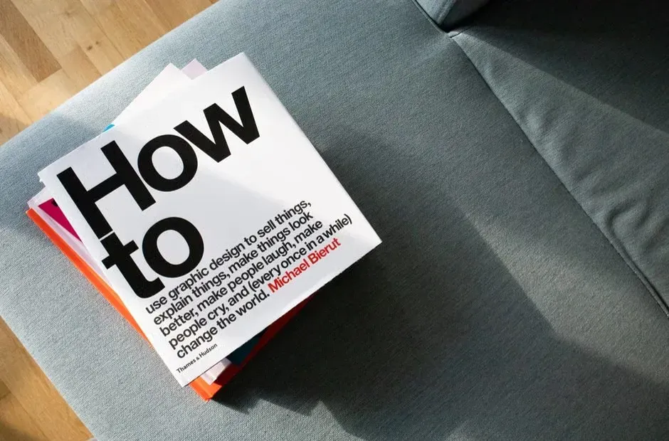
Publishers often name recent successful books that sit near the debut in tone and readership. These “comp titles” guide both the pitch to booksellers and the look of the jacket. The goal is to place the new book on the same mental shelf without copying anyone.
That balance is tricky for a debut. Too similar, and the book looks derivative. Too different, and a shopper may not know who it’s for. Designers usually study current bestseller displays and online listings to see what’s crowded and what’s still open.
Designers Explore Multiple Directions

An in-house designer or a freelance jacket artist typically develops several rough concepts rather than a single polished one. These might differ in imagery, illustration versus photography, or the role of lettering. Showing options lets the team react to something concrete.
Many covers use stock imagery, commissioned illustration, or custom photography, depending on budget and style. Debut titles often receive modest budgets compared with lead titles, which can push designers toward typographic solutions or smart use of licensed art. Constraints, in other words, frequently shape creativity.
The Editor, Art Director, and Marketing Weigh In

Concepts usually go to the art director first, then to the editor who acquired the book. Marketing and publicity teams add their view on how the cover will look in ads, social posts, and catalogs. Each group cares about slightly different things, such as emotional fit, shelf impact, or clarity at small sizes.
Partner offer
Sales teams carry particular weight. They hear directly from bookstore buyers and retail chains, who may react strongly to a jacket. A cover that tests well with accounts can win support for larger orders, which matters a great deal for an unknown author.
Designing for Thumbnails and Screens
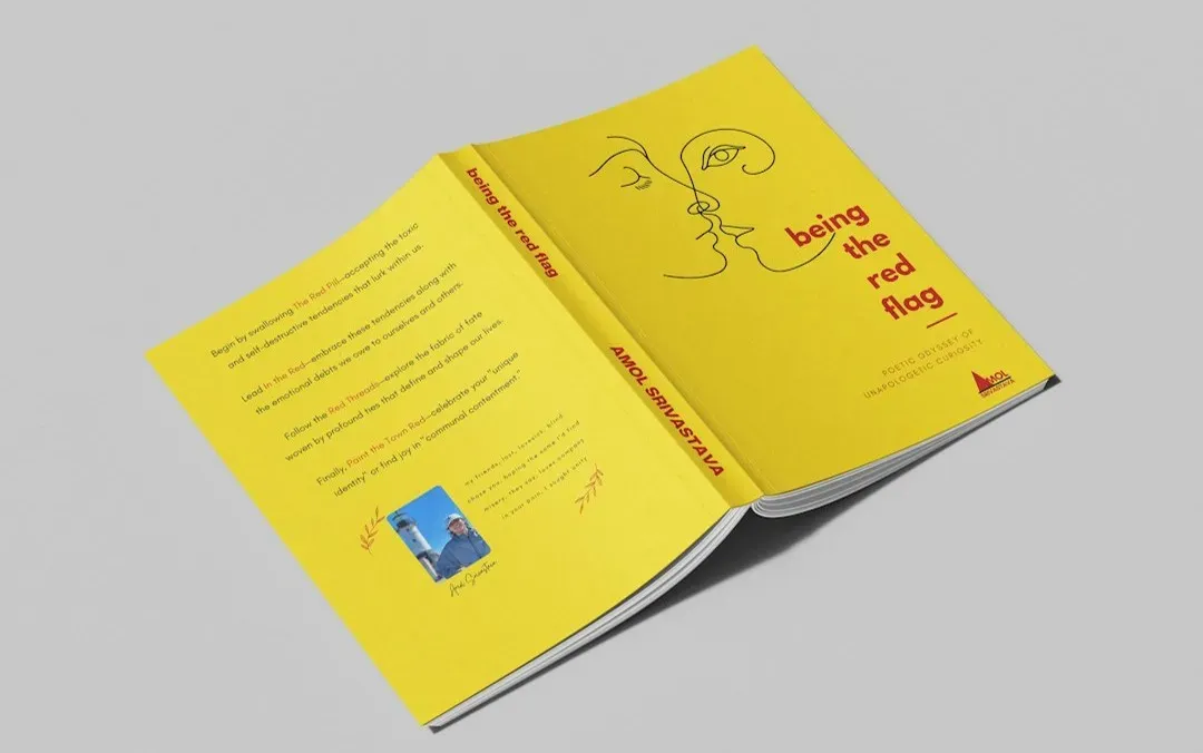
A large share of book discovery now happens online, where the cover appears as a tiny image. Designers therefore check whether the title and author name stay legible when shrunk. Busy artwork and thin lettering can disappear at that size.
Covers also need to work across formats, including hardcover, paperback, ebook, and audiobook, the latter usually shown as a square. Publishers often adapt a single design for each. Planning for these shapes early avoids awkward crops later.
The Author’s Role
Author involvement varies by publisher and contract. Some authors have formal consultation rights, while others are simply shown the design and invited to comment. Traditional publishers generally keep final authority over the jacket, which is worth knowing if you’re negotiating a first deal.
Good editors encourage authors to give feedback about accuracy, such as period details or character descriptions, instead of personal taste alone. A cover that contradicts the story can draw reader complaints. Authors who explain what the book feels like, rather than dictating imagery, tend to be most helpful.
Testing, Revising, and Reading the Market
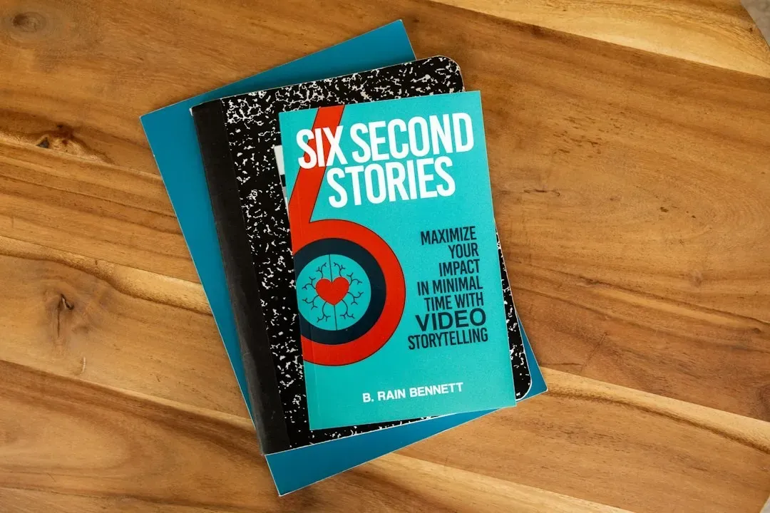
Some publishers informally test covers with booksellers, sales reps, or social media audiences before locking a design. Others rely on professional instinct and past performance. Evidence on how well any method predicts sales is mixed, so decisions often blend data with judgment.
Revisions are normal, and a cover may go through many rounds. Occasionally a book gets a new jacket after publication, especially for a paperback edition, if the first look didn’t connect. Those redesigns show that a cover is a working marketing tool, not a fixed piece of art.
Conclusion

For a debut, the winning cover is rarely the most beautiful one in isolation. It’s the one that signals the right genre, stands out among similar titles, reads clearly at thumbnail size, and earns confidence from editors, marketers, and booksellers. That consensus takes time, and it involves compromise.
A cover can’t write the book, but it can get the right reader to pick it up. For a first novel, that single moment of attention is often the most valuable thing a design can buy.
Partner offer
Planning a trip to Vegas?
Compare hotel rates and show tickets on VEGAS.com.