

Album covers used to be the first handshake between a band and a stranger flipping through a record bin. Long before streaming thumbnails shrank everything down to a postage stamp, these images were billboards, mood boards, and sometimes outright provocations. Some of the covers below are so burned into pop culture that even casual listeners recognize them instantly, while others require a genuine devotion to music history to place correctly. This is less a quiz and more a walk through nine covers that changed how we think about visual identity in music. Each one tells a story about the band that made it, the era it came from, and why it still gets referenced decades later.
Pink Floyd and the prism that never gets old
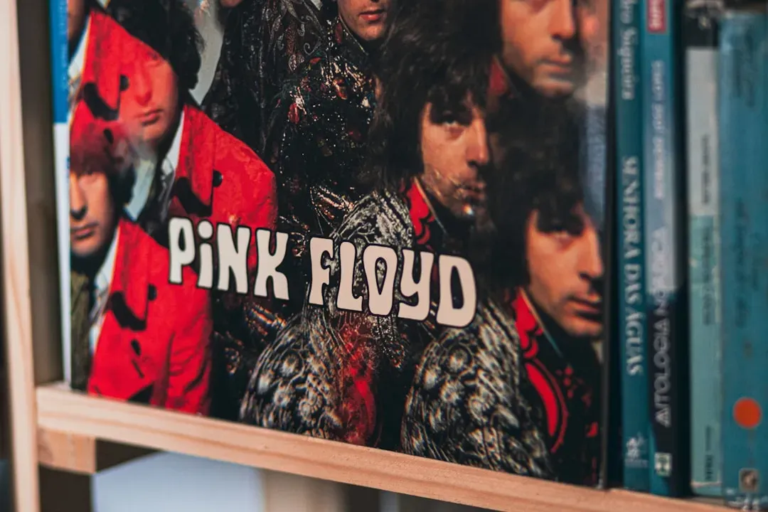
The refracted light beam on “The Dark Side of the Moon” is arguably the single most recognizable piece of album art in rock history. Designed by Hipgnosis and George Hardie, the stark black background and simple triangle turned into a visual shorthand for the entire progressive rock movement. It has since been printed on more t-shirts, posters, and phone cases than almost any other band logo in existence.
What makes it fascinating is how little the image has to do with the album’s themes on the surface, yet how perfectly it captures the record’s obsession with light, time, and perception. Pink Floyd’s members reportedly picked the design quickly from a small stack of options, not realizing it would become their defining visual signature. That casual decision turned into one of the most licensed images in music merchandising.
Nirvana and the baby that grew up in court

The underwater baby chasing a dollar bill on a fishhook, from “Nevermind,” is instantly identifiable even to people who have never listened to a full Nirvana song. The image was strange, unsettling, and darkly funny all at once, which fit the band’s own contradictions perfectly. It has become shorthand for early nineties alternative rock in a way few other covers have matched.
The cover gained renewed attention in recent years when the baby depicted in the photo filed lawsuits against the surviving band members and Kurt Cobain’s estate over the image’s use, a legal saga that stretched from 2021 into subsequent years before being resolved. That ongoing story kept the album art in headlines well past its thirtieth anniversary. Few covers have managed to stay culturally relevant through both nostalgia and litigation at once.
The Velvet Underground and Andy Warhol’s peelable banana
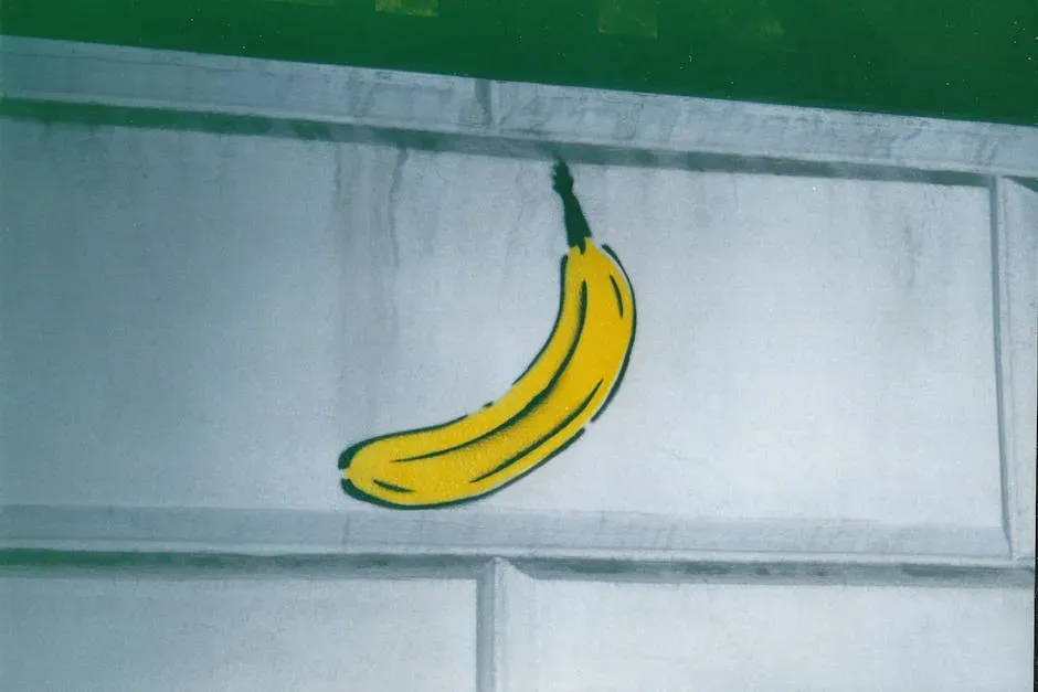
The Velvet Underground’s debut album featured a bright yellow banana designed by Andy Warhol, complete with a sticker that could be peeled back to reveal a pink banana underneath. It was one of the earliest examples of pop art crossing directly into album packaging, and it turned a relatively obscure band into a visual legend almost overnight. The simplicity of the design is part of its genius, a single fruit doing more cultural work than most elaborate illustrations ever could.
Because Warhol was already a major figure in the art world, the collaboration gave the band credibility and mystique that its initial sales numbers did not reflect. The album barely charted upon release, yet the cover has outlived nearly every other design from that era in terms of recognition. It remains a staple in art history courses as much as music ones.
The Beatles and the crosswalk that became a pilgrimage site
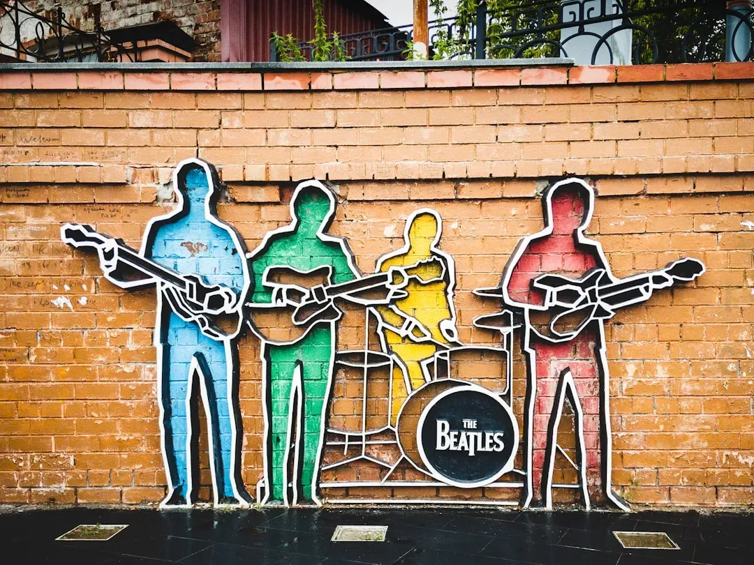
“Abbey Road” shows four men walking across a street in single file, and somehow that mundane image became one of the most parodied and photographed compositions in music history. The zebra crossing outside Abbey Road Studios in London still draws visitors who want to recreate the walk themselves, decades after the photo was taken in 1969. It is a rare case of an album cover turning a real, ordinary location into a permanent tourist attraction.
Part of the appeal lies in how effortless the shot looks despite being carefully staged, with the band walking back and forth while photographer Iain Macmillan snapped just a handful of frames from a stepladder. No text, no band name, no album title appears anywhere on the front, which was almost unheard of for a major release at the time. That confidence in letting the image speak alone is part of why it still feels modern.
Joy Division and the radio waves nobody expected to see

“Unknown Pleasures” features a stark white plot of radio wave pulses against a black background, an image originally sourced from an astronomy encyclopedia depicting signals from a pulsar. Designer Peter Saville chose it for its stark, almost clinical beauty, and it ended up defining the visual language of post punk. The band’s name does not even appear on the front cover, a bold choice for a debut release.
The image has since been reproduced on countless items far removed from music, from clothing to home decor, often by people who have no idea it originated with a Manchester band from the late seventies. That kind of detachment from its source is unusual and speaks to how purely graphic the design is. It works as art independent of the music it was made to represent.
Partner offer
Led Zeppelin and the falling figures of Hindenburg
The debut Led Zeppelin album uses a black and white photograph of the Hindenburg airship disaster, its nose engulfed in flames as it crashes. The choice was blunt and dramatic, matching the band’s thunderous sound with an image of catastrophic collapse. It set a tone of grandeur and menace that suited a group about to reshape hard rock.
The photograph itself predates the band by decades, originally capturing the actual 1937 disaster in New Jersey, which gives the cover a layer of historical weight beyond typical album art. Repurposing a real tragedy as a rock cover was a bold and slightly unsettling move for its time. It remains one of the more literal and visceral covers on this list.
Fleetwood Mac and the woodland pose that hid real tension
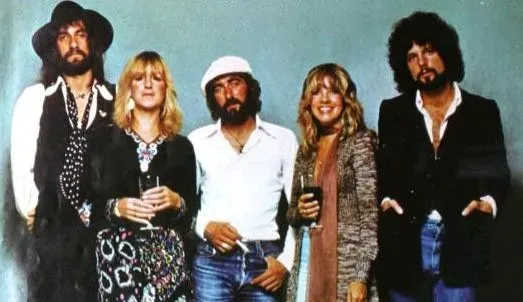
“Rumours” shows Mick Fleetwood and Stevie Nicks in flowing, almost theatrical poses against a plain backdrop, an image that looks warm and playful on the surface. Behind that image, the band was going through multiple breakups and personal upheaval, all of which fed directly into the songwriting on the record. The contrast between the lighthearted cover and the raw emotional content inside is part of what makes the album’s legacy so enduring.
“Rumours” remains one of the best selling albums of all time, and the cover’s soft, almost mythic quality has aged into something closer to iconography. It avoids showing the whole band, focusing instead on just two members in costume-like attire. That choice adds a bit of mystery to an otherwise straightforward portrait shot.
Metallica and the coffins buried in black

“Master of Puppets” uses an illustration of rows of white crosses and coffins connected by strings to a pair of hands in the sky, a grim visual metaphor for control and manipulation. The imagery matches the album’s themes of addiction, war, and loss of autonomy with unusual precision. Few metal covers from the era balanced literal illustration and thematic depth quite so effectively.
The album is widely regarded as one of the most influential thrash metal releases ever made, and its cover art has become just as iconic within the genre as the music itself. It has been referenced and parodied by other bands and artists many times over the following decades. The starkness of the color palette, mostly grey and black, gives it a somber weight that fits the subject matter.
David Bowie and the lightning bolt that outlived him

“Aladdin Sane” features David Bowie with a jagged red and blue lightning bolt painted across his face, a look that became one of the most instantly recognizable images in music history. Photographer Brian Duffy and makeup artist Pierre La Roche created the design almost on the spot during the shoot. The image captured Bowie’s shift into a more theatrical, otherworldly persona following the Ziggy Stardust era.
Following Bowie’s death in 2016, the lightning bolt image saw a massive resurgence, appearing in tributes, murals, and merchandise around the world. It has become shorthand for Bowie’s entire career rather than just the one album it originally represented. Few single images carry that much weight across an artist’s full body of work.
Partner offer
Planning a trip to Vegas?
Compare hotel rates and show tickets on VEGAS.com.