


Album art used to be more than packaging. It was the first handshake between a record and the person about to buy it, often in a store, flipping through bins without ever having heard a single note. Some covers did their job so well that they outlasted the music industry that made them, turning into posters, t-shirts, and shorthand for entire eras of pop culture. What follows is a look at eleven covers that managed to become bigger than the albums they wrapped. Each one tells a small story about the time it came from, the artist behind it, and sometimes the accident that made it work.
Fleetwood Mac – Rumours (1977)
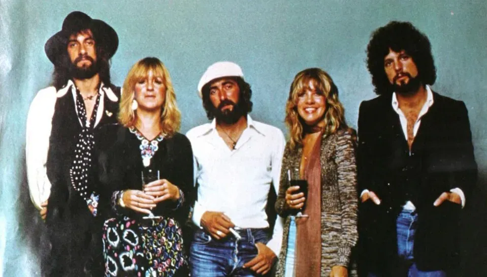
The cover shows Mick Fleetwood and Stevie Nicks in flowing black, photographed by Herbert Worthington against a plain background, with Fleetwood holding wooden balls that later became a running joke among fans. It looks theatrical rather than documentary, which fits an album written in the middle of two band breakups happening at once. Nicks is captured mid-spin, her cape catching the air, giving the shot a sense of motion that most 1970s covers lacked.
Rumours went on to sell more than forty million copies worldwide, and the image became inseparable from that success. It never explained the drama inside the band, but it hinted at something theatrical and slightly mysterious, which turned out to be exactly right. Decades later, the photo still shows up in retrospectives on classic rock aesthetics, usually without much explanation needed.
Pink Floyd – The Wall (1979)
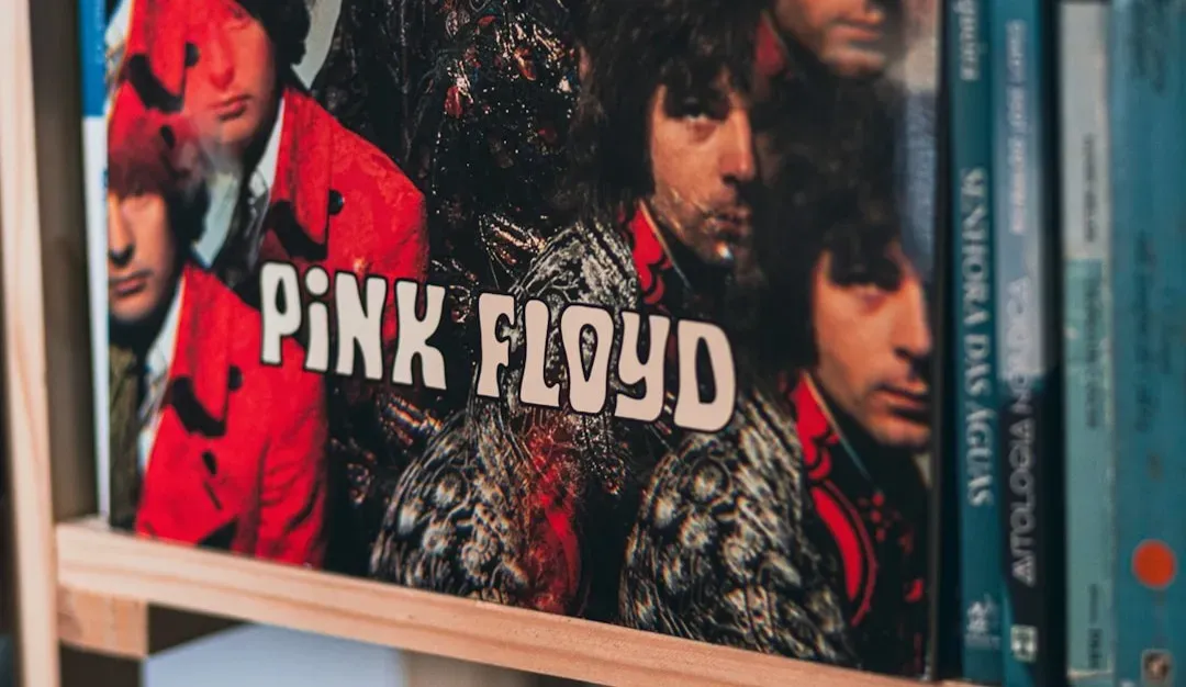
Designed by Gerald Scarfe, the cover strips away photography entirely in favor of a plain white brick wall, a choice that felt almost defiant at the time. There is no band photo, no title in fancy lettering, just the wall itself, cracked and cold. It matched the album’s themes of isolation and control almost too well, which is part of why it still reads as unsettling.
Scarfe’s other contributions, especially the animated sequences from the later film, extended the imagery far beyond the record sleeve. But the cover alone did enough work to become a visual shorthand for concept albums in general. Few designs from that decade feel as stripped down and still as effective.
Michael Jackson – Thriller (1982)
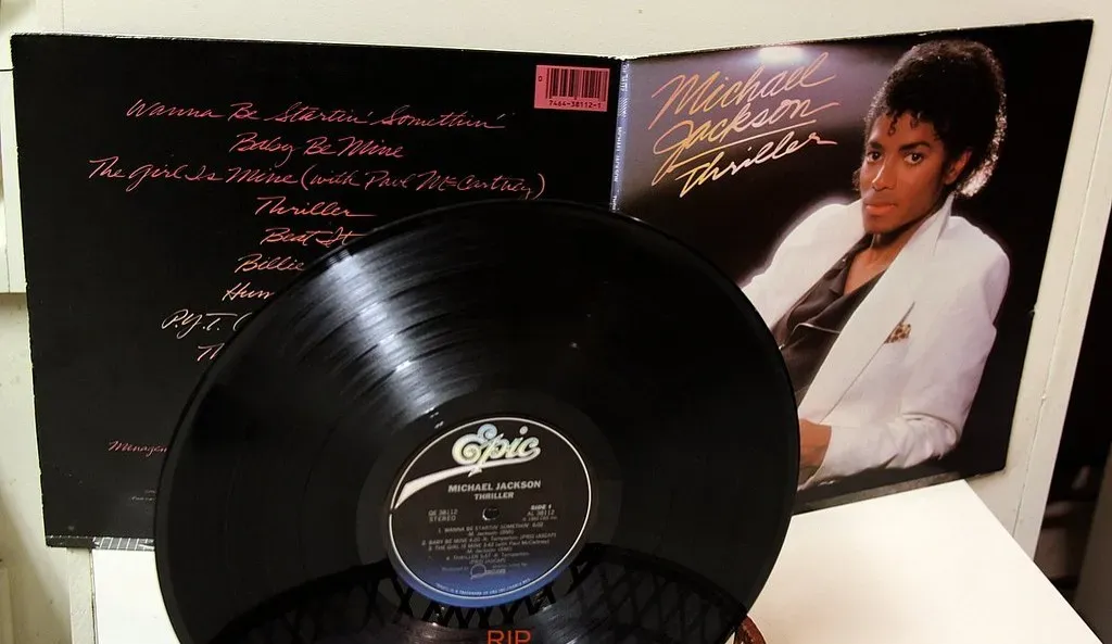
Photographed by Dick Zimmerman, the Thriller cover shows Jackson reclining in a white suit against a plain background, looking relaxed rather than performative. It is a simple portrait, almost old fashioned compared to the horror themed music video that followed it. That contrast is part of the appeal, since the cover gives no hint of the werewolf transformation waiting inside.
Thriller remains one of the best selling albums in history, and the cover’s calm, almost formal tone helped it cross into households that might have been wary of anything looking too edgy. It sits comfortably in family record collections and music history exhibits alike. Few images from the era feel as universally recognizable, regardless of whether the viewer grew up with vinyl or streaming.
Prince – Purple Rain (1984)
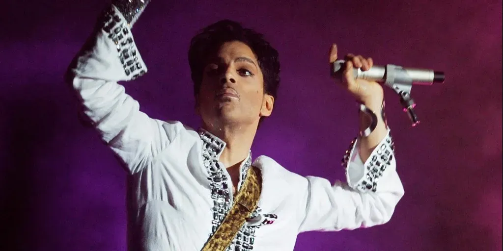
The cover leans entirely into its title, drenching Prince in shades of purple as he sits on a motorcycle, dressed in ruffled clothing that mixed rock theatrics with something closer to royal costume. It was shot to match the film of the same name, giving the image a cinematic quality that most album covers of the period did not attempt. The purple haze around him almost feels like fog from a stage show rather than a photo studio.
Purple Rain became one of the defining visual symbols of 1980s pop, partly because the color scheme was so committed and specific. It is hard to think of another album cover that ties its entire palette to a single word in the title this literally. That commitment is exactly why the image still gets referenced whenever people discuss album art from that decade.
Bruce Springsteen – Born in the U.S.A. (1984)

Photographed by Annie Leibovitz, the cover shows Springsteen’s back, jeans, and a baseball cap tucked into his back pocket, framed against a red and white striped background suggesting the American flag. It became one of the most debated covers of its time, partly because some viewers read it as a straightforward patriotic statement, missing the more complicated themes running through the album itself. Springsteen later noted the ambiguity was intentional, though the visual simplicity made it easy to misread.
The cover’s stark composition, focused entirely on denim and a flag motif, gave it staying power well beyond the record’s chart performance. It has been imitated, parodied, and referenced in political contexts many times since. Few covers manage to spark that much interpretation from so little visual information.
Guns N’ Roses – Appetite for Destruction (1987)
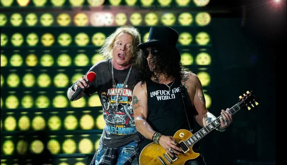
The original cover, painted by Robert Williams, depicted a robot assaulting a woman and was pulled almost immediately due to backlash from retailers and censors. The band replaced it with the now familiar skull and cross design featuring the five band members’ skulls arranged around a cross, a much safer but still striking image. That switch turned into one of the more famous censorship stories in rock history.
Partner offer
The skull design became the version most fans actually remember, printed on shirts and posters for decades after release. It carried enough menace to suit the album’s aggressive sound without repeating the controversy of the original artwork. The story behind the swap has become almost as well known as the cover itself.
Nirvana – Nevermind (1991)
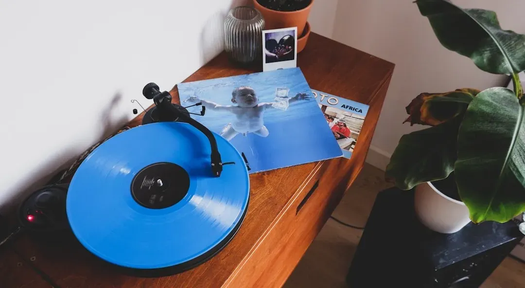
The cover features a naked baby swimming toward a dollar bill on a fishhook, a photograph taken by Kirk Weddle that became one of the most recognized images in music history. Its blend of innocence and dark commentary on capitalism fit the album’s mood perfectly, even though the shoot itself was reportedly fairly casual and quick. The baby, Spencer Elden, later became a recurring figure in legal disputes over the image well into adulthood.
Nevermind’s cover helped define the visual language of grunge, favoring blunt symbolism over glamor or posed band shots. It is often cited in design retrospectives as proof that a single unglamorous photo can outlast far more polished album art. Few images from the early 1990s carry as much instant recognition.
(What’s the Story) Morning Glory? – Oasis (1995)
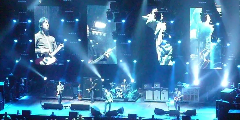
Photographed on Berwick Street in Soho, London, the cover shows a blurred figure walking past band members Liam Gallagher and Bonehead, a mostly unplanned detail that added a documentary feel to the shot. The street itself later became something of a pilgrimage site for fans of Britpop, with tour guides pointing out the exact spot. It captured a specific moment in London’s music scene without trying too hard to stage it.
The cover’s slightly grainy, casual look matched the album’s mix of anthemic rock and unpolished swagger. It helped cement Oasis as a band rooted in ordinary British streets rather than glossy studio backdrops. Decades later, the image is still used as visual shorthand for the mid 1990s Britpop moment.
Radiohead – OK Computer (1997)
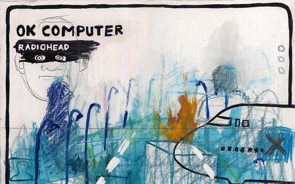
Designed by Stanley Donwood alongside Thom Yorke, the cover uses a chaotic mix of digital imagery, warped text, and unsettling motorway diagrams that mirrored the album’s anxieties about technology and modern alienation. It rejected the clean, polished look many bands used at the time, favoring something closer to a corrupted computer file. That visual disorientation matched the record’s themes almost perfectly.
Donwood continued designing artwork for Radiohead well beyond this release, but OK Computer’s cover remains the one most frequently pointed to as a turning point in album design. It showed that unsettling, layered imagery could work just as well commercially as a clean portrait. Critics still reference it when discussing how album art can extend a record’s mood rather than simply decorate it.
Kanye West – My Beautiful Dark Twisted Fantasy (2010)
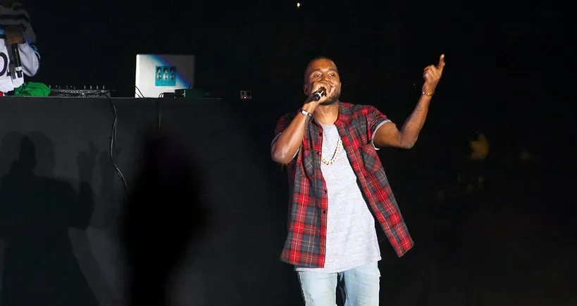
Painted by George Condo, the cover shows a surreal, almost grotesque image of West with wings, seated beside a phoenix like figure, rendered in Condo’s signature distorted style. Several retailers refused to stock the original artwork, leading to alternate covers being released alongside it. The controversy only added to its notoriety rather than diminishing its impact.
The painting fit an album built around excess, contradiction, and unease, themes West explored heavily in interviews around its release. It stood out sharply in a decade when most hip hop covers leaned toward photography rather than fine art. Condo’s involvement also helped blur lines between contemporary art and mainstream music marketing in a way few covers before it had managed.
Beyoncé – Lemonade (2016)
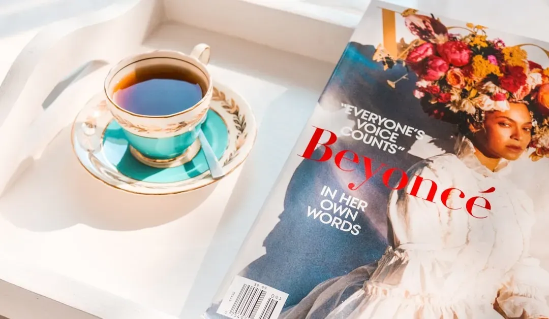
The cover, shot with a stark, almost sculptural quality, shows Beyoncé in braided hair and dark clothing, staring directly into the camera with an expression that reads as both calm and defiant. It arrived alongside a full length visual album, which meant the cover was only one piece of a much larger, tightly coordinated rollout. Even isolated from the film, the image carried enough weight to stand as its own statement.
Lemonade’s visual identity, including the cover, drew heavily on themes of Southern heritage, resilience, and personal history, ideas that ran throughout the accompanying short film. It became one of the most discussed album releases of the 2010s, and the cover’s stripped down intensity helped it register instantly on shelves and screens alike. Nearly a decade later, it remains one of the most referenced images from an era when album art had to work as hard on a phone screen as it once did on a record sleeve.
These eleven covers span roughly fifty years of shifting technology, from vinyl sleeves meant to be handled in a shop to digital thumbnails meant to catch attention in a scroll. What ties them together is not a shared style, since they range from stark minimalism to surreal painting to candid photography. It is the way each one managed to say something true about the record inside, often before a single song had played.Partner offer
Planning a trip to Vegas?
Compare hotel rates and show tickets on VEGAS.com.