

A movie poster has a few seconds to do its job. It has to suggest a mood, a genre and a promise, all on a sheet of paper that someone walks past on the way to buy popcorn.
The eight posters below each took a different route to get there. Some came from painters working to tight deadlines. One started life on a paperback, and another borrowed a surrealist’s photograph.
Jaws (1975): A Paperback Painting Becomes a Film Icon
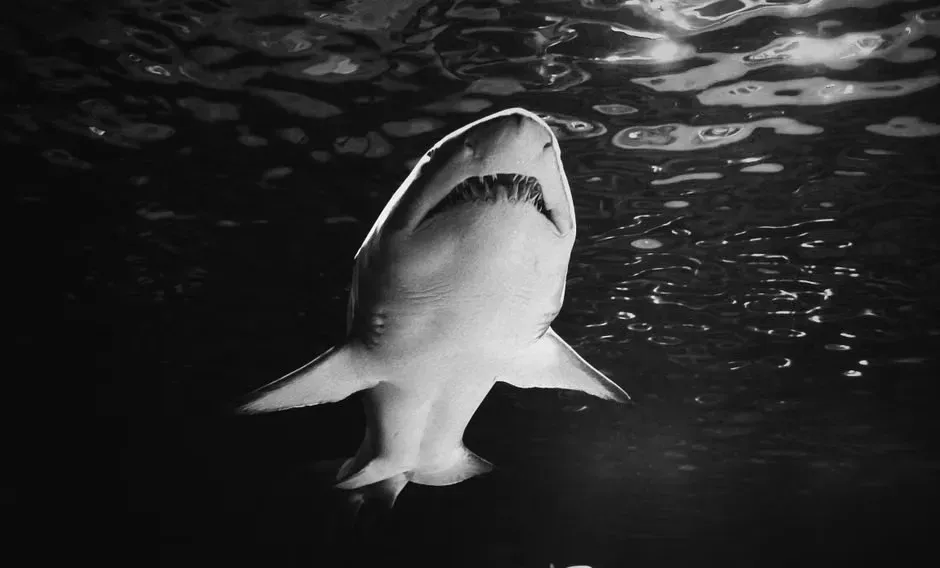
The image of a huge shark rising toward a lone swimmer started as book cover art. Illustrator Roger Kastel painted it for the paperback edition of Peter Benchley’s novel.
Universal liked the composition enough to carry it over to the film’s advertising with only small adjustments. The shark is enormous, the swimmer is tiny, and the water is flat. Nothing on the poster shows the attack itself, which is probably why it still unsettles people.
Star Wars (1977): Two Artists, Two Different Visions
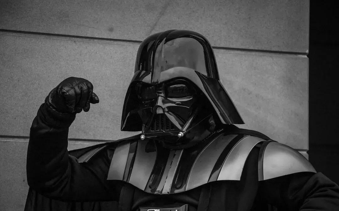
The first Star Wars campaign didn’t rely on a single poster. Tom Jung painted an early version that showed Luke Skywalker with his lightsaber raised above a crowd of characters.
Soon afterward, the brothers Greg and Tim Hildebrandt painted a second version that became just as recognizable. It put a large, looming Darth Vader in the background behind the heroes. Fans still debate which version feels more like the film.
Vertigo (1958): Saul Bass and the Spiral
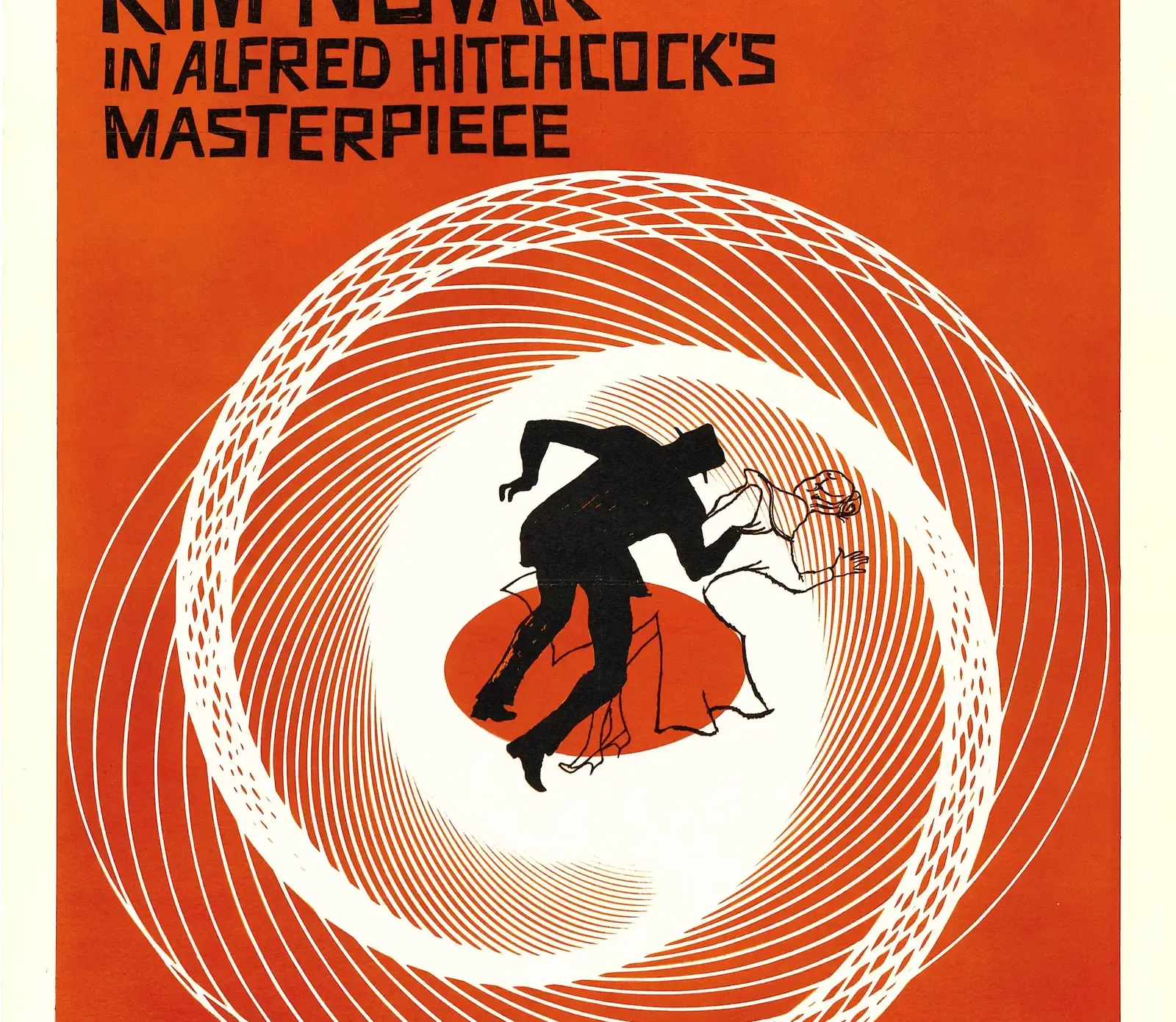
Designer Saul Bass reduced Hitchcock’s thriller to a few shapes. A small human figure tumbles through bold, swirling spirals in warm, flat colors.
Bass worked on the film’s title sequence as well, so the poster and the opening credits share a visual language. The spiral hints at the disorientation of the title without showing a single scene. Graphic designers still cite it as a model of poster minimalism.
The Godfather (1972): A Logo Built From a Puppeteer’s Hand

Designer S. Neil Fujita created the book jacket for Mario Puzo’s novel. He is also credited with the hand over the words that became the film’s trademark look.
The hand with strings suggests control, as though the family is moving people like marionettes. The poster pairs this with a close portrait of Marlon Brando’s Vito Corleone in a tuxedo with a rose at the lapel. Black, white and a touch of red keep the whole thing restrained.
Partner offer
Breakfast at Tiffany’s (1961): Robert McGinnis Draws Holly Golightly
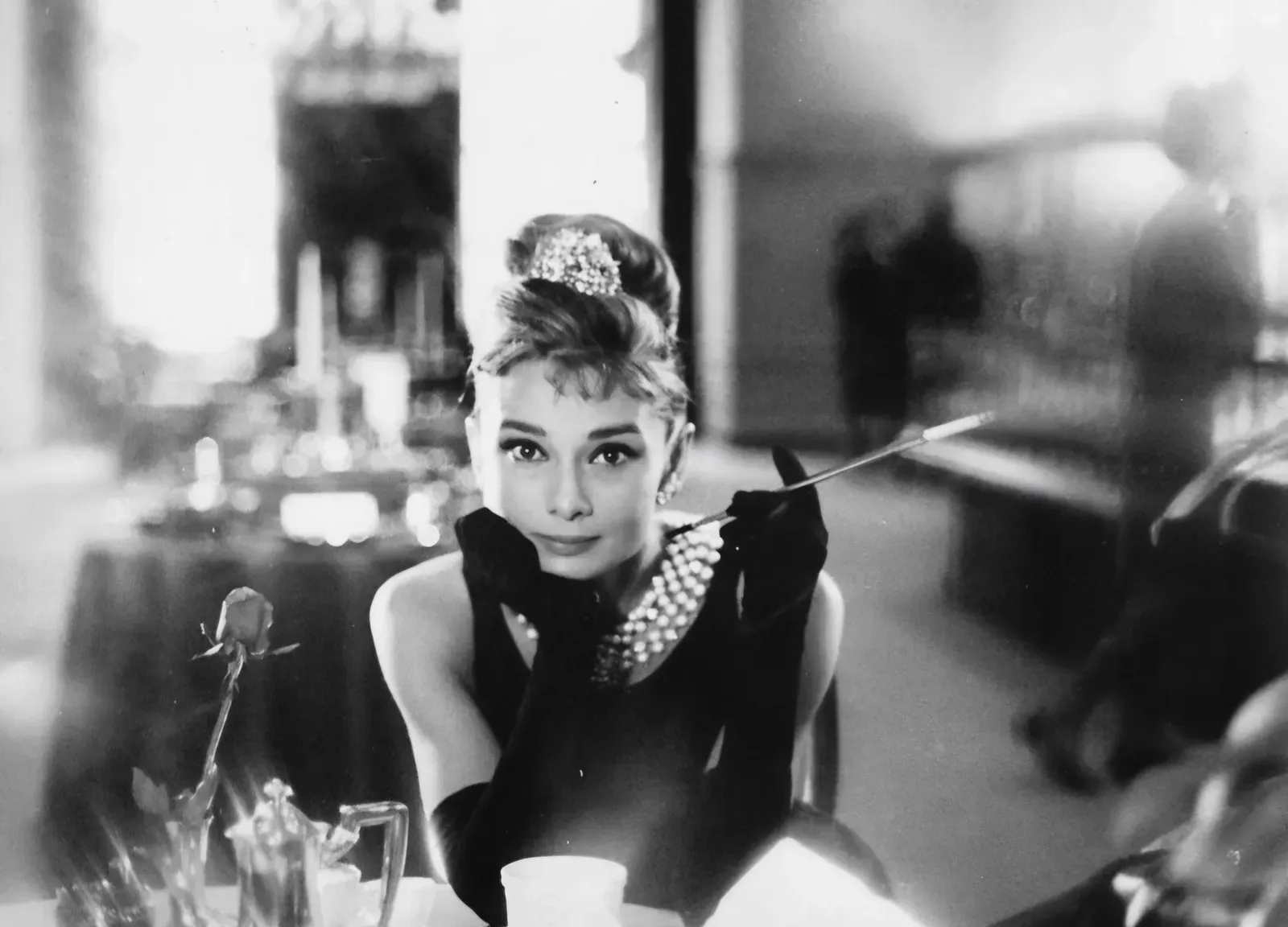
Robert McGinnis illustrated the poster for this film. It shows Audrey Hepburn in a black dress with a long cigarette holder, her hair piled high.
McGinnis was known for painting elegant, stylish figures for paperbacks and for several James Bond posters, including Thunderball. Here, the painted style gives Hepburn a graceful, slightly idealized look. The pose has been reproduced on countless prints and mugs ever since.
Metropolis (1927): A Silent Film Poster Worth a Fortune
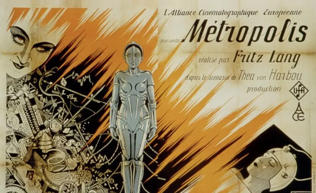
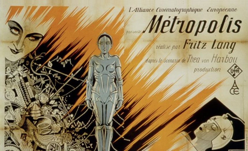
Heinz Schulz Neudamm designed the German poster for Fritz Lang’s science fiction epic. It features a towering, angular cityscape with a stylized figure of the robot Maria in the center.
Very few original copies survived the decades. One of them reportedly set a record for a movie poster at auction in 2005, which turned the design into a collector’s grail. The geometric look is pure Art Deco, and it mirrors the film’s vision of a vertical, divided city.
The Silence of the Lambs (1991): A Moth and a Dalí Skull
The poster shows Jodie Foster’s face with a moth covering her mouth. Look closely at the moth’s wings and you’ll see a tiny skull.
That skull is taken from a photograph by Philippe Halsman, made with Salvador Dalí in the 1950s, in which several nude women pose to form a skull shape. The studio adapted the image for the film’s marketing. It lets the poster hint at horror without a drop of blood.
Back to the Future (1985): Drew Struzan’s Painted Optimism
Illustrator Drew Struzan painted the poster for Back to the Future, with Marty McFly checking his watch beside the DeLorean. The car’s fire trails and the glowing clock give the scene an urgent, adventurous energy.
Struzan was one of Hollywood’s busiest poster painters in the 1980s. He also created artwork for the Indiana Jones films and a Star Wars re-release. His hand painted style, with warm skin tones and layered characters, defined how many blockbusters looked before digital collage took over.
Closing Notes
Each of these posters began as a commission and ended up as a lasting piece of film history. Their designers used paint, photographs, and simple shapes to make a first impression that has outlasted most of the advertising around them.
Partner offer
Planning a trip to Vegas?
Compare hotel rates and show tickets on VEGAS.com.