


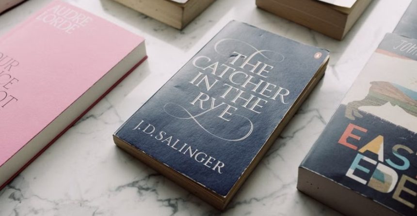
Walk into any bookstore and you’ll notice something odd: certain covers never seem to fade from memory, even decades after their first printing. A carousel horse, a shark’s open jaw, a pair of floating eyes over a glittering skyline. These images have outlived their original marketing purpose and become part of how we talk about the books themselves.
Behind each of these designs sits a specific person, a tight deadline, and often a fight between artist and publisher that never made it into the history books until much later. Here are nine covers whose backstories are almost as compelling as the novels they wrap.
The Great Gatsby (1925): Francis Cugat’s floating eyes
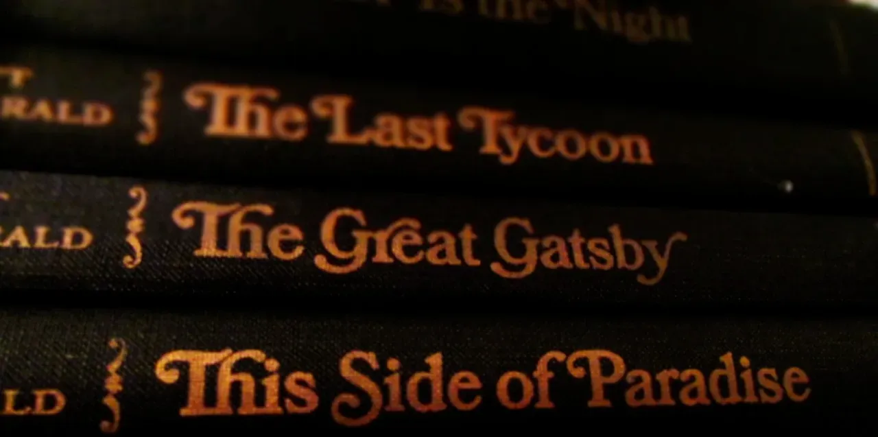
The cover of F. Scott Fitzgerald’s novel is unusual because it was finished before the book itself. This iconic work of art was created by Spanish artist Francis Cugat, and the Gatsby cover, for which he was paid the princely sum of $100, was the only one he ever designed. Scribner’s commissioned the piece while Fitzgerald was still writing, working only from a loose premise and an early working title for the novel.
What makes the story remarkable is that Fitzgerald apparently wrote the imagery back into his own manuscript. The artwork influenced the story: Cugat finished the illustration before the final manuscript was submitted, and Fitzgerald wrote to his editor Maxwell Perkins that he had written it into the book. Many scholars connect the painted eyes directly to the haunting billboard of Doctor T.J. Eckleburg that appears throughout the novel.
Jaws (1974): Paul Bacon’s shark that almost wasn’t
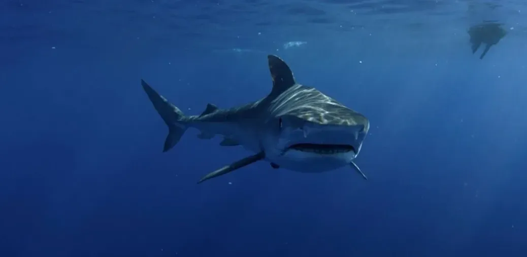
Long before Steven Spielberg’s film poster terrified moviegoers, Peter Benchley’s novel needed a cover, and the process behind it was surprisingly chaotic. An editor at Doubleday called artist Paul Bacon, who made a rough layout of the enormous head of a fish, then asked why they couldn’t have a swimmer as well to create a sense of disaster and scale. Bacon came in the next morning with the completed jacket, an open-jawed shark’s head rising toward a swimming woman.
Bacon was already a legend in the industry by that point. He was known for pioneering what the publishing industry calls the Big Book Look, hardcovers with big, bold titles and quasi-abstract designs that synthesized a book’s themes down to just a couple of colors and maybe a single quintessential image, and three generations of readers grew up reading covers either designed by Bacon or inspired by his work. His original hardcover shark eventually shaped the visual language that the film poster would borrow directly.
To Kill a Mockingbird (1960): Shirley Smith’s quiet symbol
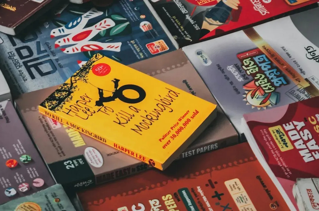
Harper Lee’s novel arrived with a cover that avoided any obvious drama. The cover features none of the more iconic images associated with Mockingbird but does include the tree where gifts were left mysteriously for the Finch children. It was a restrained choice for a book that deals with racial injustice, courtroom tension, and childhood fear.
The tree motif became so associated with the story that it has followed the book through dozens of later editions. With its muted green, deep black, and striking tree illustration, the design symbolized innocence, childhood curiosity, and the layered complexities of the story, while the typography was bold yet classic, immediately distinguishing it from other contemporary book jackets of its time. Even sixty years on, publishers keep returning to that same silhouette rather than inventing something flashier.
The Catcher in the Rye (1951): a carousel horse painted by a friend
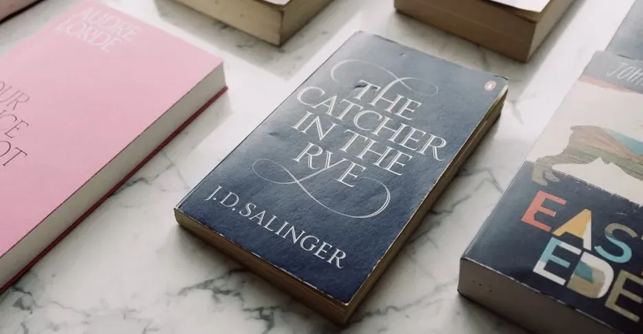
J.D. Salinger was famously particular about how his work was presented, which makes the origin of this cover even more interesting. The original cover art for the first edition was created by E. Michael Mitchell, a Canadian-born artist and one of Salinger’s very few close friends, and it draws its inspiration from the carousel horse featured towards the end of the novel. Given how protective Salinger was of his book, letting a personal friend design it was a small act of trust.
The imagery carries more weight than a simple illustration of a fairground ride. The cover features a solitary carousel horse, its fiery red hue stark against a backdrop of pristine white, and this seemingly innocuous image carries symbolic weight, mirroring the journey of Holden Caulfield himself. Later paperback reprints replaced it with more literal portraits of Holden, but longtime fans of the book still consider Mitchell’s version the definitive image.
The Hobbit (1937): Tolkien’s own hand at work
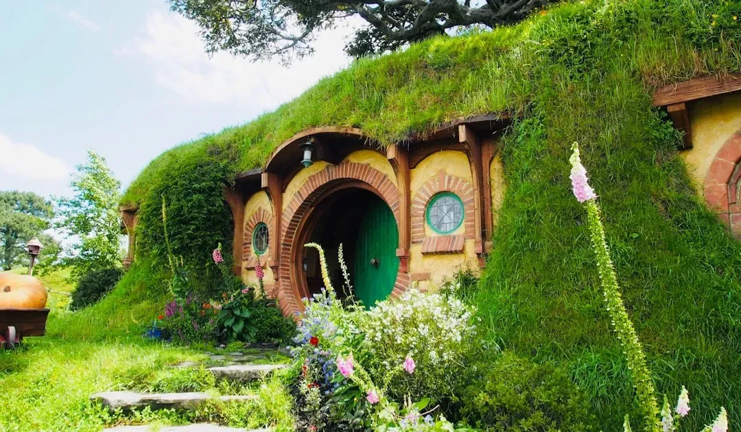
J.R.R. Tolkien wasn’t just the author of Middle-earth’s first published adventure; he was also its original illustrator and designer. He sketched the dust jacket himself, choosing a stylized mountain landscape with runes bordering the top and bottom, a decision that let him embed Elvish-style lettering directly into the design rather than leaving it to a hired artist.
That hands-on approach set a precedent that few authors get to repeat. Tolkien continued sketching maps and cover concepts for later editions of his work, and the mountain and dragon imagery from his own drawings still echoes through countless fantasy covers published today, even ones with no direct connection to his estate.
Partner offer
Alice’s Adventures in Wonderland (1865): John Tenniel’s enduring line work
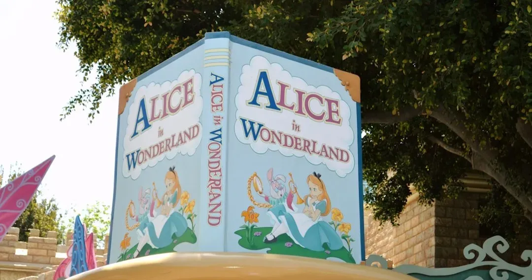
Lewis Carroll’s fantasy might have looked entirely different if the author hadn’t insisted on a specific illustrator. He chose John Tenniel, an established political cartoonist for Punch magazine, to render Alice, the White Rabbit, and the Mad Hatter’s tea party in precise, engraved detail.
Tenniel’s illustrations became so tightly fused with the text that they’re often reprinted alongside the story even in modern editions with new artwork. His visual interpretation of Alice, a fairly plain-looking girl rather than the golden-haired figure later popularized by adaptations, remains the version many literary historians consider closest to Carroll’s original intent.
Harry Potter and the Philosopher’s Stone (1997): Thomas Taylor’s modest first attempt
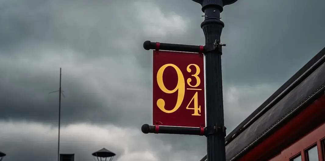
Before J.K. Rowling’s series became a global phenomenon, the UK first edition needed cover art on a limited budget, and the job went to a young illustrator named Thomas Taylor. He painted Harry standing on a train platform, wand in hand, based on a description in the manuscript rather than any input from Rowling directly during the process.
Only about five hundred hardcover copies of that first print run exist, making surviving examples some of the most valuable modern book collectibles in existence. Taylor has said in various interviews over the years that he had no idea the book would become anything more than a small children’s title, which makes the image’s now-mythical status feel almost accidental.
Fahrenheit 451 (1953): Joseph Mugnaini’s man made of newsprint

Ray Bradbury’s dystopian novel about book burning got a cover that matched its central metaphor almost too well. Artist Joseph Mugnaini, who would go on to collaborate with Bradbury on several projects, designed a figure built from twisted strips of burning paper, arms raised as flames consume the newsprint body.
Bradbury and Mugnaini’s working relationship extended well beyond this single cover; the two remained friends and collaborators for years afterward. The image has been reproduced, referenced, and reimagined so often in academic discussions of censorship that it now functions almost as visual shorthand for the book’s warning about a society that destroys the written word.
Where the Wild Things Are (1963): Maurice Sendak’s monsters with soft eyes
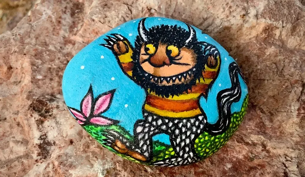
Maurice Sendak wrote and illustrated his own picture book, which meant the cover came from the same hand that shaped the story inside. He gave his wild things exaggerated claws and teeth but paired them with oddly gentle, almost worried expressions, a choice that kept the book from feeling frightening to the children it was written for.
That balance between menace and warmth is part of why the book has stayed in print continuously since its release. Sendak reportedly based some of the creatures’ faces on relatives from his childhood, softening what could have been a straightforwardly scary monster book into something stranger and more tender.
Final thoughts

What ties these nine covers together isn’t a shared style or era. Some were painted by the authors themselves, others by close friends working under tight deadlines, and at least one nearly got scrapped over an editor’s uneasy reaction. Yet each one managed to distill an entire novel into a single glance, which is a harder trick than it sounds.
The next time a familiar cover catches your eye on a shelf, it might be worth remembering that the image likely has its own small history, one shaped by budget constraints, personal relationships, or a last-minute redesign that nobody expected to last a hundred years.
Partner offer
Planning a trip to Vegas?
Compare hotel rates and show tickets on VEGAS.com.